


Welcome to HiResCovers.NET
|
| |||||||||||||
|
||||||||||||||
|
|
| |||
|
||||
|
| |||||||||||||||||
|
||||||||||||||||||
|
| |||||||||||||||||||||||||
|
||||||||||||||||||||||||||
|
|
| |||
|
||||
 Loading tabs, please wait...
abcdefghijklmnopqrstuvwxyzABCDEFGHIJKLMNOPQRSTUVWXYZ
|
|

Welcome Guest, Register to Remove this Message!
|
Welcome to the highest quality Custom DVD, Blu-ray and Ultra-HD 4k cover art, available anywhere in the world. Please register, or log in, to browse our site. • Almost 200,000 300 dpi high quality images • Moderated uploads, to ensure the highest quality possible. • A forum for artwork requests, help designing cover art and much more • If you cannot find the movie you need, simply create a request for it to be created and uploaded to the gallery. • A section of Design Assets, including templates, logos and fonts. |
Guest Message © 2025 Dev Fuse

|
|
 
|
 Sep 18 2020, 06:50 AM Sep 18 2020, 06:50 AM
Post
#1
|
||
  Group: Members Posts: 1,354 Coverart: 840 Thanks: 1331 From: Tulsa, Oklahoma Joined: April 6 2012 |
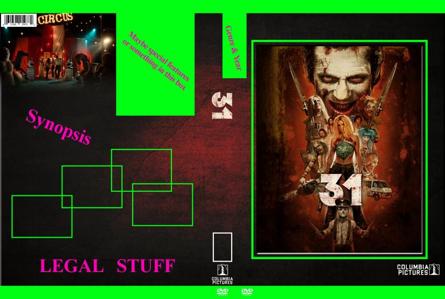
OK OK OK lol I am still working on the James Bond set but this has been bothering me as well. my dvd template is cool to me somewhat. there are some things i really want to fix like the font is lame it bothers me looks cheap lol. the back looks a lil boring I can do more now days with stuff. I want a somewhat simple layout that I can basically build fast as I do own over 10K movies. probably 6500 are dvd that i want done in my style. So that leads me to this. I want to fixx this template but make it somewhat easy for me to redo covers and so on.
Kernie was always a big inspiration for me to have sets but unlike the comic collection I want to do my whole collection Genres and stuff. Basically how my clz is set up. I am going to expand the horror action and maybe comedy to sub genres as well but nevermind that. I want to make something that looks cool and such heres what I got idk what to really do Im like stuck. I like the border image I originally used but idk I want to make all these look like they belong together but you can tell when a genre switches like I was doing with colors and stuff. but i also want to label on the spine what genre its in and the year heres what Ive done I like the smaller upc I been doing on my kino covers so I incorporated that into this as well. also if you dont know what my original template is its in my gallery lol
also I know 31 isnt columbia but I am trying to make sure my layout will have room for studios with bigger logos lol |
|
   |
 
|
|
The Following 5 Users Say Thank You To xspankyxduckx For This Post: Bazzah, ctaulbee, sauron, Speedz0r, VincentLupo | ||


|
Sep 19 2020, 06:01 AM
Post
#2
|
|
  Group: Moderator Posts: 5,702 Coverart: 240 Thanks: 22382 From: Norway Joined: June 24 2006 |
Won't the screenshots mess with the credits/template of the movie your working on?
  Please keep my covers on this site and this site only! |
|
|
|
The Following 5 Users Say Thank You To Speedz0r For This Post: Bazzah, ctaulbee, sauron, VincentLupo, xspankyxduckx | |

|
Sep 19 2020, 06:15 AM
Post
#3
|
|
|
Group: Members Posts: 1,354 Coverart: 840 Thanks: 1331 From: Tulsa, Oklahoma Joined: April 6 2012 |
QUOTE (Speedz0r @ Sep 19 2020, 12:01 AM)  Won't the screenshots mess with the credits/template of the movie your working on? Thats kind of my thoughts as well. see my old template only had like little info stuff at bottom this 1 I want to actually make it look half decent lol. so I may go about the screenshots a whole different way. I am thinking of not using a bevel effect as well now so yea idk if the green spots will even be the same lol |
|
|
|
|
Sep 19 2020, 07:28 AM
Post
#4
|
||
|
Group: Members Posts: 1,354 Coverart: 840 Thanks: 1331 From: Tulsa, Oklahoma Joined: April 6 2012 |
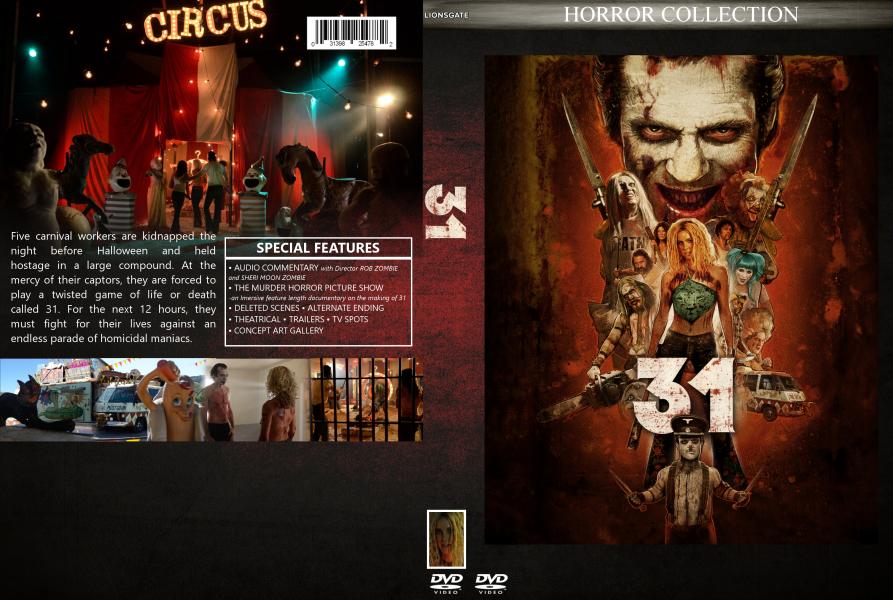
So I have pretty much change the whole back layout lol. Im liking the direction I am going with this on the back the front Im still a lil stumped on. the spine I would like to throw the year (maybe date as well ex. 0919 for like sept 19 dunno tho) Id also some how like to put horror collection on the spine as well. maybe in the bottom center of the front put the years as well idk. im still messing with that. I trying to make this layout workish for each genre not just horror as well lol. When I say workish the laout on the back for say the synopsis, special features and big image may be a lil different but all the rest the sae I would say so Im not like spending hours on each cover but I dont mind spending some time on each 10k is alot to do haha. any ideas on front layout and how to incorporate the spine stuff would be awesome thanks everyone |
|
|
|
|
|
The Following 5 Users Say Thank You To xspankyxduckx For This Post: Bazzah, ctaulbee, sauron, Speedz0r, VincentLupo | ||
|
Sep 19 2020, 10:04 AM
Post
#5
|
||
|
Group: Members Posts: 1,354 Coverart: 840 Thanks: 1331 From: Tulsa, Oklahoma Joined: April 6 2012 |
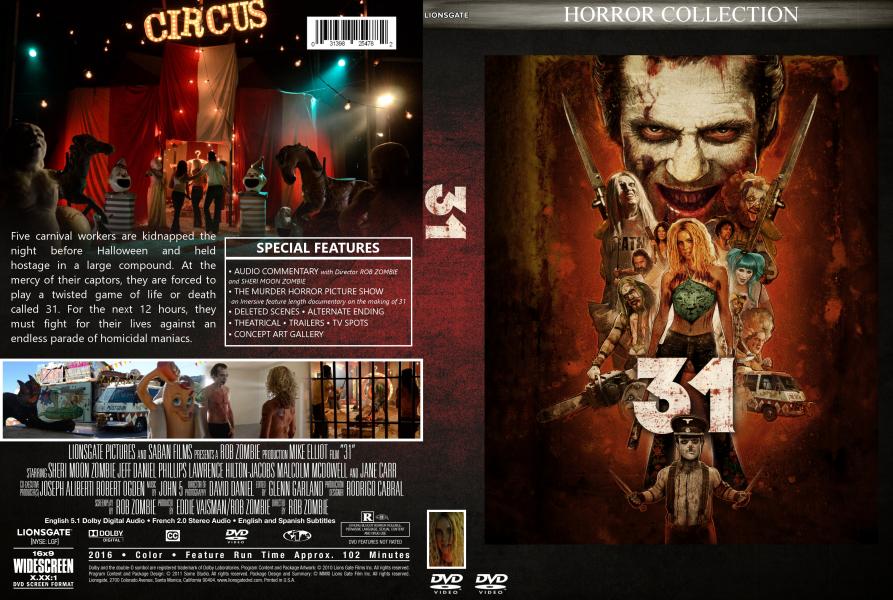
just a lil update to the back that front is still bugging e lol
|
|
|
|
|
|
The Following 5 Users Say Thank You To xspankyxduckx For This Post: Bazzah, ctaulbee, sauron, Speedz0r, VincentLupo | ||
|
Sep 19 2020, 12:21 PM
Post
#6
|
|
  Group: Root Admin Posts: 22,895 Coverart: 1,634 Thanks: 52598 From: Home Joined: May 3 2006 My Favorite Cover Designer: All HiRes designers |
I would reduce the synopsis text size, and alilgn it with the features box. And reduce the stills box height a little, and pull it away from the legal.
    |
|
|
|
The Following 6 Users Say Thank You To Bazzah For This Post: ctaulbee, joelazza, sauron, Speedz0r, VincentLupo, xspankyxduckx | |
|
Sep 19 2020, 07:05 PM
Post
#7
|
|
|
Group: Members Posts: 1,354 Coverart: 840 Thanks: 1331 From: Tulsa, Oklahoma Joined: April 6 2012 |
QUOTE (Bazzah @ Sep 19 2020, 07:21 AM) I would reduce the synopsis text size, and alilgn it with the features box. And reduce the stills box height a little, and pull it away from the legal. thanks ill do that. I am actually wanting to find a lil bit of a bigger synopsis or something to put it the whole distance above the screencaps but I cant find 1 lol. |
|
|
|
The Following 5 Users Say Thank You To xspankyxduckx For This Post: Bazzah, ctaulbee, sauron, Speedz0r, VincentLupo | |
|
Sep 19 2020, 07:41 PM
Post
#8
|
|
|
Group: Root Admin Posts: 22,895 Coverart: 1,634 Thanks: 52598 From: Home Joined: May 3 2006 My Favorite Cover Designer: All HiRes designers |
QUOTE (xspankyxduckx @ Sep 19 2020, 08:05 PM) thanks ill do that. I am actually wanting to find a lil bit of a bigger synopsis or something to put it the whole distance above the screencaps but I cant find 1 lol. You could write one yourself 
|
|
|
|
The Following 4 Users Say Thank You To Bazzah For This Post: ctaulbee, sauron, Speedz0r, VincentLupo | |
|
Sep 20 2020, 01:02 AM
Post
#9
|
||
|
Group: Members Posts: 1,354 Coverart: 840 Thanks: 1331 From: Tulsa, Oklahoma Joined: April 6 2012 |
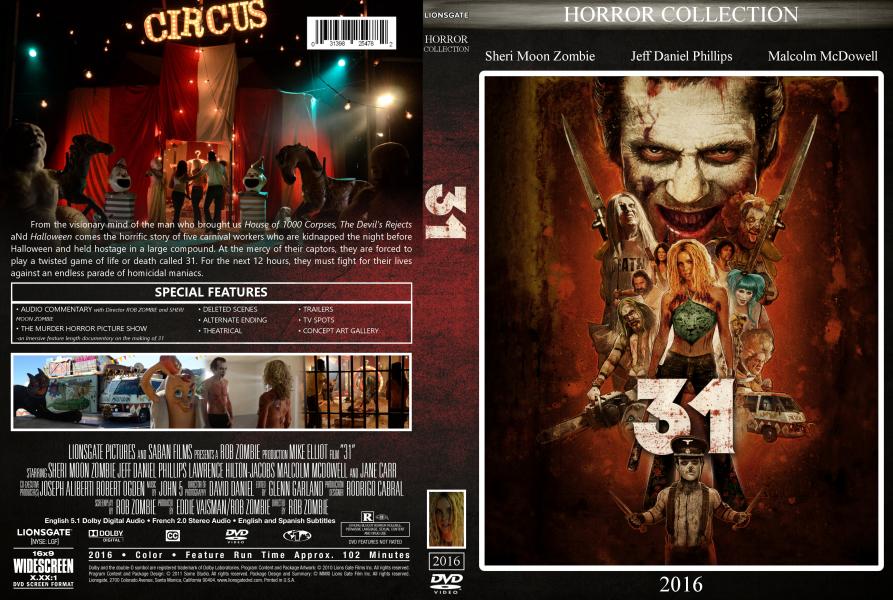
ok hers what i got going now lol
I decided to add a few cast members names on the front the spot seemed like a big blank space. now for the white border on the front I kind of like it because not everything is going to be the same color unless I can find a grunge grey or black texture that will kind of match the metal background under horror collection
Also I added a lil more to the synopsis and the big image on the back I may fade a lil more so its not behind the text as bad This post has been edited by xspankyxduckx: Sep 20 2020, 01:04 AM |
|
|
|
|
|
|
Sep 20 2020, 09:45 AM
Post
#10
|
|
|
Group: Root Admin Posts: 22,895 Coverart: 1,634 Thanks: 52598 From: Home Joined: May 3 2006 My Favorite Cover Designer: All HiRes designers |
I would reduce the weight of the border, to just a few px. Also, as you said, fade the image some more under the synopsis
|
|
|
|
The Following 6 Users Say Thank You To Bazzah For This Post: ctaulbee, joelazza, sauron, Speedz0r, VincentLupo, xspankyxduckx | |
|
Sep 20 2020, 12:56 PM
Post
#11
|
|
 Group: Members Posts: 213 Coverart: 1 Thanks: 814 From: Australia Joined: January 2 2011 My Favorite Cover Designer: Kernie and tmscrapbook |
I'd blend more of the background image behind the text same as what bazzah said
and put the color background the same as whats along the top front so it matches especially if you want genres on the spines. Maybe make the 31 title tad smaller on the spines so it not from 1 side to the other side of the spine. Credit font is alittle uneasy on the eyes to read looks 3D-ish to read. Bring the dotted list of features a tad more down from the top white border. synopsis text is readable. running time,year info bar is readable and clear. 2016 on the front should match the same type of horror collection? Change the grey color behind the horror collection text to a blood effect pattern/same with the spine one horror collection? This post has been edited by joelazza: Sep 20 2020, 12:57 PM  |
|
|
|
The Following 5 Users Say Thank You To joelazza For This Post: Bazzah, ctaulbee, sauron, Speedz0r, VincentLupo | |

|
Sep 20 2020, 02:02 PM
Post
#12
|
|
|
Group: Members Posts: 1,354 Coverart: 840 Thanks: 1331 From: Tulsa, Oklahoma Joined: April 6 2012 |
QUOTE (Bazzah @ Sep 20 2020, 03:45 AM) I would reduce the weight of the border, to just a few px. Also, as you said, fade the image some more under the synopsis Reduce the weight that's a term I've never heard lol. What's that mean? |
|
|
|
|
Sep 20 2020, 02:56 PM
Post
#13
|
|||
  Group: Root Admin Posts: 8,142 Coverart: 2,919 Thanks: 17826 From: The Realm of Nightmares Joined: May 3 2006 |
Make it thinner

          My Gallery • Please leave a like and short comment if you download my work, thanks. • My Criterion Collection |
||
|
|
|
||
The Following 6 Users Say Thank You To ctaulbee For This Post: Bazzah, joelazza, sauron, Speedz0r, VincentLupo, xspankyxduckx | |||
|
Sep 20 2020, 04:46 PM
Post
#14
|
|
|
Group: Members Posts: 1,354 Coverart: 840 Thanks: 1331 From: Tulsa, Oklahoma Joined: April 6 2012 |
QUOTE (ctaulbee @ Sep 20 2020, 08:56 AM) Make it thinner lol thats what I was thinking hahaha. i just dunno all the terms haha |
|
|
|
The Following 5 Users Say Thank You To xspankyxduckx For This Post: Bazzah, ctaulbee, sauron, Speedz0r, VincentLupo | |
|
Sep 21 2020, 08:06 PM
Post
#15
|
|
 Group: Moderator Posts: 12,533 Coverart: 67 Thanks: 20286 From: United Kingdom Joined: May 14 2006 |
Here’s what I think...
|
|
|
|
The Following 4 Users Say Thank You To sauron For This Post: Bazzah, ctaulbee, Speedz0r, VincentLupo | |
|
|
1 User(s) are reading this topic (1 Guests and 0 Anonymous Users)
| 0 Members: | ||||
|
||||
|
|
| The Artwork hosted on this site is for personal use only. We do not condone piracy and we do not supply images for use in any illegal activities, including DVD or Blu-ray piracy. | ||||
| Time is now: 14th October 2025 - 12:42 PM | Gallery Index | Privacy policy | Lo-Fi Version | 
|
Copyright © 2006 - 2025 by HiResCovers.net