Welcome to HiResCovers.NET
|
| |||||||||||||
|
||||||||||||||
|
|
| |||
|
||||
|
| |||||||||||||||||
|
||||||||||||||||||
|
| |||||||||||||||||||||||||
|
||||||||||||||||||||||||||
|
|
| |||
|
||||
 Loading tabs, please wait...
abcdefghijklmnopqrstuvwxyzABCDEFGHIJKLMNOPQRSTUVWXYZ
Welcome Guest, Register to Remove this Message!
|
Welcome to the highest quality Custom DVD, Blu-ray and Ultra-HD 4k cover art, available anywhere in the world. Please register, or log in, to browse our site. • Almost 200,000 300 dpi high quality images • Moderated uploads, to ensure the highest quality possible. • A forum for artwork requests, help designing cover art and much more • If you cannot find the movie you need, simply create a request for it to be created and uploaded to the gallery. • A section of Design Assets, including templates, logos and fonts. |
Guest Message © 2025 Dev Fuse
|
|
 
|
 Jul 5 2018, 11:18 AM Jul 5 2018, 11:18 AM
Post
#1
|
|
|
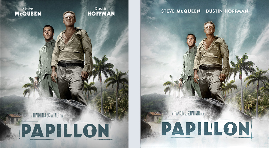
Unfortunately, I didn't finish in time ^^ That's why I decided to start a WIP. This is what I have so far:
 Need to adjust the light effects on Hoffman in order to match it with McQueen. Suggestions welcome |
|
|
|
|
The Following 5 Users Say Thank You To weyn For This Post: chemnitzer, ctaulbee, M0vieM0nster, sauron, VincentLupo | |
 Jul 5 2018, 11:26 AM Jul 5 2018, 11:26 AM
Post
#2
|
|
|
Beautiful start buddy. Such a shame you didn't have time to finish it for the HRC
 |
|
|
|
|
 Jul 5 2018, 05:20 PM Jul 5 2018, 05:20 PM
Post
#3
|
|
|
Really nice work on the front weyn
           My Gallery • Please leave a like and short comment if you download my work, thanks. • My Criterion Collection |
|
|
|
|
 Jul 5 2018, 05:39 PM Jul 5 2018, 05:39 PM
Post
#4
|
|
|
Nice work! Are they standing on a rock?
|
|
|
|
|
 Jul 6 2018, 12:19 PM Jul 6 2018, 12:19 PM
Post
#5
|
|
|
|
|
 Jul 6 2018, 07:32 PM Jul 6 2018, 07:32 PM
Post
#6
|
|
|
This is ridiculously good, and is right up there with Garot's Cover of the Month-winner for Das Boot when it comes to breathing new life into a film with very few available designs.
Whether it's a matter of "zooming out" a tiny bit, moving the crashing wave down a tiny bit, or making the back dirt road a little more saturated to differentiate it from the splash (or decreasing the semi-shadow you have down there so that the water is more white instead of gray?), anything you can do to further define the elements would be icing on the cake of the outstanding scene you've built here. Also, you've got a really nice sky... what if you decrease the size of the stars by about 12%, then let the actors' names be on a single line up top? This could also allow you to move the whole design up a little bit, so that there could be more of the water showing. 
|
|
|
|
|
The Following 6 Users Say Thank You To Bunny Dojo For This Post: Bazzah, ctaulbee, M0vieM0nster, sauron, VincentLupo, weyn | |
 Jul 7 2018, 01:26 AM Jul 7 2018, 01:26 AM
Post
#7
|
|
|
The head of the guy at left look weird except that i really like it ! Good point for BD too !
|
|
|
|
|
 Jul 14 2018, 03:31 PM Jul 14 2018, 03:31 PM
Post
#8
|
|
 Group: Members Posts: 3 Thanks: 14 Joined: April 12 2014 |
I agree with Tim, it's always nice to see new life given to oft overlooked titles. The overall composition is really strong and does an excellent job of emulating both the beauty and the grit of the film. It's one thing to build a great composition; it's another to accurately represent the tone of a film and I think you've succeeded on both counts here.
Looking forward to seeing the finished product. Keep going! |
|
|
|
The Following 4 Users Say Thank You To BluFan1001 For This Post: Bazzah, ctaulbee, sauron, VincentLupo | |
 
|
1 User(s) are reading this topic (1 Guests and 0 Anonymous Users)
| 0 Members: | ||||
|
||||
|
|
| The Artwork hosted on this site is for personal use only. We do not condone piracy and we do not supply images for use in any illegal activities, including DVD or Blu-ray piracy. | ||||
| Time is now: 14th October 2025 - 06:04 PM | Gallery Index | Privacy policy | Lo-Fi Version | 
|
Copyright © 2006 - 2025 by HiResCovers.net


