


Welcome to HiResCovers.NET
|
| |||||||||||||
|
||||||||||||||
|
|
| |||
|
||||
|
| |||||||||||||||||
|
||||||||||||||||||
|
| |||||||||||||||||||||||||
|
||||||||||||||||||||||||||
|
|
| |||
|
||||
 Loading tabs, please wait...
abcdefghijklmnopqrstuvwxyzABCDEFGHIJKLMNOPQRSTUVWXYZ
|
|

Welcome Guest, Register to Remove this Message!
|
Welcome to the highest quality Custom DVD, Blu-ray and Ultra-HD 4k cover art, available anywhere in the world. Please register, or log in, to browse our site. • Almost 200,000 300 dpi high quality images • Moderated uploads, to ensure the highest quality possible. • A forum for artwork requests, help designing cover art and much more • If you cannot find the movie you need, simply create a request for it to be created and uploaded to the gallery. • A section of Design Assets, including templates, logos and fonts. |
Guest Message © 2025 Dev Fuse

 
|

 Aug 11 2018, 04:54 PM Aug 11 2018, 04:54 PM
Post
#1
|
|
  Group: Cover Designer Posts: 13,830 Coverart: 564 Thanks: 12364 From: Denmark Joined: August 16 2007 My Favorite Custom Cover: To have and have not My Favorite Cover Designer: Tim Gengler |
Thought I'd start something for this title.
Still a long way to go; characters to cut out, and placements and so on. 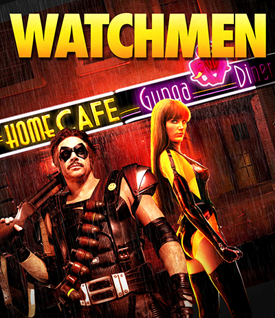  A designer knows he has achieved perfection - not when there's nothing left to add - but when there's nothing left to take away - Antoine de Saint Exupéry |
   |
 
|


|
Aug 11 2018, 05:16 PM
Post
#2
|
|||
   Group: Root Admin Posts: 8,142 Coverart: 2,919 Thanks: 17826 From: The Realm of Nightmares Joined: May 3 2006 |
Good start buddy, great to see you dusting off the old Wacom...

          My Gallery • Please leave a like and short comment if you download my work, thanks. • My Criterion Collection |
||
|
|
|
||

|
Aug 11 2018, 07:21 PM
Post
#3
|
|
 Group: Root Admin Posts: 22,895 Coverart: 1,634 Thanks: 52605 From: Home Joined: May 3 2006 My Favorite Cover Designer: All HiRes designers |
Great start buddy!
    |
|
|
|

|
Aug 12 2018, 07:44 AM
Post
#4
|
|
  Group: Moderator Posts: 5,702 Coverart: 240 Thanks: 22382 From: Norway Joined: June 24 2006 |
I like it a lot so far, but atm I do think the girl is a bit too yellow. I know he's further in front, but I still think the guy should be moved higher up. One last thing, maybe make the TT a little smaller, move it down just a little bit so you can have actor names on top (if you want to add them). Great to see you back in action and looking forward to see where you'll take this one

 Please keep my covers on this site and this site only! |
|
|
|
|
Aug 12 2018, 11:44 AM
Post
#5
|
|
 Group: Moderator Posts: 12,533 Coverart: 67 Thanks: 20287 From: United Kingdom Joined: May 14 2006 |
Nice start so far and good to see you've not gone down the blue colour route like a lot of the other covers.
|
|
|
|
The Following 4 Users Say Thank You To sauron For This Post: Bazzah, ctaulbee, Speedz0r, VincentLupo | |
|
Aug 12 2018, 07:32 PM
Post
#6
|
|
|
Group: Cover Designer Posts: 13,830 Coverart: 564 Thanks: 12364 From: Denmark Joined: August 16 2007 My Favorite Custom Cover: To have and have not My Favorite Cover Designer: Tim Gengler |
QUOTE (Speedz0r @ Aug 12 2018, 09:44 AM)  I like it a lot so far, but atm I do think the girl is a bit too yellow. I know he's further in front, but I still think the guy should be moved higher up. One last thing, maybe make the TT a little smaller, move it down just a little bit so you can have actor names on top (if you want to add them). Great to see you back in action and looking forward to see where you'll take this one Placement and individual coloring and so on ain't at all final. Still cutting out the pieces... QUOTE (sauron @ Aug 12 2018, 01:44 PM) Nice start so far and good to see you've not gone down the blue colour route like a lot of the other covers. Yea, thought I'd try something else than what's been done a million times before. Background is actually from the game, but the 'Gunga Diner' sign with logo and names was cut from a set piece image I had. Added light glow to the neon signs. Managed to add the Re-elect Nixon poster in the background, also featured in the comic book. A few more characters cut out. New heads on Ozymandias and Nite Owl. Still tinkering with the placements and coloring. Not satisfied with placement and pose of Dr. Manhattan, but have no better images/poses of him. I feel he should be on the front somehow, just not sure at the moment. Will see where this leads me. 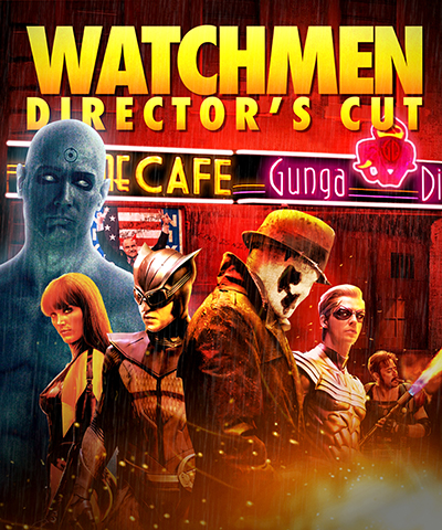 This post has been edited by JollyRoger: Aug 12 2018, 08:45 PM A designer knows he has achieved perfection - not when there's nothing left to add - but when there's nothing left to take away - Antoine de Saint Exupéry |
|
|
|
|
Aug 12 2018, 07:53 PM
Post
#7
|
|
|
Group: Root Admin Posts: 22,895 Coverart: 1,634 Thanks: 52605 From: Home Joined: May 3 2006 My Favorite Cover Designer: All HiRes designers |
Would Dr Manhattan be better in the middle?
|
|
|
|
|
Aug 12 2018, 08:27 PM
Post
#8
|
|
|
Group: Cover Designer Posts: 13,830 Coverart: 564 Thanks: 12364 From: Denmark Joined: August 16 2007 My Favorite Custom Cover: To have and have not My Favorite Cover Designer: Tim Gengler |
Something like this perhaps?
 QUOTE (Speedz0r @ Aug 12 2018, 09:44 AM) maybe make the TT a little smaller, move it down just a little bit so you can have actor names on top (if you want to add them). Great to see you back in action and looking forward to see where you'll take this one BTW not planning on adding actor's names, no names on the retail packaging either. Not really needed after all. Still debating whether or not to add the retail tagline 'Who will save us now?' at the bottom of the front. Also added the 'No More Masks' promotional teaser poster to the background. still need some work to properly do the trick, but all in good time... This post has been edited by JollyRoger: Aug 12 2018, 08:30 PM A designer knows he has achieved perfection - not when there's nothing left to add - but when there's nothing left to take away - Antoine de Saint Exupéry |
|
|
|
|
Aug 12 2018, 08:37 PM
Post
#9
|
|
|
Group: Root Admin Posts: 22,895 Coverart: 1,634 Thanks: 52605 From: Home Joined: May 3 2006 My Favorite Cover Designer: All HiRes designers |
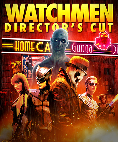
Yeah that's better. And how about the guy on the right being bigger, to balance it out?
|
|
|
|
|
Aug 12 2018, 08:51 PM
Post
#10
|
|
|
Group: Cover Designer Posts: 13,830 Coverart: 564 Thanks: 12364 From: Denmark Joined: August 16 2007 My Favorite Custom Cover: To have and have not My Favorite Cover Designer: Tim Gengler |
Like so.
A designer knows he has achieved perfection - not when there's nothing left to add - but when there's nothing left to take away - Antoine de Saint Exupéry |
|
|
|
|
Aug 12 2018, 09:14 PM
Post
#11
|
|
|
Group: Root Admin Posts: 22,895 Coverart: 1,634 Thanks: 52605 From: Home Joined: May 3 2006 My Favorite Cover Designer: All HiRes designers |
Yeah, that's better
|
|
|
|
|
Aug 12 2018, 11:30 PM
Post
#12
|
||
   Group: Master Designer Posts: 2,666 Coverart: 546 Thanks: 7138 Joined: July 22 2008 |
Wow, this got really good really quickly!
Depending on whether you add other elements or not, what if you were to mimic the yellow-on-black banner from the graphic novel for the title? That way, you can pretty much make the rest of the cover as powerful as you want without worrying about the title getting lost (for instance, the fire on the bottom probably wouldn't have fade to darkness, unless you end up really wanting the tagline down there). 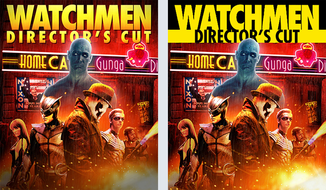
|
|
|
|
|
|
The Following 4 Users Say Thank You To Bunny Dojo For This Post: Bazzah, ctaulbee, JollyRoger, VincentLupo | ||
|
Aug 13 2018, 05:28 AM
Post
#13
|
|
|
Group: Cover Designer Posts: 13,830 Coverart: 564 Thanks: 12364 From: Denmark Joined: August 16 2007 My Favorite Custom Cover: To have and have not My Favorite Cover Designer: Tim Gengler |
Thanks a lot, Tim! I'll probably end up not adding the tagline. As You said it would look weird having to fade out the light from the fire at the bottom. Also it would cover up that very nice bottom of Silk Spectre (hubs huba), hehe. I'll most likely add the tagline to the back somewhere.
Not so keen on the yellow/black banner, actually kinda like my own version, but thanks for the illustration, which makes my choice a lot easier. On a separate note, I'm looking for some water/rain drop splashes to add to the characters. If anyone have some w transparent background, I'd be happy. Please send me a pm, or simply add them, to the resources part of the gallery, thanks in advance! This post has been edited by JollyRoger: Aug 13 2018, 05:29 AM A designer knows he has achieved perfection - not when there's nothing left to add - but when there's nothing left to take away - Antoine de Saint Exupéry |
|
|
|
|
Aug 13 2018, 09:52 AM
Post
#14
|
|
|
Group: Root Admin Posts: 22,895 Coverart: 1,634 Thanks: 52605 From: Home Joined: May 3 2006 My Favorite Cover Designer: All HiRes designers |
I really like Tim's TT design
 See if any of these water splashes help you buddy http://www.hirescovers.net/forum/index.php...l&f_id=1830 |
|
|
|
|
Aug 13 2018, 10:17 AM
Post
#15
|
|
|
Group: Moderator Posts: 5,702 Coverart: 240 Thanks: 22382 From: Norway Joined: June 24 2006 |
Looks a lot better now, altho wouldn't mind seeing more of Silk Spectre
 . Color wise I like Bunny Dojo's example best, but I like your TT better then the simple black and yellow. You don't wanna use a brush? I got rons wings of water and rons splashes. . Color wise I like Bunny Dojo's example best, but I like your TT better then the simple black and yellow. You don't wanna use a brush? I got rons wings of water and rons splashes.
Please keep my covers on this site and this site only! |
|
|
|
The Following 4 Users Say Thank You To Speedz0r For This Post: Bazzah, ctaulbee, JollyRoger, VincentLupo | |
|
Aug 13 2018, 10:57 AM
Post
#16
|
|
|
Group: Cover Designer Posts: 13,830 Coverart: 564 Thanks: 12364 From: Denmark Joined: August 16 2007 My Favorite Custom Cover: To have and have not My Favorite Cover Designer: Tim Gengler |
QUOTE (Speedz0r @ Aug 13 2018, 12:17 PM) Looks a lot better now, altho wouldn't mind seeing more of Silk Spectre . Color wise I like Bunny Dojo's example best, but I like your TT better then the simple black and yellow. You don't wanna use a brush? I got rons wings of water and rons splashes.I'll take those too, thanks A designer knows he has achieved perfection - not when there's nothing left to add - but when there's nothing left to take away - Antoine de Saint Exupéry |
|
|
|
|
Aug 13 2018, 12:45 PM
Post
#17
|
|
|
Group: Moderator Posts: 5,702 Coverart: 240 Thanks: 22382 From: Norway Joined: June 24 2006 |
Great resources Baz. I ran into some issues uploading them to the MD Designer Assets, but hoping it will be sorted quickly. Anyways, you can find them there. I'm uploading in total 5 different brush sets so you know when they all have been added.
Please keep my covers on this site and this site only! |
|
|
|
The Following 4 Users Say Thank You To Speedz0r For This Post: Bazzah, ctaulbee, JollyRoger, VincentLupo | |
|
Aug 13 2018, 04:23 PM
Post
#18
|
|
|
Group: Cover Designer Posts: 13,830 Coverart: 564 Thanks: 12364 From: Denmark Joined: August 16 2007 My Favorite Custom Cover: To have and have not My Favorite Cover Designer: Tim Gengler |
Thanks for the resources, guys.
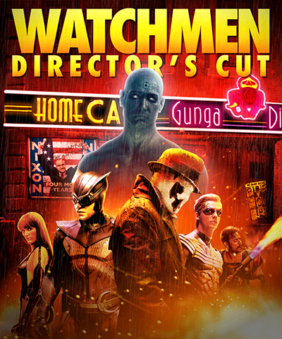
Here's a wet update withsome minor changes. Turned Rorschach around, moved the front characters down a tad, fixed the blue color of Dr. Manhattan, added water and splashes, fixed the top background, and the light at the bottom. How's this looking? 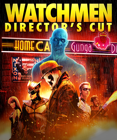 :EDIT: still seem to have a minor darkening at the very bottom. Must be a layer I forgot to turn off. Will fix that. This post has been edited by JollyRoger: Aug 13 2018, 04:28 PM A designer knows he has achieved perfection - not when there's nothing left to add - but when there's nothing left to take away - Antoine de Saint Exupéry |
|
|
|
The Following 4 Users Say Thank You To JollyRoger For This Post: Bazzah, ctaulbee, Speedz0r, VincentLupo | |
|
Aug 13 2018, 05:34 PM
Post
#19
|
|
|
Group: Moderator Posts: 5,702 Coverart: 240 Thanks: 22382 From: Norway Joined: June 24 2006 |
Looks good JR. Hard to tell about the rain splashes and so on, but you should add some dripping raindrops on his hat at least as well as on the two characters on the left.
Please keep my covers on this site and this site only! |
|
|
|
|
Aug 13 2018, 05:43 PM
Post
#20
|
|
|
Group: Root Admin Posts: 22,895 Coverart: 1,634 Thanks: 52605 From: Home Joined: May 3 2006 My Favorite Cover Designer: All HiRes designers |
Do you think the front characters are a little too orange?
|
|
|
|
|
|
1 User(s) are reading this topic (1 Guests and 0 Anonymous Users)
| 0 Members: | ||||
|
||||
|
|
| The Artwork hosted on this site is for personal use only. We do not condone piracy and we do not supply images for use in any illegal activities, including DVD or Blu-ray piracy. | ||||
| Time is now: 14th October 2025 - 10:40 PM | Gallery Index | Privacy policy | Lo-Fi Version | 
|
Copyright © 2006 - 2025 by HiResCovers.net