Welcome to HiResCovers.NET
|
| |||||||||||||
|
||||||||||||||
|
|
| |||
|
||||
|
| |||||||||||||||||
|
||||||||||||||||||
|
| |||||||||||||||||||||||||
|
||||||||||||||||||||||||||
|
|
| |||
|
||||
 Loading tabs, please wait...
abcdefghijklmnopqrstuvwxyzABCDEFGHIJKLMNOPQRSTUVWXYZ
Welcome Guest, Register to Remove this Message!
|
Welcome to the highest quality Custom DVD, Blu-ray and Ultra-HD 4k cover art, available anywhere in the world. Please register, or log in, to browse our site. • Almost 200,000 300 dpi high quality images • Moderated uploads, to ensure the highest quality possible. • A forum for artwork requests, help designing cover art and much more • If you cannot find the movie you need, simply create a request for it to be created and uploaded to the gallery. • A section of Design Assets, including templates, logos and fonts. |
Guest Message © 2025 Dev Fuse
 
|
 Feb 26 2018, 08:39 PM Feb 26 2018, 08:39 PM
Post
#41
|
|
|
Great work so far! Love the blue glow on the characters on the right one
  Please keep my covers on this site and this site only! |
|
|
|
|
The Following 4 Users Say Thank You To Speedz0r For This Post: Bazzah, ctaulbee, Matush, VincentLupo | |
 Feb 26 2018, 08:54 PM Feb 26 2018, 08:54 PM
Post
#42
|
|
|
Great work for me m8, I can not wait to finish. I have no suggestion at this moment sorry
 |
|
|
|
|
 Feb 26 2018, 08:57 PM Feb 26 2018, 08:57 PM
Post
#43
|
|
|
Where the blue light is coming from? Really impressive work so far
This post has been edited by M0vieM0nster: Feb 26 2018, 09:04 PM |
|
|
|
|
The Following 4 Users Say Thank You To M0vieM0nster For This Post: Bazzah, ctaulbee, Matush, VincentLupo | |
 Feb 26 2018, 09:26 PM Feb 26 2018, 09:26 PM
Post
#44
|
|
|
Thanks, all!
The blue light is needed to add cool/warm contrast. Without it, the composition would be as appealing? And thanks, Movie! I'll def add the Star Wars title about the current TT to match the retail  My gallery: HERE
|
|
|
|
|
 Feb 26 2018, 10:21 PM Feb 26 2018, 10:21 PM
Post
#45
|
|
|
Some subtle stars outside the frame?
|
|
|
|
|
The Following 4 Users Say Thank You To M0vieM0nster For This Post: Bazzah, ctaulbee, Matush, VincentLupo | |
 Feb 26 2018, 11:15 PM Feb 26 2018, 11:15 PM
Post
#46
|
|
|
It's still feeling a little "photoshoppy" so I was wondering if anyone could help me point out why Exciting work, Paris! Nothing jumps out as needing to be changed, but here are a bunch of small "maybes" for potential adjustments to see if they help: Could it be a matter of the lighting? Mark Hamill and Darth Vader look very close to the desired effect, but Carrie Fisher is a bit flatly lit (like a regular photo, rather than an "epic" portrait). On the right, too, the buildings are a bit flat (otherwise, the right side of the cover is darn-outstanding). Likewise, maybe tighten up the color palette even a tiny bit further, to get the green out of Carrie Fisher's top? Along with the overall outline glow, it seems like Sturzan enjoys adding little bursts of light; maybe some additional small pings would further enhance your effect? For the background treeline, perhaps add a very slight gradient lightning the bottom? It might be worth playing with the black hues under Selective Color to give the darkness a slight blue-purple tint? Also, the title treatment is almost definitely contributing to the "photoshoppy" feeling you mentioned. I think you need to work your magic there -- either in losing the perspective, changing from plain white text, or adding some sort of interaction with the composition. I hope something in there is helpful and look forward to seeing where you head with this one and the series as a whole 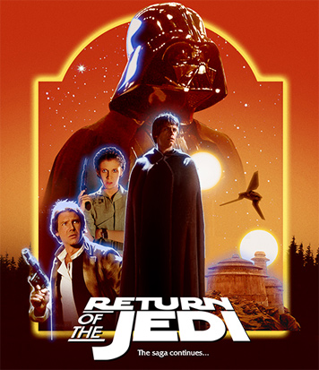 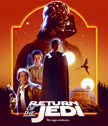
|
|
|
|
|
The Following 9 Users Say Thank You To Bunny Dojo For This Post: Bazzah, Bozzy, ctaulbee, M0vieM0nster, Matush, Paris, sauron, Speedz0r, VincentLupo | |
 Feb 27 2018, 10:21 AM Feb 27 2018, 10:21 AM
Post
#47
|
|
|
Beautiful work, but... I too find the blue glow a little unnatural. Also, it feels a little off-balance with so many characters on the left side?
 |
|
|
|
|
 Feb 27 2018, 09:22 PM Feb 27 2018, 09:22 PM
Post
#48
|
|
|
Thanks again, Bunny! I played with your suggestions and they really helped!. And I tried better integrating the TT by adding color unity to the composition and having it better echo the composition structure.
Thanks for the feedback, Bazz! I think I'm going to stick with the blue because of the color contrast. And I went back and forth on the layout weight because I was also unsure about it. But I then added the dark shuttle against the bright sky and thought it provided the needed balance? (IV included for continuity ref. I'll add white rim lights soon as well as other additions) 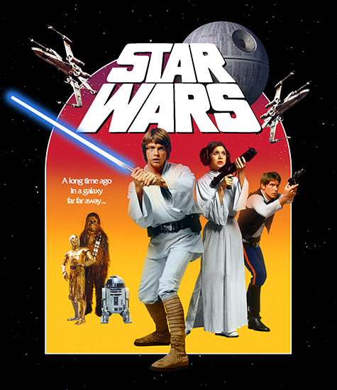 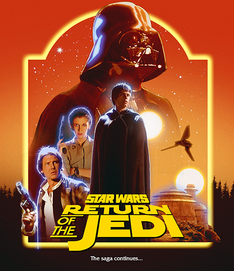
 My gallery: HERE
|
|
|
|
|
The Following 5 Users Say Thank You To Paris For This Post: Bazzah, ctaulbee, M0vieM0nster, Matush, VincentLupo | |
 Feb 28 2018, 12:06 PM Feb 28 2018, 12:06 PM
Post
#49
|
|
|
I like what you've done, grat layout and choice of images. I don't think it's off-balance as well with the buildings and the shuttle.
But I agree abut the blue glow. In my opinion it's not fitting the warm colors and most important the blue glow around characters in Star Wars stands for the force ghosts. Of course not the same color but very similar. And neither of them is a force ghost in Episode VI. ^^ Han's hand holding the gun isn't working for me as well. Somehow it's obvious looking fake. It's too big I think and should be placed higher.  |
|
|
|
|
 Feb 28 2018, 12:34 PM Feb 28 2018, 12:34 PM
Post
#50
|
|
|
Thanks for the note on Han's hand placement. The image isn't cut out and no color matching has been done on his arm.
I started on Empire and I have a better idea on where I want the series to go. And VI is staring to look like an a little too complex... I'll walk IV closer is Struzan style and that should hopefully make these feel closer. And I'll add more elements to the bottom of Empire to make it a more pleasing composition. (Sorry guy, I think that one might have blue outlines too 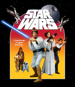 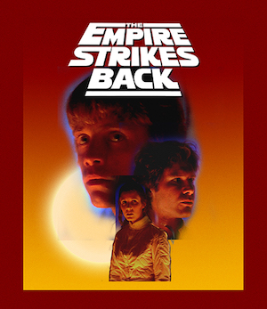 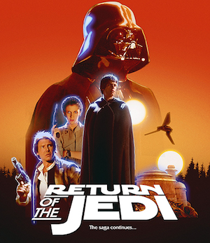 This post has been edited by Paris: Feb 28 2018, 08:16 PM  My gallery: HERE
|
|
|
|
|
The Following 5 Users Say Thank You To Paris For This Post: Bazzah, ctaulbee, M0vieM0nster, Matush, VincentLupo | |
 Feb 28 2018, 01:00 PM Feb 28 2018, 01:00 PM
Post
#51
|
|
|
These are looking like they are going to be an excellent set
 |
|
|
|
|
 Feb 28 2018, 07:33 PM Feb 28 2018, 07:33 PM
Post
#52
|
|
|
Thanks, Bazz!
I'm going to tweak Jedi to make it more like a montage with a better hierarchy. The good thing about this cover set is that I'm learning more about montage as I go along, but that's also the bad part haha.  My gallery: HERE
|
|
|
|
|
The Following 6 Users Say Thank You To Paris For This Post: Bazzah, ctaulbee, M0vieM0nster, Matush, sauron, VincentLupo | |
 Feb 28 2018, 09:35 PM Feb 28 2018, 09:35 PM
Post
#53
|
|
|
I need a greater contrast in character sizes for Jedi
 My gallery: HERE
|
|
|
|
|
 May 6 2018, 07:10 PM May 6 2018, 07:10 PM
Post
#54
|
|
|
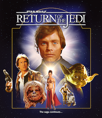
A rough new direction. I haven't focused on hair, color or edges until I have a final direction, but this is close.
I'm trying to get these two covers to live in the same world and feel like a set. Princess Leia isn't integrated with color or lighting so she feels a little "photoshopy". Adding light wrap or rim light to her head will help her sit in a little better. It's a very fine line between plausible Star Wars retail montage and fan art , so this one has been tough to get right. Luke and Yoda are in the direction I want to go: • basic, dramatic lighting with no lighting effects • lifted black levels • detail in dark areas • hires, sharpened images to give the feeling of it being painted 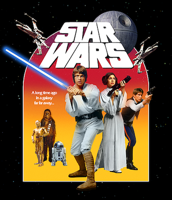 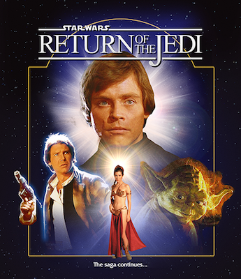
 My gallery: HERE
|
|
|
|
|
 May 6 2018, 07:19 PM May 6 2018, 07:19 PM
Post
#55
|
|||
|
I also tried a technique I think will be my new "go-to" for improving lighting. Adding lighting is not difficult, except hair. Light interacts differently with hair making it hard to paint light on someone's hair convincingly. So I pasted Luke's rim lighting from image 1 to image 2 for the cover
This post has been edited by Paris: May 6 2018, 07:20 PM  My gallery: HERE
|
|||
|
|
|||
 May 6 2018, 07:25 PM May 6 2018, 07:25 PM
Post
#56
|
|
|
I like where this is going. How about having both of the frames the same?
 |
|
|
|
|
 May 6 2018, 09:14 PM May 6 2018, 09:14 PM
Post
#57
|
|
|
Thanks, I'll look into that!
Update with better integration. Yoda is not fitting in at the moment  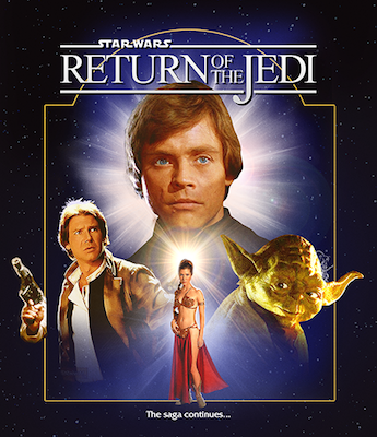 This post has been edited by Paris: May 6 2018, 09:25 PM  My gallery: HERE
|
|
|
|
|
 May 6 2018, 10:25 PM May 6 2018, 10:25 PM
Post
#58
|
|
|
more character blocking. For the top half, I'll add some ships or Struzan shooting stars
  This post has been edited by Paris: May 6 2018, 10:30 PM  My gallery: HERE
|
|
|
|
|
The Following 5 Users Say Thank You To Paris For This Post: Bazzah, ctaulbee, Matush, Speedz0r, VincentLupo | |
 May 7 2018, 10:13 AM May 7 2018, 10:13 AM
Post
#59
|
|
|
Neat idea for the hair! As you said, hair lighting is very difficult because technically you would have to break it down to lighting single hairs.
This post has been edited by weyn: May 7 2018, 10:25 AM |
|
|
|
|
 Oct 4 2018, 09:45 AM Oct 4 2018, 09:45 AM
Post
#60
|
|
|
After Spy, I went back to studying Struzan to get a better sense of what makes a good montage and what makes his work unique.
http://www.drewstruzan.com/illustrated/portfolio/?type=mp I came away with some new insights: - keep dark values light - keep light values dark - lean towards desaturated not vibrant - use "light wrap" from the background color if brighter than character - mix positive space with negative space Still rough. There's a lot of in progress assets. I have to make parts of the image more painterly and Luke's body (a painting from a trading card) more realistic. New version: 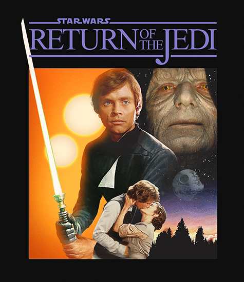 edit: deleted older image because it was confused as the new version. This post has been edited by Paris: Oct 4 2018, 02:54 PM  My gallery: HERE
|
|
|
|
|
The Following 8 Users Say Thank You To Paris For This Post: Bazzah, ctaulbee, JollyRoger, M0vieM0nster, M0vieM0nster, Matush, sauron, VincentLupo | |
 
|
1 User(s) are reading this topic (1 Guests and 0 Anonymous Users)
| 0 Members: | ||||
|
||||
|
|
| The Artwork hosted on this site is for personal use only. We do not condone piracy and we do not supply images for use in any illegal activities, including DVD or Blu-ray piracy. | ||||
| Time is now: 13th October 2025 - 06:08 PM | Gallery Index | Privacy policy | Lo-Fi Version | 
|
Copyright © 2006 - 2025 by HiResCovers.net


