


Welcome to HiResCovers.NET
|
| |||||||||||||
|
||||||||||||||
|
|
| |||
|
||||
|
| |||||||||||||||||
|
||||||||||||||||||
|
| |||||||||||||||||||||||||
|
||||||||||||||||||||||||||
|
|
| |||
|
||||
 Loading tabs, please wait...
abcdefghijklmnopqrstuvwxyzABCDEFGHIJKLMNOPQRSTUVWXYZ
|
|

Welcome Guest, Register to Remove this Message!
|
Welcome to the highest quality Custom DVD, Blu-ray and Ultra-HD 4k cover art, available anywhere in the world. Please register, or log in, to browse our site. • Almost 200,000 300 dpi high quality images • Moderated uploads, to ensure the highest quality possible. • A forum for artwork requests, help designing cover art and much more • If you cannot find the movie you need, simply create a request for it to be created and uploaded to the gallery. • A section of Design Assets, including templates, logos and fonts. |
Guest Message © 2025 Dev Fuse

 
|

 Oct 24 2018, 09:57 PM Oct 24 2018, 09:57 PM
Post
#41
|
|
 Group: Members Posts: 875 Coverart: 751 Thanks: 782 Joined: January 27 2018 |
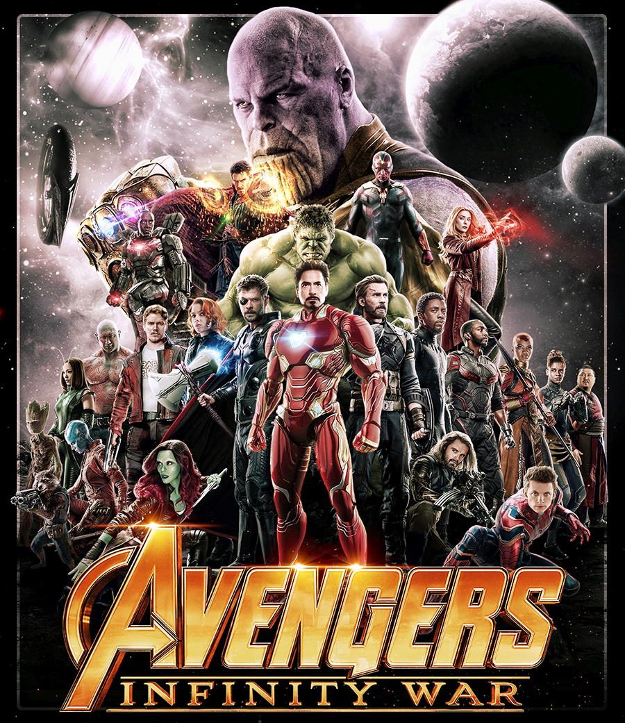
If it were up to me,... and it isn't... I would move Dr Strange a little down and to the left on the front cover, so that the energy circle around his left hand doesn't overlap Thanos' chin so much. Just looks a little too close to my eye. Damn fine, though, overall.
|
   |
 
|


|
Oct 24 2018, 10:19 PM
Post
#42
|
|
 Group: Members Posts: 260 Coverart: 60 Thanks: 123 From: Finland Joined: December 26 2006 |
QUOTE (RobertM53 @ Oct 25 2018, 01:57 AM)  If it were up to me,... and it isn't... I would move Dr Strange a little down and to the left on the front cover, so that the energy circle around his left hand doesn't overlap Thanos' chin so much. Just looks a little too close to my eye. Damn fine, though, overall. Just what i was thinking, and great start on the back 
|
|
|
|


|
Oct 25 2018, 03:11 PM
Post
#43
|
|
  Group: Root Admin Posts: 22,895 Coverart: 1,634 Thanks: 52605 From: Home Joined: May 3 2006 My Favorite Cover Designer: All HiRes designers |
Thanks all
I have moved Strange, so he stands out a bit more. How about a much heavier purple on the front characters? 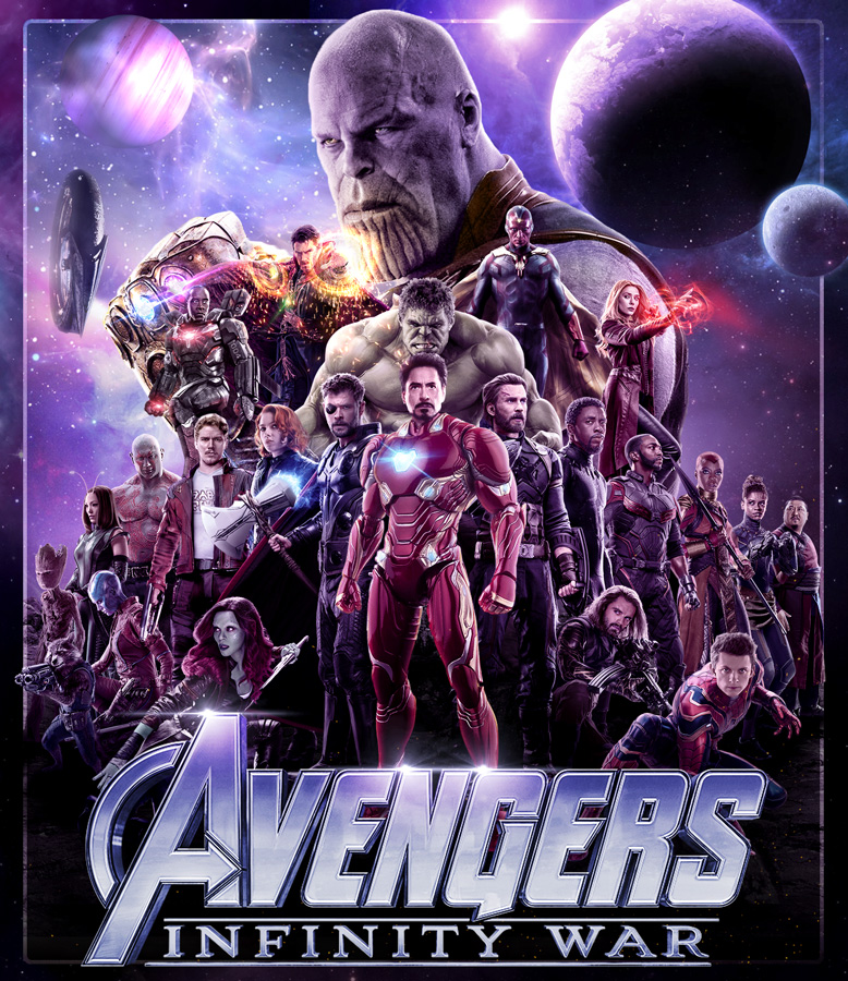 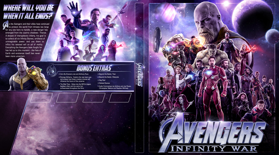
     |
|
|
|
|
Oct 25 2018, 05:23 PM
Post
#44
|
||
   Group: Master Designer Posts: 2,666 Coverart: 546 Thanks: 7138 Joined: July 22 2008 |
QUOTE (Bazzah @ Oct 25 2018, 11:11 AM) How about a much heavier purple on the front characters? Your previous one probably looked even better (the most recent one before the heavy purple, Post #33). I'd go with that one, or maybe individually overlay a little purple light on areas each character (so that the skintones don't get too effected and you don't end up with a gray Hulk, etc.)? Also, maybe more of a silver title, just to add a little bit more contrast? (A label using that back montage is all but guaranteed to win you Label of the Month.  ) )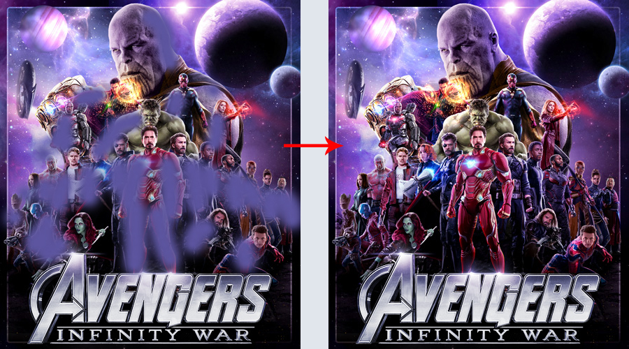 This post has been edited by Bunny Dojo: Oct 25 2018, 06:11 PM |
|
|
|
|
|
|
Oct 25 2018, 06:40 PM
Post
#45
|
|
|
Group: Root Admin Posts: 22,895 Coverart: 1,634 Thanks: 52605 From: Home Joined: May 3 2006 My Favorite Cover Designer: All HiRes designers |
Thanks Tim
I will look at doing that
|
|
|
|
|
Oct 26 2018, 02:10 AM
Post
#46
|
|
  Group: Contributor Posts: 3,491 Coverart: 136 Thanks: 5254 From: United Kingdom Joined: May 22 2006 |
I think it's shaping up to be your finest cover so far imo, the only suggestions i have might be darkening hulk slightly at his core... as the light source is behind but not much obviously, maybe think about the spine TT so its a bit bigger and easier to see? The only other nit pick would be to try and match the fonts a little more, take the E and S from the TT for the quote etc? but brilliant stuff so far Baz
|
|
|
|
|
Oct 26 2018, 11:01 AM
Post
#47
|
|
|
Group: Root Admin Posts: 22,895 Coverart: 1,634 Thanks: 52605 From: Home Joined: May 3 2006 My Favorite Cover Designer: All HiRes designers |
Thank you MM. I have darkened Hulk's front a little, and added some more shadows/highlights on the characters. I will have a look at the font, but it may be a little tricky to change them.
With bunny's tips, this is how the front looks. 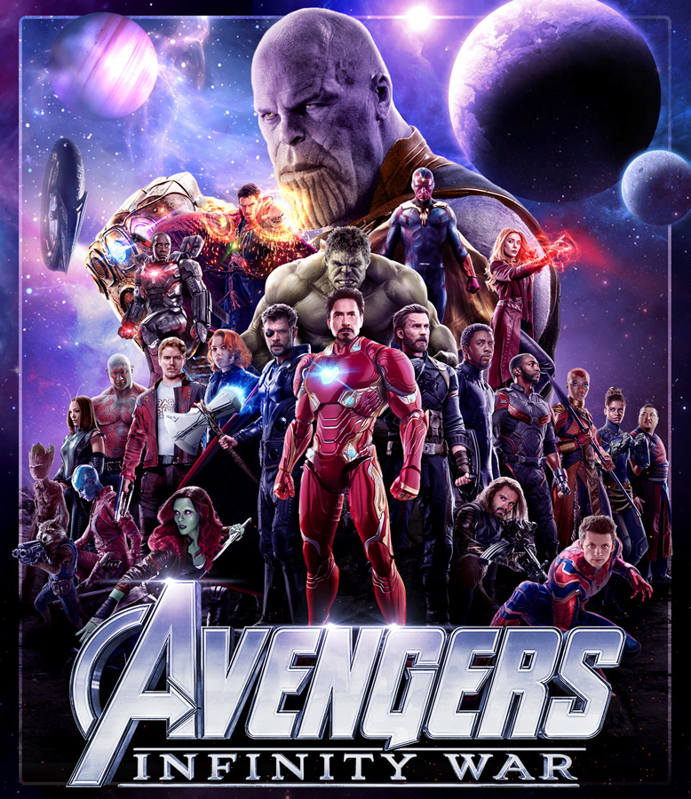
|
|
|
|
|
Oct 26 2018, 01:22 PM
Post
#48
|
|
  Group: Moderator Posts: 5,702 Coverart: 240 Thanks: 22382 From: Norway Joined: June 24 2006 |
I think it's looking very good boss
 Please keep my covers on this site and this site only! |
|
|
|
|
Oct 26 2018, 02:25 PM
Post
#49
|
||||
 Group: Master Designer Posts: 3,060 Coverart: 404 Thanks: 8528 From: Germany Joined: June 13 2013 My Favorite Custom Cover: van Helsing by Bunny Dojo |
Just another idea with more warm colors (to maybe fit the movie's sceneries some more)?
|
|||
|
|
|
|||
The Following 4 Users Say Thank You To Fidi For This Post: Bazzah, ctaulbee, M0vieM0nster, VincentLupo | ||||

|
Oct 26 2018, 02:43 PM
Post
#50
|
|
|
Group: Root Admin Posts: 22,895 Coverart: 1,634 Thanks: 52605 From: Home Joined: May 3 2006 My Favorite Cover Designer: All HiRes designers |
Thanks guys. That looks awesome Fidi
|
|
|
|
|
Oct 26 2018, 04:28 PM
Post
#51
|
|
  Group: Cover Designer Posts: 13,830 Coverart: 564 Thanks: 12364 From: Denmark Joined: August 16 2007 My Favorite Custom Cover: To have and have not My Favorite Cover Designer: Tim Gengler |
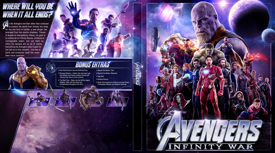
On the back montage, I think Falcon would look better on the opposite side, left of Dr. Strange
A designer knows he has achieved perfection - not when there's nothing left to add - but when there's nothing left to take away - Antoine de Saint Exupéry |
|
|
|

|
Oct 26 2018, 04:28 PM
Post
#52
|
|
|
Group: Cover Designer Posts: 13,830 Coverart: 564 Thanks: 12364 From: Denmark Joined: August 16 2007 My Favorite Custom Cover: To have and have not My Favorite Cover Designer: Tim Gengler |
Updated front looks awesome by the way...

A designer knows he has achieved perfection - not when there's nothing left to add - but when there's nothing left to take away - Antoine de Saint Exupéry |
|
|
|
|
Oct 26 2018, 04:46 PM
Post
#53
|
|
|
Group: Root Admin Posts: 22,895 Coverart: 1,634 Thanks: 52605 From: Home Joined: May 3 2006 My Favorite Cover Designer: All HiRes designers |
Thanks Jrrr. But why move Falcon to the other site? He's filling a hole where he is
|
|
|
|
|
Oct 26 2018, 05:04 PM
Post
#54
|
|
|
Group: Cover Designer Posts: 13,830 Coverart: 564 Thanks: 12364 From: Denmark Joined: August 16 2007 My Favorite Custom Cover: To have and have not My Favorite Cover Designer: Tim Gengler |
Looks like he's falling into the pool of characters. Moving him to the other side would make him sweep out from behind them, if you understand what I'm getting at. You want your imagery to pop, not implode.
You have room enough to nudge the cluster of characters to the right, and then have Falcon sweeping out on their left side, perhaps even with a slight 3d effect, if he extends into the text area to the far left. This post has been edited by JollyRoger: Oct 26 2018, 05:06 PM A designer knows he has achieved perfection - not when there's nothing left to add - but when there's nothing left to take away - Antoine de Saint Exupéry |
|
|
|
|
Oct 26 2018, 05:13 PM
Post
#55
|
|
|
Group: Moderator Posts: 5,702 Coverart: 240 Thanks: 22382 From: Norway Joined: June 24 2006 |
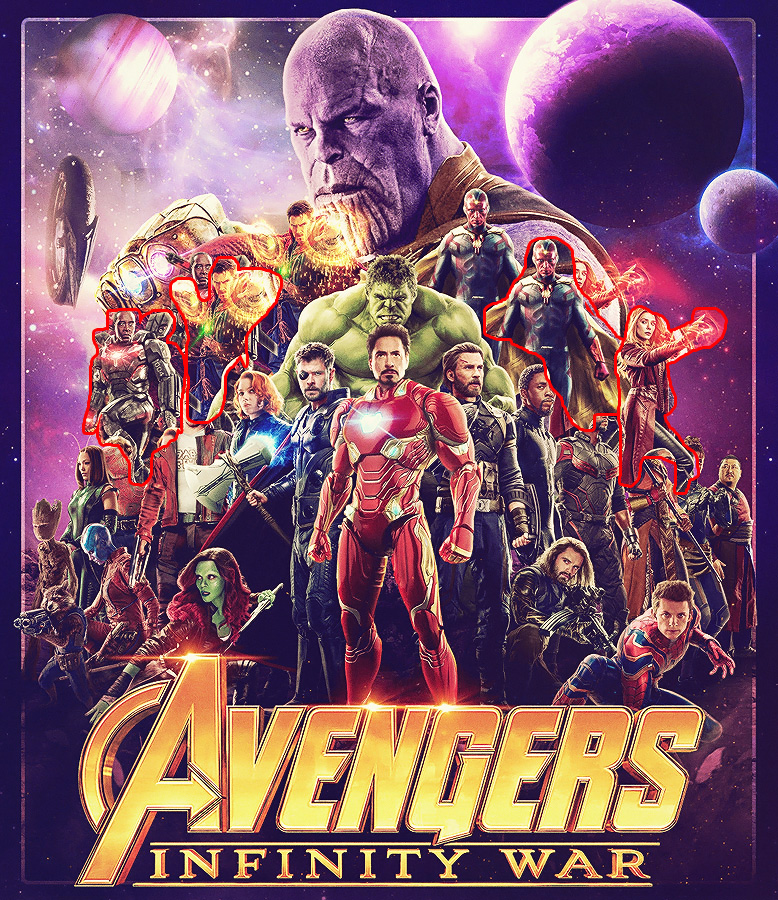
Sorry for the crazy bad mock up, but what about moving the marked characters more to the sides, to free up some more space for Thanos?
Please keep my covers on this site and this site only! |
|
|
|
The Following 4 Users Say Thank You To Speedz0r For This Post: Bazzah, ctaulbee, JollyRoger, VincentLupo | |
|
Oct 26 2018, 05:44 PM
Post
#56
|
|
|
Group: Root Admin Posts: 22,895 Coverart: 1,634 Thanks: 52605 From: Home Joined: May 3 2006 My Favorite Cover Designer: All HiRes designers |
Thanks guys. I will have a look at both of those ideas
|
|
|
|
|
Oct 26 2018, 07:59 PM
Post
#57
|
||
|
Group: Root Admin Posts: 22,895 Coverart: 1,634 Thanks: 52605 From: Home Joined: May 3 2006 My Favorite Cover Designer: All HiRes designers |
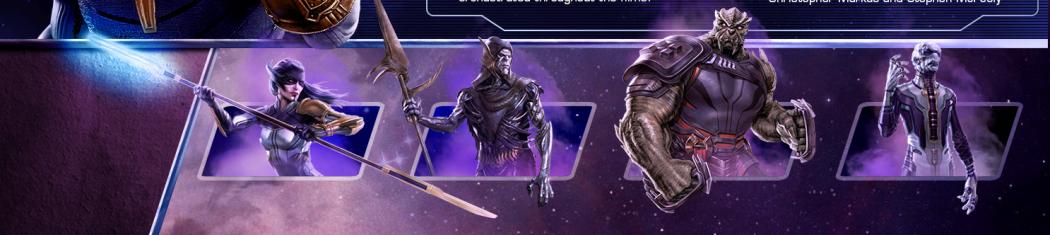
Moved characters on the front, and added some bad guys on the back. I am still thinking on Falcon Jrrr. It isn't as easy as shifting the montage over, because of Hulk. And I don't really want to move Hulk either
|
|
|
|
|
|
|
Oct 26 2018, 08:09 PM
Post
#58
|
|
|
Group: Cover Designer Posts: 13,830 Coverart: 564 Thanks: 12364 From: Denmark Joined: August 16 2007 My Favorite Custom Cover: To have and have not My Favorite Cover Designer: Tim Gengler |
Hulk and Vision could be swapped for eachother? Flipped horisontally?
A designer knows he has achieved perfection - not when there's nothing left to add - but when there's nothing left to take away - Antoine de Saint Exupéry |
|
|
|
The Following 4 Users Say Thank You To JollyRoger For This Post: Bazzah, Bazzah, ctaulbee, VincentLupo | |
|
Oct 26 2018, 09:05 PM
Post
#59
|
|
|
Group: Contributor Posts: 3,491 Coverart: 136 Thanks: 5254 From: United Kingdom Joined: May 22 2006 |
How about making ironman on the front look a bit less clean? A bit of damage etc?
|
|
|
|
|
Oct 27 2018, 03:30 AM
Post
#60
|
|
|
Group: Members Posts: 875 Coverart: 751 Thanks: 782 Joined: January 27 2018 |
Perhaps re-do the front montage so that all the characters are arranged left to right alphabetically.
 (I've been drinking...) (I've been drinking...)This post has been edited by RobertM53: Oct 27 2018, 03:31 AM |
|
|
|
The Following 5 Users Say Thank You To RobertM53 For This Post: Bazzah, ctaulbee, JollyRoger, M0vieM0nster, VincentLupo | |
|
|
1 User(s) are reading this topic (1 Guests and 0 Anonymous Users)
| 0 Members: | ||||
|
||||
|
|
| The Artwork hosted on this site is for personal use only. We do not condone piracy and we do not supply images for use in any illegal activities, including DVD or Blu-ray piracy. | ||||
| Time is now: 14th October 2025 - 05:44 PM | Gallery Index | Privacy policy | Lo-Fi Version | 
|
Copyright © 2006 - 2025 by HiResCovers.net