


Welcome to HiResCovers.NET
|
| |||||||||||||
|
||||||||||||||
|
|
| |||
|
||||
|
| |||||||||||||||||
|
||||||||||||||||||
|
| |||||||||||||||||||||||||
|
||||||||||||||||||||||||||
|
|
| |||
|
||||
 Loading tabs, please wait...
abcdefghijklmnopqrstuvwxyzABCDEFGHIJKLMNOPQRSTUVWXYZ
|
|

Welcome Guest, Register to Remove this Message!
|
Welcome to the highest quality Custom DVD, Blu-ray and Ultra-HD 4k cover art, available anywhere in the world. Please register, or log in, to browse our site. • Almost 200,000 300 dpi high quality images • Moderated uploads, to ensure the highest quality possible. • A forum for artwork requests, help designing cover art and much more • If you cannot find the movie you need, simply create a request for it to be created and uploaded to the gallery. • A section of Design Assets, including templates, logos and fonts. |
Guest Message © 2025 Dev Fuse

 
|

 Aug 20 2012, 09:10 AM Aug 20 2012, 09:10 AM
Post
#41
|
|
  Group: Members Posts: 3,384 Coverart: 107 Thanks: 174 From: Norway Joined: February 23 2011 |
Agree with NR!
Maybe move the shadow from the chasing space craft a little? Looks to me like it should be moved a bit down, so it matches the sun's placement better. |
   |
 
|
The Following 1 Users Say Thank You To Zungam For This Post: VincentLupo | |


|
Aug 20 2012, 11:20 PM
Post
#42
|
|
 Group: Members Posts: 4,771 Coverart: 100 Thanks: 132 From: UK Joined: October 21 2006 |
Mat this stunning work m8, wish it were mine

|
|
|
|
The Following 1 Users Say Thank You To venome For This Post: VincentLupo | |

|
Aug 21 2012, 01:18 AM
Post
#43
|
||
   Group: Master Designer Posts: 2,666 Coverart: 546 Thanks: 7138 Joined: July 22 2008 |
QUOTE (Nightrider @ Aug 20 2012, 04:50 AM)  Man this is SO cool! It's pretty darn astonishing!You have found a way to re-invent Star Wars covers  For a series that's been done so many times (and done quite well several times), even knowing how good you are, I never would have expected to click and see something so vibrant and "new." This is very impressive! I'd side with Felipe that you probably don't need the actors' names. The other thing that could eliminate a little text is to just add a "I" (or II, III, IV, etc.) in the bottom-right area of your art instead of writing the whole Episode I. This might just me be unnecessarily moving things around, but I tried a quick mock-up and I think it might compliment that fantastic artwork you created pretty nicely -- 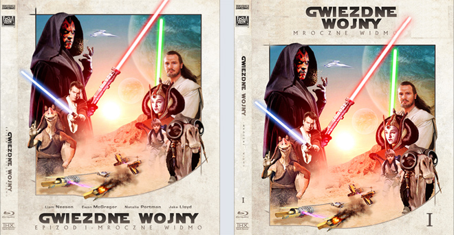
|
|
|
|
|
|
|
Aug 21 2012, 02:18 AM
Post
#44
|
|
 Group: Members Posts: 4,140 Coverart: 54 Thanks: 1364 From: Portugal Joined: October 18 2006 My Favorite Cover Designer: ShokXoneStudios; BunnyDojo |
Not sure how i missed this but you've done an amazing work so far dude!
I'm with BunnyDojo, his idea seems better imo, including the spine text. My only concern is related with the different skin tones you have between the characthers. Obi-Wan Kenobi and Padmé Amidala are too red when compared with the others.  Practice custom Blu-Ray covers, DVD covers and other stuff designs are displayed solely for the purpose of demonstrating design skills and are no way intended to infringe upon the copyrights of the owners of the respective images with which they were designed. Thank you for reading. |
|
|
|
The Following 1 Users Say Thank You To Arkflip For This Post: VincentLupo | |
|
Aug 21 2012, 04:09 AM
Post
#45
|
|
 Group: Members Posts: 913 Coverart: 71 Thanks: 263 From: Idaho Joined: April 25 2008 My Favorite Custom Cover: ALOT My Favorite Cover Designer: Everyone |
you try centering them like this at all?
Attached image(s)
 |
|
|
|
The Following 1 Users Say Thank You To RookerProductions For This Post: VincentLupo | |
|
Aug 21 2012, 06:17 AM
Post
#46
|
|
 Group: Master Designer Posts: 1,074 Coverart: 376 Thanks: 1853 From: Poland Joined: November 29 2008 My Favorite Custom Cover: many... |
Thank you very much guys,
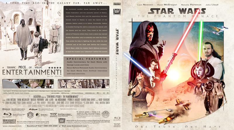
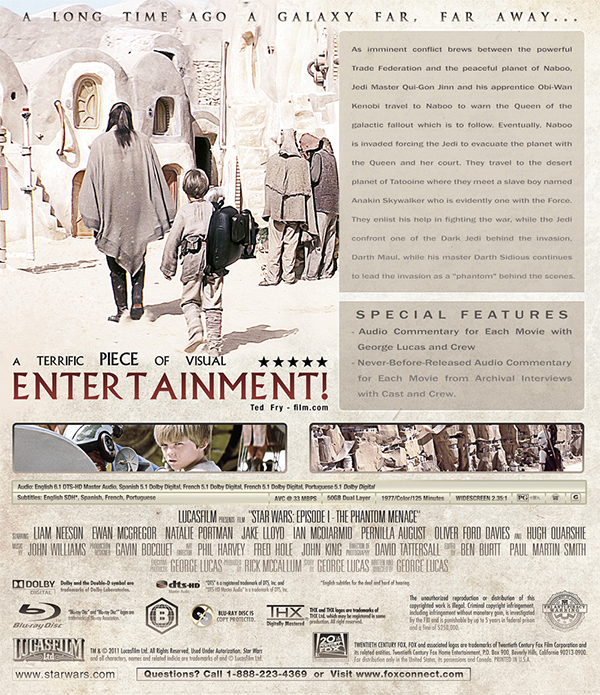
@ Tim m8, Thank you very much for your valuable suggestions. Here I made three different versions, I can not seem to decide which is more suitable. A 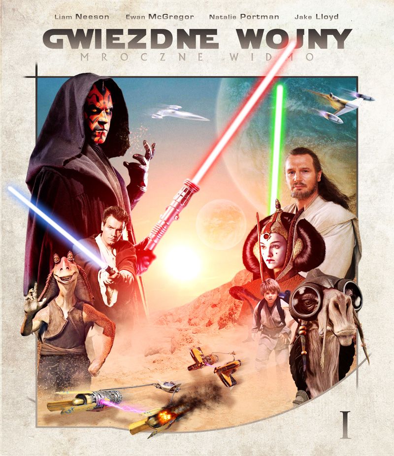 B 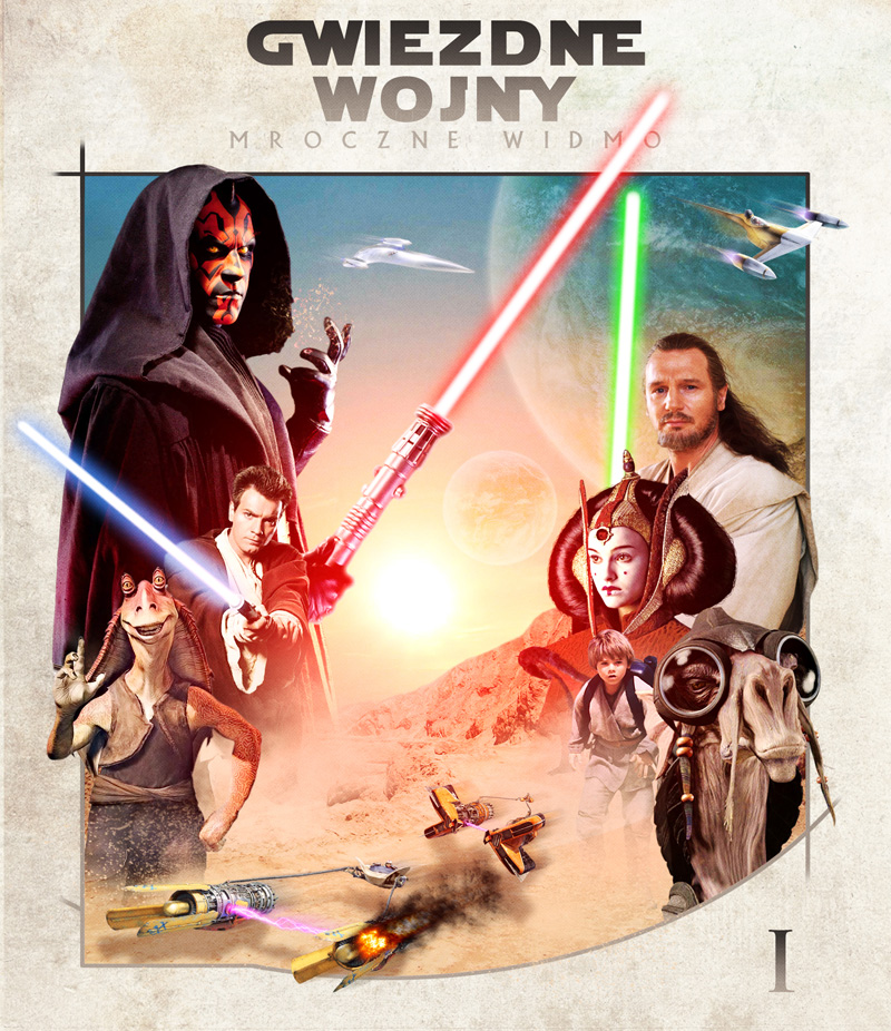 C 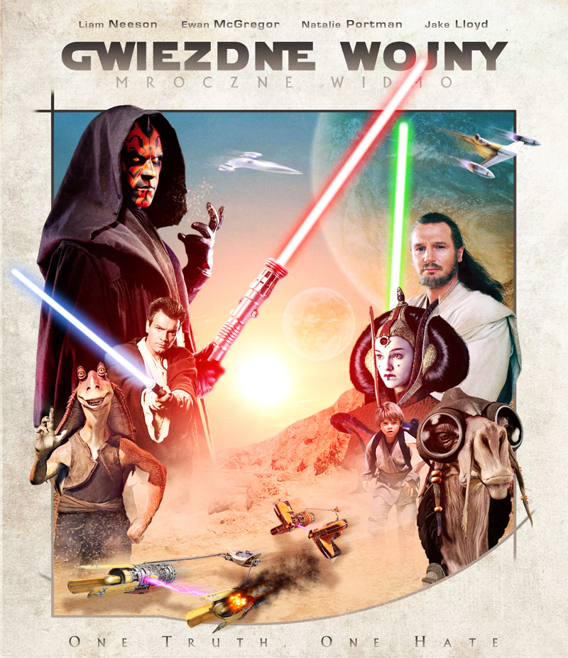 ABC 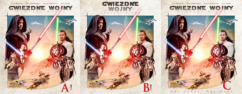 QUOTE (Arkflip @ Aug 21 2012, 03:18 AM) My only concern is related with the different skin tones you have between the characthers. Obi-Wan Kenobi and Padmé Amidala are too red when compared with the others. Thanks Ark, In the presentation of the "C" changed the color of Obi-Wan Kenobi and Padme ... better now? QUOTE (RookerProductions @ Aug 21 2012, 05:09 AM) you try centering them like this at all? Hey RP, I thought about it at the beginning when I started this collection, but many covers already has a similar arrangement as you present above, and I wanted a little different. QUOTE (Zungam @ Aug 20 2012, 10:10 AM) Agree with NR! Maybe move the shadow from the chasing space craft a little? Looks to me like it should be moved a bit down, so it matches the sun's placement better. In the next update I move spacecraft down, sorry m8, I missed that it. This post has been edited by Matush: Aug 21 2012, 06:19 AM QUOTE (venome @ Aug 21 2012, 12:20 AM) Mat this stunning work m8, wish it were mine :P |
|
|
|
The Following 1 Users Say Thank You To Matush For This Post: VincentLupo | |
|
Aug 21 2012, 06:41 AM
Post
#47
|
|
|
Group: Members Posts: 4,140 Coverart: 54 Thanks: 1364 From: Portugal Joined: October 18 2006 My Favorite Cover Designer: ShokXoneStudios; BunnyDojo |
Version B for me Mat!

Practice custom Blu-Ray covers, DVD covers and other stuff designs are displayed solely for the purpose of demonstrating design skills and are no way intended to infringe upon the copyrights of the owners of the respective images with which they were designed. Thank you for reading. |
|
|
|
The Following 1 Users Say Thank You To Arkflip For This Post: VincentLupo | |
|
Aug 21 2012, 07:09 AM
Post
#48
|
|
|
Group: Members Posts: 913 Coverart: 71 Thanks: 263 From: Idaho Joined: April 25 2008 My Favorite Custom Cover: ALOT My Favorite Cover Designer: Everyone |
B or C for me
|
|
|
|
The Following 1 Users Say Thank You To RookerProductions For This Post: VincentLupo | |
|
Aug 21 2012, 08:54 AM
Post
#49
|
|
 Group: Members Posts: 4,463 Coverart: 191 Thanks: 805 From: Land of Oz Joined: February 10 2008 My Favorite Custom Cover: To Hard To Choose, I Like Lots |
I kinda like B as well buddy
It's all uphill til you get to the top
|
|
|
|
The Following 1 Users Say Thank You To Nightrider For This Post: VincentLupo | |
|
Aug 22 2012, 08:12 PM
Post
#50
|
|
 Group: Members Posts: 1,339 Coverart: 38 Thanks: 935 From: Backyard Joined: July 30 2008 |
Cool fresh design Matush
B for me. |
|
|
|
The Following 1 Users Say Thank You To Sxxo For This Post: VincentLupo | |
|
Aug 22 2012, 08:21 PM
Post
#51
|
|
|
Group: Master Designer Posts: 1,074 Coverart: 376 Thanks: 1853 From: Poland Joined: November 29 2008 My Favorite Custom Cover: many... |
ok, thanks guys.
I showed these three versions on different sites and most of the people are for a version of "C", me too. Thank you very much, update soon. QUOTE (venome @ Aug 21 2012, 12:20 AM) Mat this stunning work m8, wish it were mine :P |
|
|
|
The Following 1 Users Say Thank You To Matush For This Post: VincentLupo | |
|
Aug 26 2012, 07:13 PM
Post
#52
|
|
|
Group: Master Designer Posts: 1,074 Coverart: 376 Thanks: 1853 From: Poland Joined: November 29 2008 My Favorite Custom Cover: many... |
so, update :
 QUOTE (venome @ Aug 21 2012, 12:20 AM) Mat this stunning work m8, wish it were mine :P |
|
|
|
The Following 1 Users Say Thank You To Matush For This Post: VincentLupo | |
|
Aug 26 2012, 07:18 PM
Post
#53
|
|
 Group: Members Posts: 5,689 Coverart: 1,491 Thanks: 27 From: Georgia, USA Joined: May 14 2006 My Favorite Custom Cover: Kernie's Comic Set WOW! My Favorite Cover Designer: umi & nini |
Not to be picky, but I LOVE this, and it's been far too long since seeing you here my friend!!!
|
|
|
|
The Following 1 Users Say Thank You To chefjoe For This Post: VincentLupo | |
|
Aug 26 2012, 07:23 PM
Post
#54
|
|
|
Group: Members Posts: 3,384 Coverart: 107 Thanks: 174 From: Norway Joined: February 23 2011 |
Looks smashing!
Shouldn't it be "A Galaxy Far, Far Away" insted of "THE Galaxy"? Maybe bring some colors to the back as well? |
|
|
|
The Following 1 Users Say Thank You To Zungam For This Post: VincentLupo | |
|
Aug 26 2012, 07:38 PM
Post
#55
|
|
|
Group: Master Designer Posts: 1,074 Coverart: 376 Thanks: 1853 From: Poland Joined: November 29 2008 My Favorite Custom Cover: many... |
QUOTE (Zungam @ Aug 26 2012, 08:23 PM) Shouldn't it be "A Galaxy Far, Far Away" insted of "THE Galaxy"? You're right, I'll fix it, thanks m8 Here U go: 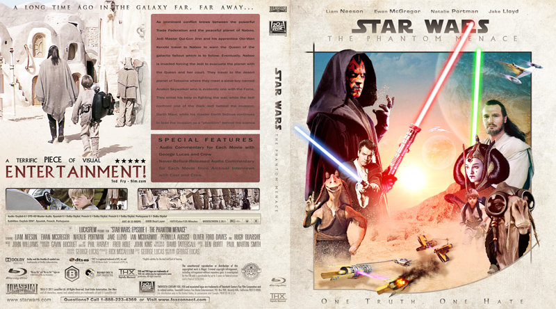 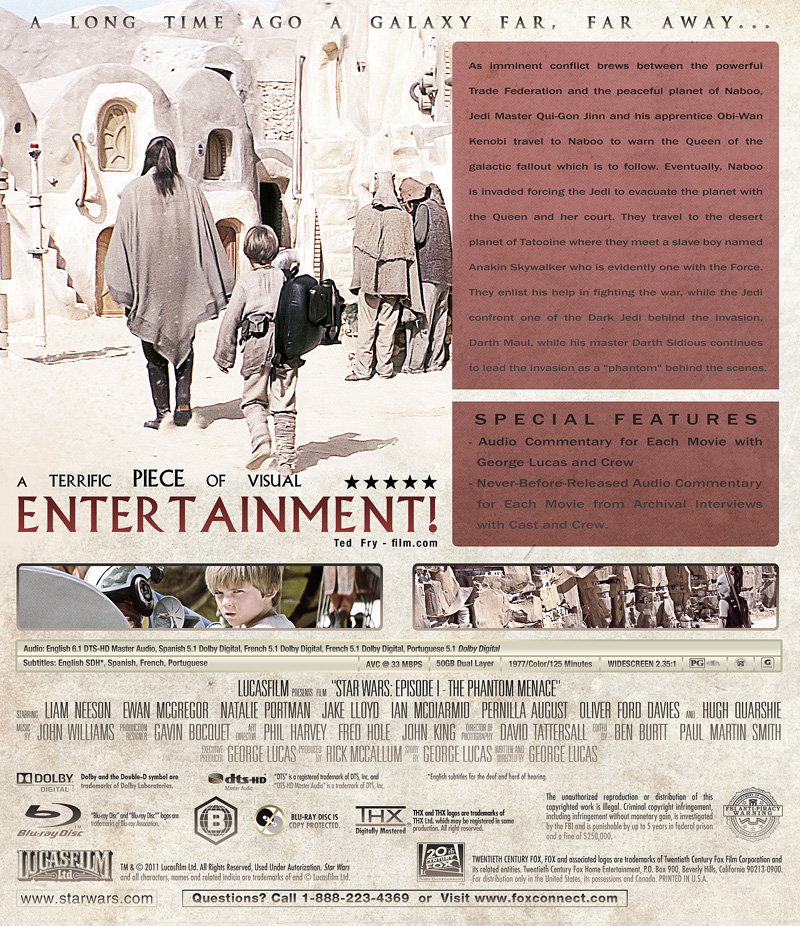 worx now ? This post has been edited by Matush: Aug 26 2012, 09:54 PM QUOTE (venome @ Aug 21 2012, 12:20 AM) Mat this stunning work m8, wish it were mine :P |
|
|
|
The Following 1 Users Say Thank You To Matush For This Post: VincentLupo | |
|
Aug 26 2012, 08:36 PM
Post
#56
|
|
  Group: Cover Designer Posts: 13,830 Coverart: 564 Thanks: 12364 From: Denmark Joined: August 16 2007 My Favorite Custom Cover: To have and have not My Favorite Cover Designer: Tim Gengler |
Great stuff, Mat!
I think that Darth Maul's light saber should be longer.
A designer knows he has achieved perfection - not when there's nothing left to add - but when there's nothing left to take away - Antoine de Saint Exupéry |
|
|
|
The Following 1 Users Say Thank You To JollyRoger For This Post: VincentLupo | |

|
Aug 27 2012, 01:20 AM
Post
#57
|
|
|
Group: Members Posts: 4,140 Coverart: 54 Thanks: 1364 From: Portugal Joined: October 18 2006 My Favorite Cover Designer: ShokXoneStudios; BunnyDojo |
I like it but being brutally honest with you, the back looks poor if we compare front and back. You've a stunning front artwork and then why such a plain back?
Practice custom Blu-Ray covers, DVD covers and other stuff designs are displayed solely for the purpose of demonstrating design skills and are no way intended to infringe upon the copyrights of the owners of the respective images with which they were designed. Thank you for reading. |
|
|
|
The Following 1 Users Say Thank You To Arkflip For This Post: VincentLupo | |
|
Aug 27 2012, 05:11 AM
Post
#58
|
|
|
Group: Master Designer Posts: 1,074 Coverart: 376 Thanks: 1853 From: Poland Joined: November 29 2008 My Favorite Custom Cover: many... |
QUOTE (JollyRoger @ Aug 26 2012, 09:36 PM) Great stuff, Mat! I think that Darth Maul's light saber should be longer.Fixed , thanks QUOTE (Arkflip @ Aug 27 2012, 02:20 AM) I like it but being brutally honest with you, the back looks poor if we compare front and back. You've a stunning front artwork and then why such a plain back? I'll see what I can do, but I would prefer to back was more poor. QUOTE (venome @ Aug 21 2012, 12:20 AM) Mat this stunning work m8, wish it were mine :P |
|
|
|
The Following 1 Users Say Thank You To Matush For This Post: VincentLupo | |
|
Aug 27 2012, 11:35 AM
Post
#59
|
|
  Group: Moderator Posts: 12,533 Coverart: 67 Thanks: 20285 From: United Kingdom Joined: May 14 2006 |
Looking great but not sure the red box behind the synopsis works... Maybe try it a lighter colour to match the colours you've got across the cover already.
Maybe something like this... This post has been edited by sauron: Aug 27 2012, 12:39 PM
Attached image(s)
 |
|
|
|
The Following 1 Users Say Thank You To sauron For This Post: VincentLupo | |

|
Aug 28 2012, 01:04 AM
Post
#60
|
|
|
Group: Members Posts: 2 Thanks: 2 From: Netherlands Joined: August 26 2012 |
Wow! Awesome job! I think Lucas Arts should hire you
 Just a couple of things to make them even better in my opinion:
Great to see how a cover is made. It shows to me I have a long way to go... Keep up the good and awesome work! |
|
|
|
The Following 1 Users Say Thank You To pietheinde26e For This Post: VincentLupo | |
|
|
1 User(s) are reading this topic (1 Guests and 0 Anonymous Users)
| 0 Members: | ||||
|
||||
|
|
| The Artwork hosted on this site is for personal use only. We do not condone piracy and we do not supply images for use in any illegal activities, including DVD or Blu-ray piracy. | ||||
| Time is now: 14th October 2025 - 12:05 PM | Gallery Index | Privacy policy | Lo-Fi Version | 
|
Copyright © 2006 - 2025 by HiResCovers.net