


Welcome to HiResCovers.NET
|
| |||||||||||||
|
||||||||||||||
|
|
| |||
|
||||
|
| |||||||||||||||||
|
||||||||||||||||||
|
| |||||||||||||||||||||||||
|
||||||||||||||||||||||||||
|
|
| |||
|
||||
 Loading tabs, please wait...
abcdefghijklmnopqrstuvwxyzABCDEFGHIJKLMNOPQRSTUVWXYZ
|
|

Welcome Guest, Register to Remove this Message!
|
Welcome to the highest quality Custom DVD, Blu-ray and Ultra-HD 4k cover art, available anywhere in the world. Please register, or log in, to browse our site. • Almost 200,000 300 dpi high quality images • Moderated uploads, to ensure the highest quality possible. • A forum for artwork requests, help designing cover art and much more • If you cannot find the movie you need, simply create a request for it to be created and uploaded to the gallery. • A section of Design Assets, including templates, logos and fonts. |
Guest Message © 2025 Dev Fuse

 May 8 2020, 11:31 AM May 8 2020, 11:31 AM
Post
#1
|
||||||
  Group: Master Designer Posts: 3,060 Coverart: 404 Thanks: 8528 From: Germany Joined: June 13 2013 My Favorite Custom Cover: van Helsing by Bunny Dojo |
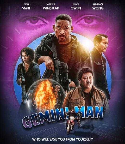
At the moment I have a weakness for these illastration looks so after Midway I've tried this with another cover.
I didn't expect that before but there's not really much to work with for Gemini Man and at the moment I don't know what to use for the back.  Here is what I have so far and as always your suggestions are welcome! 
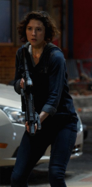
This is what I did with the characters (I know it's a bit hard to see...):
Front artwork: 
 |
|||||
   |
 
|
|||||


|
|
Replies
|
|
May 12 2020, 04:26 PM
Post
#2
|
||
  Group: Master Designer Posts: 2,666 Coverart: 546 Thanks: 7138 Joined: July 22 2008 |
You have a lot of great pieces here, and I'm excited to see the effects you're exploring.
If you could bring the top Will Smith down and left a bit, that might help tighten the composition and give you more options for your title treatment. (That creates a blank space next to his shoulder, but maybe there's a good piece of scenery or special effects for up there.) Otherwise, I pretty much agree with the guys here that the two things holding this cover back from greatness are the font and color. The font is a little too fat and bouncy, and the shading effect highlights that further, making it look friendly. Something sharper -- either sharp edges or a sharp metal texture or just a sharp flat color -- could help. For the coloring, I think your 13 Hours, Matrix, and Sully covers are all perfect examples of great dark color palettes. The colors on this one might work with a lighter background, instead of the reddish brown. Or, you could simplify the color palette even further (not necessarily gold, but this is just an example): 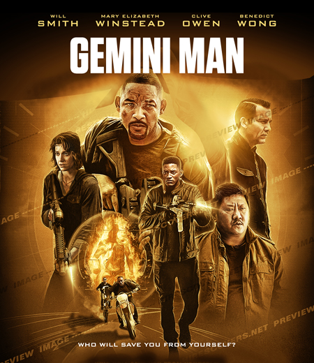
|
|
|
|
|
|


|
|
3 User(s) are reading this topic (3 Guests and 0 Anonymous Users)
| 0 Members: | ||||
|
||||
|
|
| The Artwork hosted on this site is for personal use only. We do not condone piracy and we do not supply images for use in any illegal activities, including DVD or Blu-ray piracy. | ||||
| Time is now: 14th October 2025 - 12:39 PM | Gallery Index | Privacy policy | Lo-Fi Version | 
|
Copyright © 2006 - 2025 by HiResCovers.net