


Welcome to HiResCovers.NET
|
| |||||||||||||
|
||||||||||||||
|
|
| |||
|
||||
|
| |||||||||||||||||
|
||||||||||||||||||
|
| |||||||||||||||||||||||||
|
||||||||||||||||||||||||||
|
|
| |||
|
||||
 Loading tabs, please wait...
abcdefghijklmnopqrstuvwxyzABCDEFGHIJKLMNOPQRSTUVWXYZ
|
|

Welcome Guest, Register to Remove this Message!
|
Welcome to the highest quality Custom DVD, Blu-ray and Ultra-HD 4k cover art, available anywhere in the world. Please register, or log in, to browse our site. • Almost 200,000 300 dpi high quality images • Moderated uploads, to ensure the highest quality possible. • A forum for artwork requests, help designing cover art and much more • If you cannot find the movie you need, simply create a request for it to be created and uploaded to the gallery. • A section of Design Assets, including templates, logos and fonts. |
Guest Message © 2025 Dev Fuse

 Nov 12 2017, 11:08 PM Nov 12 2017, 11:08 PM
Post
#1
|
|
  Group: Members Posts: 3,265 Coverart: 91 Thanks: 1039 Joined: September 19 2009 My Favorite Custom Cover: Friday the 13th by Samppa My Favorite Cover Designer: Euroboy, Samppa, Bunny Dojo |
Star wars was one of the first cover series I started way before I learned design concepts. I'm returning tentatively (based on resources) to the series, but am doing A New Hope for sure.
 I'm using the specs from the 3-pack original trilogy set: https://www.dvdempire.com/1563021/star-wars...gy-blu-ray.html This was my layout inspiration for the front. I will play with adding ships next and hair details. 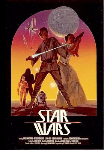 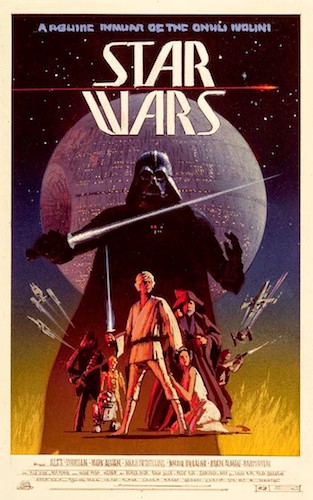 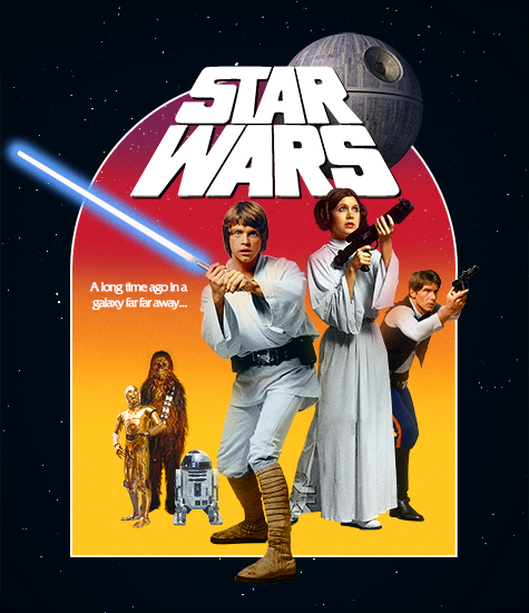  My gallery: HERE
|
   |
 
|
The Following 8 Users Say Thank You To Paris For This Post: Bazzah, ctaulbee, Darksaber, M0vieM0nster, Matush, sauron, Speedz0r, VincentLupo | |


|
|
Replies
|
|
Feb 26 2018, 11:15 PM
Post
#2
|
||
   Group: Master Designer Posts: 2,666 Coverart: 546 Thanks: 7137 Joined: July 22 2008 |
QUOTE (Paris @ Feb 26 2018, 04:13 PM)  It's still feeling a little "photoshoppy" so I was wondering if anyone could help me point out why Exciting work, Paris! Nothing jumps out as needing to be changed, but here are a bunch of small "maybes" for potential adjustments to see if they help: Could it be a matter of the lighting? Mark Hamill and Darth Vader look very close to the desired effect, but Carrie Fisher is a bit flatly lit (like a regular photo, rather than an "epic" portrait). On the right, too, the buildings are a bit flat (otherwise, the right side of the cover is darn-outstanding). Likewise, maybe tighten up the color palette even a tiny bit further, to get the green out of Carrie Fisher's top? Along with the overall outline glow, it seems like Sturzan enjoys adding little bursts of light; maybe some additional small pings would further enhance your effect? For the background treeline, perhaps add a very slight gradient lightning the bottom? It might be worth playing with the black hues under Selective Color to give the darkness a slight blue-purple tint? Also, the title treatment is almost definitely contributing to the "photoshoppy" feeling you mentioned. I think you need to work your magic there -- either in losing the perspective, changing from plain white text, or adding some sort of interaction with the composition. I hope something in there is helpful and look forward to seeing where you head with this one and the series as a whole   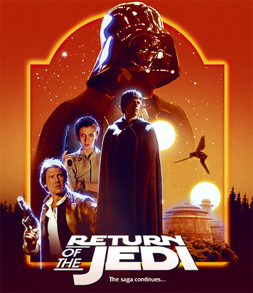
|
|
|
|
|
|
The Following 9 Users Say Thank You To Bunny Dojo For This Post: Bazzah, Bozzy, ctaulbee, M0vieM0nster, Matush, Paris, sauron, Speedz0r, VincentLupo | ||


|
|
1 User(s) are reading this topic (1 Guests and 0 Anonymous Users)
| 0 Members: | ||||
|
||||
|
|
| The Artwork hosted on this site is for personal use only. We do not condone piracy and we do not supply images for use in any illegal activities, including DVD or Blu-ray piracy. | ||||
| Time is now: 13th October 2025 - 11:22 PM | Gallery Index | Privacy policy | Lo-Fi Version | 
|
Copyright © 2006 - 2025 by HiResCovers.net