


Welcome to HiResCovers.NET
|
| |||||||||||||
|
||||||||||||||
|
|
| |||
|
||||
|
| |||||||||||||||||
|
||||||||||||||||||
|
| |||||||||||||||||||||||||
|
||||||||||||||||||||||||||
|
|
| |||
|
||||
 Loading tabs, please wait...
abcdefghijklmnopqrstuvwxyzABCDEFGHIJKLMNOPQRSTUVWXYZ
|
|

Welcome Guest, Register to Remove this Message!
|
Welcome to the highest quality Custom DVD, Blu-ray and Ultra-HD 4k cover art, available anywhere in the world. Please register, or log in, to browse our site. • Almost 200,000 300 dpi high quality images • Moderated uploads, to ensure the highest quality possible. • A forum for artwork requests, help designing cover art and much more • If you cannot find the movie you need, simply create a request for it to be created and uploaded to the gallery. • A section of Design Assets, including templates, logos and fonts. |
Guest Message © 2025 Dev Fuse

 Sep 29 2018, 07:04 PM Sep 29 2018, 07:04 PM
Post
#1
|
|
  Group: Cover Designer Posts: 13,830 Coverart: 564 Thanks: 12364 From: Denmark Joined: August 16 2007 My Favorite Custom Cover: To have and have not My Favorite Cover Designer: Tim Gengler |
Never did convert my DVD cover for this title to BD format; not am I gonna.
Instead, I'm trying something new 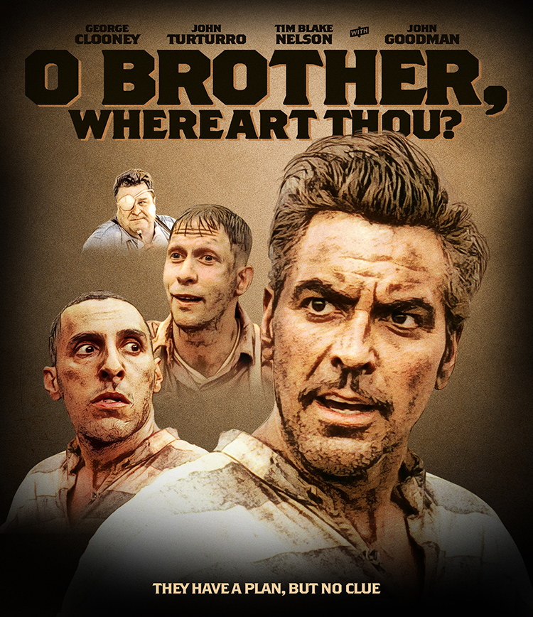
 A designer knows he has achieved perfection - not when there's nothing left to add - but when there's nothing left to take away - Antoine de Saint Exupéry |
   |
 
|


|
|
Replies
(1 - 19)
|
|
Sep 29 2018, 07:20 PM
Post
#2
|
|||
   Group: Root Admin Posts: 8,142 Coverart: 2,919 Thanks: 17826 From: The Realm of Nightmares Joined: May 3 2006 |
Is there a space between "where" and "art"? if there is then it might need some kerning.
          My Gallery • Please leave a like and short comment if you download my work, thanks. • My Criterion Collection |
||
|
|
|
||

|
Sep 29 2018, 08:59 PM
Post
#3
|
|
|
Group: Cover Designer Posts: 13,830 Coverart: 564 Thanks: 12364 From: Denmark Joined: August 16 2007 My Favorite Custom Cover: To have and have not My Favorite Cover Designer: Tim Gengler |
Worked some more on the background. Going with a rural imagery in keep with the promotional artwork.
How's this looking? 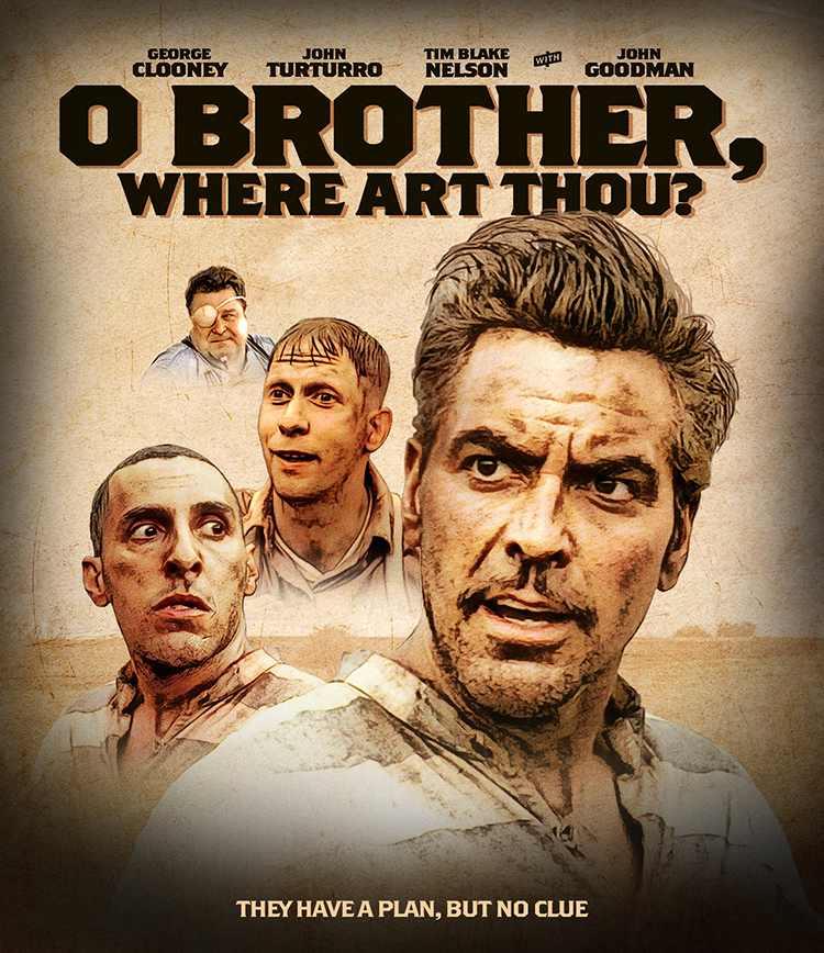
A designer knows he has achieved perfection - not when there's nothing left to add - but when there's nothing left to take away - Antoine de Saint Exupéry |
|
|
|
|
Sep 29 2018, 09:02 PM
Post
#4
|
|||
|
Group: Root Admin Posts: 8,142 Coverart: 2,919 Thanks: 17826 From: The Realm of Nightmares Joined: May 3 2006 |
Coming along
 If you intended to follow the studio, the official tagline is "They have a plan, but not a clue." My Gallery • Please leave a like and short comment if you download my work, thanks. • My Criterion Collection |
||
|
|
|
||
The Following 4 Users Say Thank You To ctaulbee For This Post: Bazzah, Jazzy, JollyRoger, VincentLupo | |||
|
Sep 30 2018, 10:51 AM
Post
#5
|
|
|
Group: Cover Designer Posts: 13,830 Coverart: 564 Thanks: 12364 From: Denmark Joined: August 16 2007 My Favorite Custom Cover: To have and have not My Favorite Cover Designer: Tim Gengler |
Thanks Curt! Fixed.
So, rearranged the floating heads a little, adding Holly Hunter, and the Blues guitarist. Also started the spine. 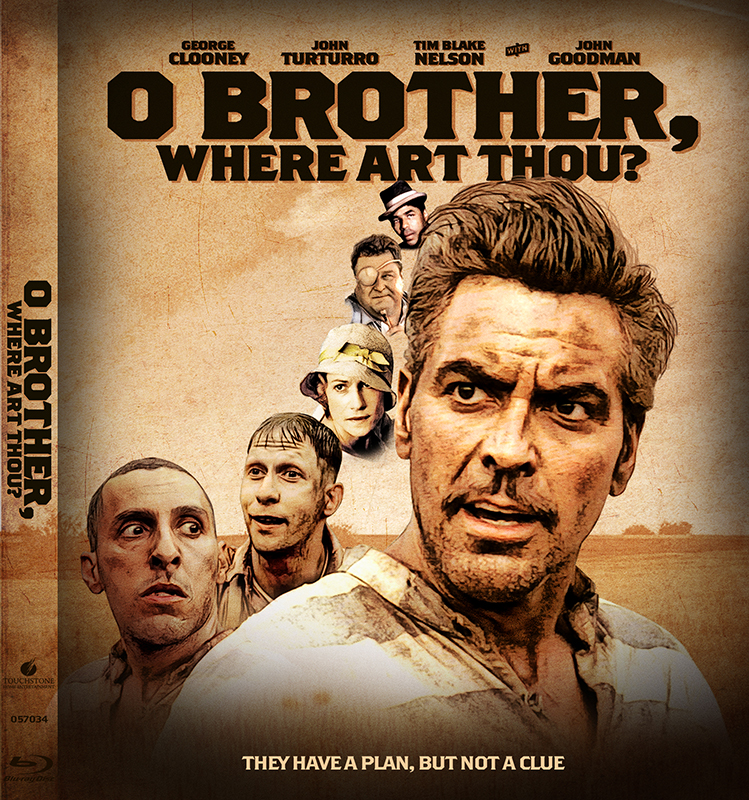
A designer knows he has achieved perfection - not when there's nothing left to add - but when there's nothing left to take away - Antoine de Saint Exupéry |
|
|
|
The Following 4 Users Say Thank You To JollyRoger For This Post: Bazzah, ctaulbee, pytlaczek, VincentLupo | |
|
Sep 30 2018, 11:27 AM
Post
#6
|
|
 Group: Root Admin Posts: 22,893 Coverart: 1,634 Thanks: 52591 From: Home Joined: May 3 2006 My Favorite Cover Designer: All HiRes designers |
Excellent job Jrrr. It looks great!
    |
|
|
|
|
Sep 30 2018, 02:29 PM
Post
#7
|
|
|
Group: Cover Designer Posts: 13,830 Coverart: 564 Thanks: 12364 From: Denmark Joined: August 16 2007 My Favorite Custom Cover: To have and have not My Favorite Cover Designer: Tim Gengler |
A little more done. How're we coming along?
 
A designer knows he has achieved perfection - not when there's nothing left to add - but when there's nothing left to take away - Antoine de Saint Exupéry |
|
|
|
The Following 6 Users Say Thank You To JollyRoger For This Post: Bazzah, ctaulbee, M0vieM0nster, pytlaczek, Speedz0r, VincentLupo | |
|
Sep 30 2018, 02:44 PM
Post
#8
|
|
|
Group: Root Admin Posts: 22,893 Coverart: 1,634 Thanks: 52591 From: Home Joined: May 3 2006 My Favorite Cover Designer: All HiRes designers |
Coming along nicely
|
|
|
|
|
Sep 30 2018, 02:45 PM
Post
#9
|
|
  Group: Contributor Posts: 3,491 Coverart: 136 Thanks: 5254 From: United Kingdom Joined: May 22 2006 |
Nice! Look forward to seeing what you do with the back?
|
|
|
|
The Following 4 Users Say Thank You To M0vieM0nster For This Post: Bazzah, ctaulbee, JollyRoger, VincentLupo | |
|
Sep 30 2018, 06:23 PM
Post
#10
|
|
  Group: Members Posts: 3,265 Coverart: 91 Thanks: 1039 Joined: September 19 2009 My Favorite Custom Cover: Friday the 13th by Samppa My Favorite Cover Designer: Euroboy, Samppa, Bunny Dojo |
Good start!
I think you should pull back a little before going to the back. I would remove all effects (effects this heavy on an entire cover can make it look less retail? It feels a little photoshop-happy. I would slowly start adding effects back in until it feels like too much. I also think that the BG in your second post had good contrast levels (minus the black vignette and heavy texture) . It would be nice to have the heads a little smaller and in the sky (lower the horizon closer to the bottom and maybe have a full-body image of the 3 leads? Your head layout is very interesting and like a classic poster but it has some edge tension with John Turturro on the left Keep it up! My gallery: HERE
|
|
|
|
The Following 4 Users Say Thank You To Paris For This Post: Bazzah, ctaulbee, JollyRoger, VincentLupo | |

|
Sep 30 2018, 06:51 PM
Post
#11
|
|
|
Group: Members Posts: 3,265 Coverart: 91 Thanks: 1039 Joined: September 19 2009 My Favorite Custom Cover: Friday the 13th by Samppa My Favorite Cover Designer: Euroboy, Samppa, Bunny Dojo |
You could also look to classic posters for more floating head layout ideas
https://www.cinematerial.com/movies/casablanca-i34583 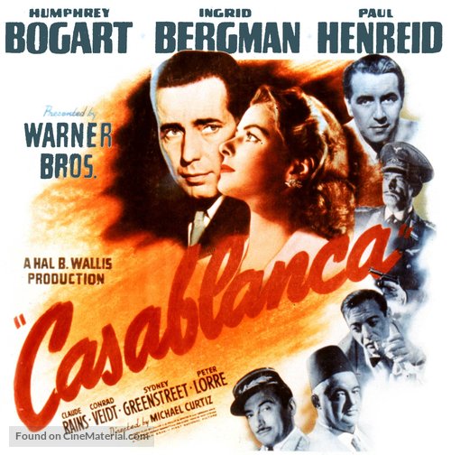 This post has been edited by Paris: Sep 30 2018, 06:52 PM My gallery: HERE
|
|
|
|
The Following 5 Users Say Thank You To Paris For This Post: Bazzah, ctaulbee, JollyRoger, sauron, VincentLupo | |
|
Oct 1 2018, 06:59 AM
Post
#12
|
||||
  Group: Master Designer Posts: 3,060 Coverart: 404 Thanks: 8528 From: Germany Joined: June 13 2013 My Favorite Custom Cover: van Helsing by Bunny Dojo |
I also like what you have done so far! And I personally like the filter work.
I'm with Paris about the colors etc and prefer the image form post #3. On the left side of Clooney's head (next to the small heads) you maybe could work some more on his hairs? Oh and a nice title btw. 
|
|||
|
|
|
|||
The Following 5 Users Say Thank You To Fidi For This Post: Bazzah, ctaulbee, JollyRoger, sauron, VincentLupo | ||||

|
Oct 2 2018, 01:35 PM
Post
#13
|
|
  Group: Moderator Posts: 5,702 Coverart: 240 Thanks: 22382 From: Norway Joined: June 24 2006 |
It's shaping up nicely. The three main characters look great, but not sure about the fade on the two other ones (two on the top(small ones)). I think the fade might be too heavy or you're simply missing too much of these two characters. Maybe fade them into the grass to the left of Clooney's head (where you have some open space). The effect on the characters might be a bit much, but I think it matches the rest of the cover very well.
 Please keep my covers on this site and this site only! |
|
|
|
The Following 5 Users Say Thank You To Speedz0r For This Post: Bazzah, ctaulbee, JollyRoger, sauron, VincentLupo | |
|
Oct 2 2018, 05:56 PM
Post
#14
|
|
|
Group: Cover Designer Posts: 13,830 Coverart: 564 Thanks: 12364 From: Denmark Joined: August 16 2007 My Favorite Custom Cover: To have and have not My Favorite Cover Designer: Tim Gengler |
Swamped with work at the mo, but I plan an update for this come the weekend.
thanks for the help and encouraging words. Between the posts here and some PMs I received with helpful suggestions; I am excited about the somewhat new direction this WIP is going to take!
A designer knows he has achieved perfection - not when there's nothing left to add - but when there's nothing left to take away - Antoine de Saint Exupéry |
|
|
|
The Following 5 Users Say Thank You To JollyRoger For This Post: Bazzah, ctaulbee, sauron, Speedz0r, VincentLupo | |
|
Oct 3 2018, 05:26 AM
Post
#15
|
|
|
Group: Cover Designer Posts: 13,830 Coverart: 564 Thanks: 12364 From: Denmark Joined: August 16 2007 My Favorite Custom Cover: To have and have not My Favorite Cover Designer: Tim Gengler |
Couldn't help myself, so here's an update. Fine tuning will be next.
I was thinking maybe swap the cow and the trio, so that the big Turturro is looking at the cow on the roof... We shall see... 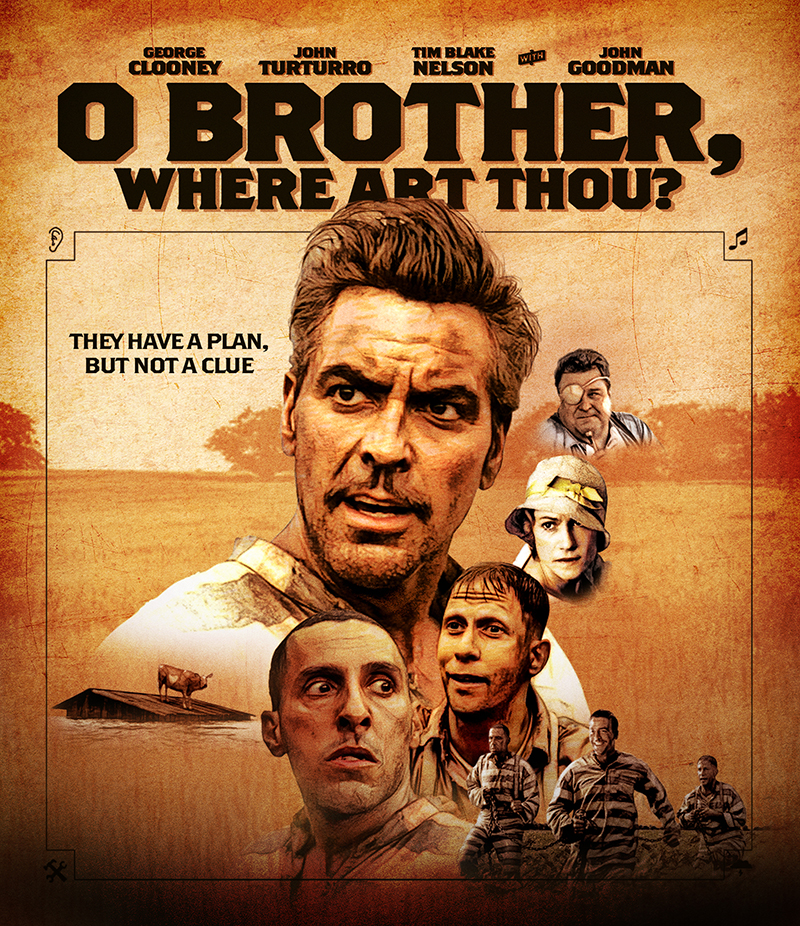
A designer knows he has achieved perfection - not when there's nothing left to add - but when there's nothing left to take away - Antoine de Saint Exupéry |
|
|
|
|
Oct 3 2018, 10:06 AM
Post
#16
|
|
|
Group: Root Admin Posts: 22,893 Coverart: 1,634 Thanks: 52591 From: Home Joined: May 3 2006 My Favorite Cover Designer: All HiRes designers |
Looking good. The frame really helps bring it together.
|
|
|
|
|
Oct 3 2018, 05:50 PM
Post
#17
|
|
 Group: Moderator Posts: 12,532 Coverart: 67 Thanks: 20282 From: United Kingdom Joined: May 14 2006 |
The most recent update is looking much better, I do feel it's a bit heavy on the left with all the images though, I would also try reducing the saturation a little so it's not so orange/red.
|
|
|
|
The Following 4 Users Say Thank You To sauron For This Post: Bazzah, ctaulbee, JollyRoger, VincentLupo | |
|
Oct 3 2018, 06:52 PM
Post
#18
|
|
|
Group: Cover Designer Posts: 13,830 Coverart: 564 Thanks: 12364 From: Denmark Joined: August 16 2007 My Favorite Custom Cover: To have and have not My Favorite Cover Designer: Tim Gengler |
  Update... Didn't see your post there, speed. I'll take it into consideration going forward. 
A designer knows he has achieved perfection - not when there's nothing left to add - but when there's nothing left to take away - Antoine de Saint Exupéry |
|
|
|
|
Oct 3 2018, 10:18 PM
Post
#19
|
|
|
Group: Moderator Posts: 12,532 Coverart: 67 Thanks: 20282 From: United Kingdom Joined: May 14 2006 |
Better now
Personally I would move the woman and the guy with the eyepatch to the bottom right and then have the tagline at the very bottom where the border line is, if that makes sense?
|
|
|
|
The Following 4 Users Say Thank You To sauron For This Post: Bazzah, ctaulbee, JollyRoger, VincentLupo | |
|
Oct 4 2018, 06:29 AM
Post
#20
|
||||
|
Group: Master Designer Posts: 3,060 Coverart: 404 Thanks: 8528 From: Germany Joined: June 13 2013 My Favorite Custom Cover: van Helsing by Bunny Dojo |
I agree with sauron abouth the placement of Goodman, the woman and the tagline.
Apart from that I'd reduce the saturation like you had in post #7 and then I'd try to give the both smaller guys on the left of Clooney a bit more natural colors (like you have them on Goodman). |
|||
|
|
|
|||
The Following 5 Users Say Thank You To Fidi For This Post: Bazzah, ctaulbee, JollyRoger, sauron, VincentLupo | ||||
|
|
1 User(s) are reading this topic (1 Guests and 0 Anonymous Users)
| 0 Members: | ||||
|
||||
|
|
| The Artwork hosted on this site is for personal use only. We do not condone piracy and we do not supply images for use in any illegal activities, including DVD or Blu-ray piracy. | ||||
| Time is now: 13th October 2025 - 09:02 PM | Gallery Index | Privacy policy | Lo-Fi Version | 
|
Copyright © 2006 - 2025 by HiResCovers.net