


Welcome to HiResCovers.NET
|
| |||||||||||||
|
||||||||||||||
|
|
| |||
|
||||
|
| |||||||||||||||||
|
||||||||||||||||||
|
| |||||||||||||||||||||||||
|
||||||||||||||||||||||||||
|
|
| |||
|
||||
 Loading tabs, please wait...
abcdefghijklmnopqrstuvwxyzABCDEFGHIJKLMNOPQRSTUVWXYZ
|
|

Welcome Guest, Register to Remove this Message!
|
Welcome to the highest quality Custom DVD, Blu-ray and Ultra-HD 4k cover art, available anywhere in the world. Please register, or log in, to browse our site. • Almost 200,000 300 dpi high quality images • Moderated uploads, to ensure the highest quality possible. • A forum for artwork requests, help designing cover art and much more • If you cannot find the movie you need, simply create a request for it to be created and uploaded to the gallery. • A section of Design Assets, including templates, logos and fonts. |
Guest Message © 2025 Dev Fuse

 Nov 12 2017, 11:08 PM Nov 12 2017, 11:08 PM
Post
#1
|
|
  Group: Members Posts: 3,265 Coverart: 91 Thanks: 1039 Joined: September 19 2009 My Favorite Custom Cover: Friday the 13th by Samppa My Favorite Cover Designer: Euroboy, Samppa, Bunny Dojo |
Star wars was one of the first cover series I started way before I learned design concepts. I'm returning tentatively (based on resources) to the series, but am doing A New Hope for sure.
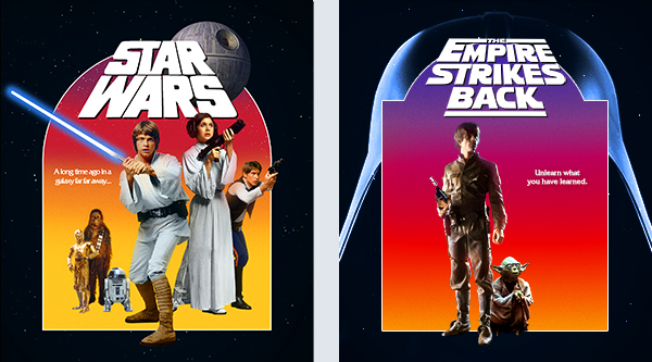
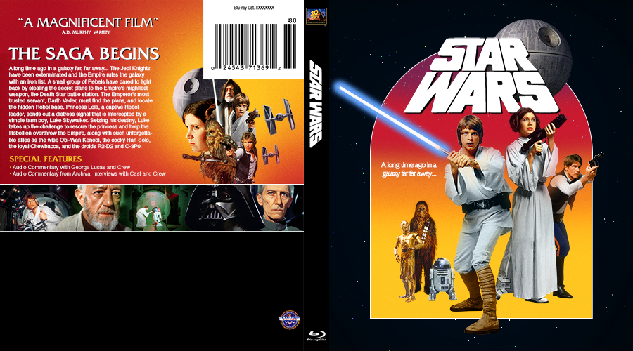
 I'm using the specs from the 3-pack original trilogy set: https://www.dvdempire.com/1563021/star-wars...gy-blu-ray.html This was my layout inspiration for the front. I will play with adding ships next and hair details. 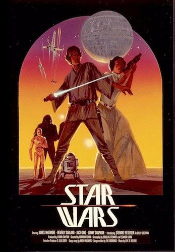 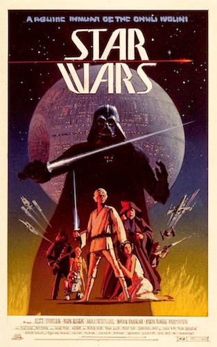 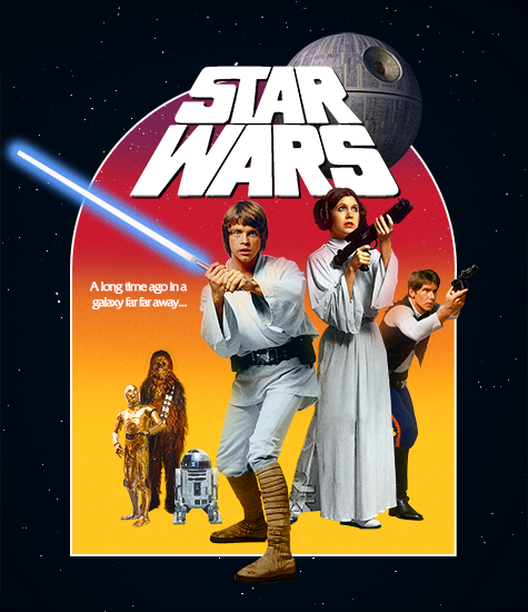  My gallery: HERE
|
   |
 
|
The Following 8 Users Say Thank You To Paris For This Post: Bazzah, ctaulbee, Darksaber, M0vieM0nster, Matush, sauron, Speedz0r, VincentLupo | |


4 Pages  1 2 3 > »
|
 
|
|
Replies
(1 - 62)
|
|
Nov 12 2017, 11:21 PM
Post
#2
|
|
  Group: Contributor Posts: 3,491 Coverart: 136 Thanks: 5254 From: United Kingdom Joined: May 22 2006 |
I really look forward to following this wip and seeing it progress! I am confident it will be awesome

|
|
|
|

|
Nov 12 2017, 11:24 PM
Post
#3
|
|
  Group: Root Admin Posts: 22,893 Coverart: 1,634 Thanks: 52577 From: Home Joined: May 3 2006 My Favorite Cover Designer: All HiRes designers |
Wow, I am loving this already
    |
|
|
|

|
Nov 13 2017, 12:48 AM
Post
#4
|
|
  Group: Moderator Posts: 2,959 Coverart: 212 Thanks: 13130 From: Olympia, Washington - U.S.A Joined: September 6 2007 |
Quite a project. Looking forward to seeing how it turns out.
|
|
|
|
|
Nov 13 2017, 07:09 AM
Post
#5
|
|
|
Group: Members Posts: 3,265 Coverart: 91 Thanks: 1039 Joined: September 19 2009 My Favorite Custom Cover: Friday the 13th by Samppa My Favorite Cover Designer: Euroboy, Samppa, Bunny Dojo |
A lot of work left to be done, but this is the direction for V.
My gallery: HERE
|
|
|
|
The Following 7 Users Say Thank You To Paris For This Post: Bazzah, ctaulbee, Darksaber, M0vieM0nster, Matush, Speedz0r, VincentLupo | |
|
Nov 13 2017, 09:57 PM
Post
#6
|
|
|
Group: Members Posts: 3,265 Coverart: 91 Thanks: 1039 Joined: September 19 2009 My Favorite Custom Cover: Friday the 13th by Samppa My Favorite Cover Designer: Euroboy, Samppa, Bunny Dojo |
Trying to capture the vibrant (bright montage over dark starry space), montage feel in A New Hope. This is the new direction. Still a lot to do before I get to cutting things out
My gallery: HERE
|
|
|
|
|
Nov 13 2017, 11:34 PM
Post
#7
|
|
 Group: Moderator Posts: 12,532 Coverart: 67 Thanks: 20282 From: United Kingdom Joined: May 14 2006 |
Wow! This is going to be an amazing set when completed.
|
|
|
|
|
Nov 14 2017, 12:23 PM
Post
#8
|
|
  Group: Cover Designer Posts: 13,830 Coverart: 564 Thanks: 12363 From: Denmark Joined: August 16 2007 My Favorite Custom Cover: To have and have not My Favorite Cover Designer: Tim Gengler |
Now you're talking! Love where this is going so far, Paris!
And BTW - huge congrats on making the official Imdb list! How awesome is that?!! A designer knows he has achieved perfection - not when there's nothing left to add - but when there's nothing left to take away - Antoine de Saint Exupéry |
|
|
|
The Following 4 Users Say Thank You To JollyRoger For This Post: Bazzah, ctaulbee, Matush, VincentLupo | |

|
Nov 15 2017, 08:27 AM
Post
#9
|
|
|
Group: Members Posts: 3,265 Coverart: 91 Thanks: 1039 Joined: September 19 2009 My Favorite Custom Cover: Friday the 13th by Samppa My Favorite Cover Designer: Euroboy, Samppa, Bunny Dojo |
Thank you guys!! I'm glad there's interest
And thanks, Jakob! It feels pretty good  I feel like i'm getting closer to what clicks on A New Hope - brighter composition with no awkward, negative black space and a strong TT that doesn't interfere with the composition. 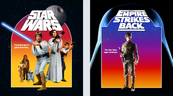 This post has been edited by Paris: Nov 15 2017, 08:42 AM My gallery: HERE
|
|
|
|
The Following 7 Users Say Thank You To Paris For This Post: Bazzah, chemnitzer, ctaulbee, Matush, sauron, Speedz0r, VincentLupo | |
|
Nov 15 2017, 11:10 AM
Post
#10
|
|
 Group: Members Posts: 479 Coverart: 43 Thanks: 1143 From: Switzerland Joined: August 12 2009 |
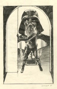
Agree with you, Paris. While the Darth Vader silhouette looks cool and menacing at the same time, there's a lot of black space. Vader's helmet is a neat idea.
Also, what exactly is that IMDB stuff you're both talking about? I wanna know!  This post has been edited by weyn: Nov 15 2017, 11:10 AM |
|
|
|
The Following 5 Users Say Thank You To weyn For This Post: Bazzah, ctaulbee, Matush, sauron, VincentLupo | |
|
Nov 15 2017, 12:13 PM
Post
#11
|
|
 Group: Members Posts: 4,140 Coverart: 54 Thanks: 1364 From: Portugal Joined: October 18 2006 My Favorite Cover Designer: ShokXoneStudios; BunnyDojo |
Well done kid! Great to see your name there!
This post has been edited by ctaulbee: Nov 15 2017, 02:58 PM
Reason for edit: Removed image and link.
Practice custom Blu-Ray covers, DVD covers and other stuff designs are displayed solely for the purpose of demonstrating design skills and are no way intended to infringe upon the copyrights of the owners of the respective images with which they were designed. Thank you for reading. |
|
|
|
The Following 5 Users Say Thank You To Arkflip For This Post: Bazzah, ctaulbee, Matush, VincentLupo, weyn | |
|
Nov 15 2017, 12:33 PM
Post
#12
|
|
|
Group: Root Admin Posts: 22,893 Coverart: 1,634 Thanks: 52577 From: Home Joined: May 3 2006 My Favorite Cover Designer: All HiRes designers |
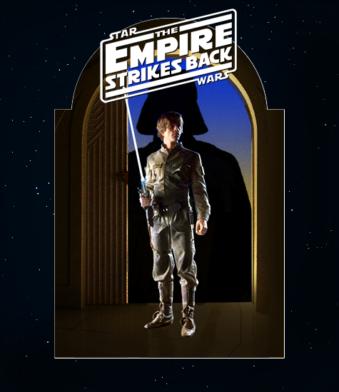
These look great! Maybe add some stars behind Vader on Empire Strikes Back?
And great stuff being IMDB famous
|
|
|
|
|
Nov 15 2017, 02:39 PM
Post
#13
|
|
|
Group: Members Posts: 3,265 Coverart: 91 Thanks: 1039 Joined: September 19 2009 My Favorite Custom Cover: Friday the 13th by Samppa My Favorite Cover Designer: Euroboy, Samppa, Bunny Dojo |
I actually don't wish to have my full name posted in the forums - I'd like it reserved for private on Facebook? Sorry guys
My gallery: HERE
|
|
|
|
The Following 5 Users Say Thank You To Paris For This Post: Bazzah, ctaulbee, Matush, sauron, VincentLupo | |
|
Nov 25 2017, 08:48 PM
Post
#14
|
|
|
Group: Members Posts: 3,265 Coverart: 91 Thanks: 1039 Joined: September 19 2009 My Favorite Custom Cover: Friday the 13th by Samppa My Favorite Cover Designer: Euroboy, Samppa, Bunny Dojo |
Small update
My gallery: HERE
|
|
|
|
The Following 6 Users Say Thank You To Paris For This Post: Bazzah, chemnitzer, M0vieM0nster, Matush, sauron, VincentLupo | |
|
Nov 26 2017, 02:57 AM
Post
#15
|
|
|
Group: Members Posts: 3,265 Coverart: 91 Thanks: 1039 Joined: September 19 2009 My Favorite Custom Cover: Friday the 13th by Samppa My Favorite Cover Designer: Euroboy, Samppa, Bunny Dojo |
Starting on the back layouts, still keeping things rough with no hair detail yet
Back montages are based off of these series of posters for the original trilogy. I'm thinking about doing a double-stills row 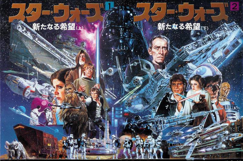 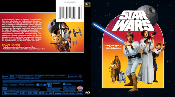 This post has been edited by Paris: Nov 26 2017, 03:31 AM My gallery: HERE
|
|
|
|
The Following 8 Users Say Thank You To Paris For This Post: Bazzah, chemnitzer, ctaulbee, JollyRoger, M0vieM0nster, Matush, sauron, VincentLupo | |
|
Nov 26 2017, 11:50 AM
Post
#16
|
|
|
Group: Root Admin Posts: 22,893 Coverart: 1,634 Thanks: 52577 From: Home Joined: May 3 2006 My Favorite Cover Designer: All HiRes designers |
Looking really good buddy
|
|
|
|
|
Nov 26 2017, 04:44 PM
Post
#17
|
|
 Group: Moderator Posts: 5,702 Coverart: 240 Thanks: 22377 From: Norway Joined: June 24 2006 |
Yeah, looking really good so far buddy
 Please keep my covers on this site and this site only! |
|
|
|
The Following 4 Users Say Thank You To Speedz0r For This Post: Bazzah, M0vieM0nster, Matush, VincentLupo | |
|
Nov 26 2017, 07:53 PM
Post
#18
|
|
|
Group: Contributor Posts: 3,491 Coverart: 136 Thanks: 5254 From: United Kingdom Joined: May 22 2006 |
I agree and i can't wait to see more
|
|
|
|
|
Nov 27 2017, 04:39 AM
Post
#19
|
|
|
Group: Members Posts: 3,265 Coverart: 91 Thanks: 1039 Joined: September 19 2009 My Favorite Custom Cover: Friday the 13th by Samppa My Favorite Cover Designer: Euroboy, Samppa, Bunny Dojo |
Thanks, fellas! Back update. still rough
 This post has been edited by Paris: Nov 27 2017, 04:41 AM My gallery: HERE
|
|
|
|
The Following 7 Users Say Thank You To Paris For This Post: Bazzah, chemnitzer, ctaulbee, M0vieM0nster, Matush, sauron, VincentLupo | |
|
Nov 27 2017, 05:20 PM
Post
#20
|
||
   Group: Master Designer Posts: 2,666 Coverart: 546 Thanks: 7137 Joined: July 22 2008 |
The mood you've created on these is incredible, and your back design seems to be heading in a very exciting direction.
 For the Star Wars front, maybe adding a tiny bit more structure would help bring everything together? If you made Carrie Fisher a little smaller, she would line up really nicely with Hamill and Ford. Maybe you could stylistically separate out the trio on the left? That might give you more elasticity on sizing -- right now, since they're in the same style and on the same plane as the Big Three, they look kind of like Lilliputians or toys by comparison. For example, maybe - 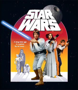 - or - - or - 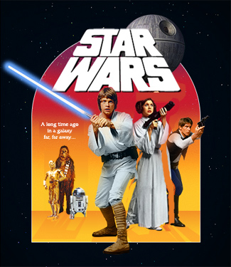 - ? - ?
|
|
|
|
|
|
The Following 7 Users Say Thank You To Bunny Dojo For This Post: Bazzah, ctaulbee, JollyRoger, M0vieM0nster, Matush, sauron, VincentLupo | ||
|
Nov 27 2017, 07:48 PM
Post
#21
|
|
|
Group: Moderator Posts: 12,532 Coverart: 67 Thanks: 20282 From: United Kingdom Joined: May 14 2006 |
Awesome update! Really like the fonts you have used as well.
|
|
|
|
|
Nov 28 2017, 12:55 AM
Post
#22
|
|
|
Group: Members Posts: 3,265 Coverart: 91 Thanks: 1039 Joined: September 19 2009 My Favorite Custom Cover: Friday the 13th by Samppa My Favorite Cover Designer: Euroboy, Samppa, Bunny Dojo |
Thanks for the perspective help, Tim!
I will definitely correct that and will experiment with the plane - I had trouble with that in the beginning, but the perspective shift should help! And thanks, Sauron! I'm trying to keep all fonts era appropriate
My gallery: HERE
|
|
|
|
The Following 5 Users Say Thank You To Paris For This Post: Bazzah, ctaulbee, Matush, sauron, VincentLupo | |
|
Nov 28 2017, 10:46 AM
Post
#23
|
|
|
Group: Moderator Posts: 5,702 Coverart: 240 Thanks: 22377 From: Norway Joined: June 24 2006 |
I think it's looking great
. Any chance you'll overlap the barcode with the fine montage on the back?
Please keep my covers on this site and this site only! |
|
|
|
The Following 4 Users Say Thank You To Speedz0r For This Post: Bazzah, ctaulbee, Matush, VincentLupo | |
|
Nov 28 2017, 12:22 PM
Post
#24
|
|
|
Group: Members Posts: 479 Coverart: 43 Thanks: 1143 From: Switzerland Joined: August 12 2009 |
That barcode is really huge! I'd make it smaller ^^
|
|
|
|
The Following 5 Users Say Thank You To weyn For This Post: Bazzah, ctaulbee, Fidi, Matush, VincentLupo | |
|
Nov 28 2017, 12:38 PM
Post
#25
|
|
 Group: Members Posts: 747 Coverart: 77 Thanks: 359 Joined: August 17 2013 My Favorite Cover Designer: Antistatic & ctaulbee |
Personally I love the back and spine but I think the front needs work. it doesn't tell me right away Star Wars or action adventure space opera.
Dunno. Just my opinion. |
|
|
|
|
Nov 28 2017, 01:40 PM
Post
#26
|
|
|
Group: Root Admin Posts: 22,893 Coverart: 1,634 Thanks: 52577 From: Home Joined: May 3 2006 My Favorite Cover Designer: All HiRes designers |
QUOTE (alienmem @ Nov 28 2017, 12:38 PM)  Personally I love the back and spine but I think the front needs work. it doesn't tell me right away Star Wars or action adventure space opera. Dunno. Just my opinion. |
|
|
|
The Following 6 Users Say Thank You To Bazzah For This Post: ctaulbee, Fidi, M0vieM0nster, Matush, sauron, VincentLupo | |
|
Nov 28 2017, 04:36 PM
Post
#27
|
|
|
Group: Members Posts: 4,140 Coverart: 54 Thanks: 1364 From: Portugal Joined: October 18 2006 My Favorite Cover Designer: ShokXoneStudios; BunnyDojo |
QUOTE (weyn @ Nov 28 2017, 01:22 PM) That barcode is really huge! I'd make it smaller ^^ Not sure if Paris are willing to change it, it's the same used on the retail and you know that he (like me and a few others) always do retail style
Practice custom Blu-Ray covers, DVD covers and other stuff designs are displayed solely for the purpose of demonstrating design skills and are no way intended to infringe upon the copyrights of the owners of the respective images with which they were designed. Thank you for reading. |
|
|
|
The Following 6 Users Say Thank You To Arkflip For This Post: ctaulbee, Fidi, M0vieM0nster, Matush, sauron, VincentLupo | |
|
Nov 28 2017, 05:36 PM
Post
#28
|
|
|
Group: Members Posts: 747 Coverart: 77 Thanks: 359 Joined: August 17 2013 My Favorite Cover Designer: Antistatic & ctaulbee |
QUOTE (Bazzah @ Nov 28 2017, 02:40 PM) Maybe I should rephrase as I wasn't accurate. I don't find the front exciting enough. Looks bland. Also that yellow and red is not to my likeing. |
|
|
|
The Following 1 Users Say Thank You To alienmem For This Post: VincentLupo | |
|
Nov 28 2017, 05:51 PM
Post
#29
|
|
|
Group: Root Admin Posts: 22,893 Coverart: 1,634 Thanks: 52577 From: Home Joined: May 3 2006 My Favorite Cover Designer: All HiRes designers |
QUOTE (alienmem @ Nov 28 2017, 05:36 PM) Maybe I should rephrase as I wasn't accurate. I don't find the front exciting enough. Looks bland. Also that yellow and red is not to my likeing. Well, I guess it isn't as exciting as your comments are |
|
|
|
The Following 5 Users Say Thank You To Bazzah For This Post: Fidi, M0vieM0nster, Matush, sauron, VincentLupo | |
|
Nov 28 2017, 06:06 PM
Post
#30
|
||||
 Group: Master Designer Posts: 3,060 Coverart: 404 Thanks: 8527 From: Germany Joined: June 13 2013 My Favorite Custom Cover: van Helsing by Bunny Dojo |
QUOTE (Bazzah @ Nov 28 2017, 07:51 PM) Well, I guess it isn't as exciting as your comments are Nothing ever will be. 
|
|||
|
|
|
|||
The Following 4 Users Say Thank You To Fidi For This Post: Bazzah, M0vieM0nster, Matush, VincentLupo | ||||

|
Nov 28 2017, 07:44 PM
Post
#31
|
|
|
Group: Members Posts: 3,265 Coverart: 91 Thanks: 1039 Joined: September 19 2009 My Favorite Custom Cover: Friday the 13th by Samppa My Favorite Cover Designer: Euroboy, Samppa, Bunny Dojo |
QUOTE (alienmem @ Nov 28 2017, 11:36 AM) Maybe I should rephrase as I wasn't accurate. I don't find the front exciting enough. Looks bland. Also that yellow and red is not to my likeing. That's very fair criticism All of the retail VHS/DVD covers feature an exciting montage with a blue color theme with ships in dynamic positions and brilliant star streaks on the artwork.    Does this get closer to that exciting space opera feel? I'll add little jet streams like the retail poster soon.  This post has been edited by Paris: Nov 28 2017, 08:00 PM My gallery: HERE
|
|
|
|
|
Nov 28 2017, 07:53 PM
Post
#32
|
|
|
Group: Members Posts: 3,265 Coverart: 91 Thanks: 1039 Joined: September 19 2009 My Favorite Custom Cover: Friday the 13th by Samppa My Favorite Cover Designer: Euroboy, Samppa, Bunny Dojo |
QUOTE (weyn @ Nov 28 2017, 06:22 AM) That barcode is really huge! I'd make it smaller ^^ Sorry, mate! I'm sticking with the retail style on all of my covers My gallery: HERE
|
|
|
|
The Following 5 Users Say Thank You To Paris For This Post: Bazzah, ctaulbee, Matush, sauron, VincentLupo | |
|
Nov 28 2017, 07:57 PM
Post
#33
|
|
|
Group: Root Admin Posts: 22,893 Coverart: 1,634 Thanks: 52577 From: Home Joined: May 3 2006 My Favorite Cover Designer: All HiRes designers |
The x-wings look really exciting Paris
Great additions
|
|
|
|
|
Nov 28 2017, 10:51 PM
Post
#34
|
|
|
Group: Members Posts: 479 Coverart: 43 Thanks: 1143 From: Switzerland Joined: August 12 2009 |
Ok I get that you're sticking to the retail style. But does that include keeping the barcode 1:1 when it's huge AF? In my opinion it just takes too much space to the disadvantage of the awesome collage just below.
This post has been edited by weyn: Nov 28 2017, 10:52 PM |
|
|
|
|
Nov 28 2017, 11:22 PM
Post
#35
|
|
|
Group: Moderator Posts: 12,532 Coverart: 67 Thanks: 20282 From: United Kingdom Joined: May 14 2006 |
Xwings look great! Are you going to match the off-black colour of the front on the spine and back?
|
|
|
|
|
Nov 28 2017, 11:48 PM
Post
#36
|
|
|
Group: Members Posts: 747 Coverart: 77 Thanks: 359 Joined: August 17 2013 My Favorite Cover Designer: Antistatic & ctaulbee |
Guys. I know It can sound like I was criticising just to bash on the cover but it is and was not my intention.
It is a WIP and I know some may take it as direspectful but I really think adding more elements like you did Paris will make it better. Obviously Paris is an amazing designer. Doesn't need lessons from anyone. I'm just expressing my opinion and I think with adding elements to the background maybe some of those colorful motion blurs behind some ships and what not, it'll give it more of a grandiose exciting front. Please don't take it the wrong way. I think the sets are gonna be great. just wanted to take a risk and help with the progress. Oh and thank bazz and Fidi, I know I'm a very exciting guy!! This post has been edited by alienmem: Nov 28 2017, 11:48 PM |
|
|
|
|
Nov 29 2017, 06:59 AM
Post
#37
|
||||
|
Group: Master Designer Posts: 3,060 Coverart: 404 Thanks: 8527 From: Germany Joined: June 13 2013 My Favorite Custom Cover: van Helsing by Bunny Dojo |
You could add some laser shots to Ford's and Fisher's guns since they have their fingers on the trigger? Some on the back with Hamil & Ford.
The lightsabers are activated so I think it would make sense if the guys with the guns are using them. I also like what you did on your stills, the big heads of Vader & Obi Wan nearly looking to each other and the smaller images of Luke and Leia with a clearly visible background behind them between the big heads. But I think Tarkin looks a bit out of place at the moment, he somehow destroys the consistency. Could you reduce his size to match him with Luke on the left so we still can see some more of the background or even change the image if it's not working with this one? |
|||
|
|
|
|||
The Following 5 Users Say Thank You To Fidi For This Post: Bazzah, ctaulbee, Matush, Speedz0r, VincentLupo | ||||
|
Dec 4 2017, 07:16 AM
Post
#38
|
|
 Group: Members Posts: 213 Coverart: 1 Thanks: 814 From: Australia Joined: January 2 2011 My Favorite Cover Designer: Kernie and tmscrapbook |
Front: like what you've being doing with the front,not too sure on luke's foot sticking out onto nothing though,50/50 on that.
Spine: should have stars in background on that,would look better Back: looking good so far,if your having credits and icons along bottom maybe stars behind them too,keep the theme all through the whole cover,i honestly agree with the barcode thing,makes covers look sh*t in my opinion especially that big, but if your trying keep it looking retail and all not much you can do about that or if you dont want to remove it and end of the day.. it's your baby,you're the one making it so it's whatever you want to do to your work of art.Hope to see progress,hope to see what you come up with whole trilogy sets.  |
|
|
|
|
Feb 26 2018, 08:13 PM
Post
#39
|
|
|
Group: Members Posts: 3,265 Coverart: 91 Thanks: 1039 Joined: September 19 2009 My Favorite Custom Cover: Friday the 13th by Samppa My Favorite Cover Designer: Euroboy, Samppa, Bunny Dojo |
Sorry guys, I won't revive the age-old barcode debate in the thread.
I was waiting until I had the perfect ideas for V and VI because it's finally a chance for me to make the definitive Original Trilogy set for the site (Cirus and Matush set the bar really high )Alienmem's comments were in the right direction - the covers should feel more epic. I'm studying more of what makes an appealing montage and have been looking at a lot of Sturzan. With this cover, I'm using light effects to make Jedi's live action stills feel close to a painted poster without having to literally use paint filters in photoshop. It's still feeling a little "photoshoppy" so I was wondering if anyone could help me point out why I know a lot of painted posters don't have deep values, but I'm sure I'm missing something else...Things to do: - Finish cutouts - Finish painting out watermarks - Add sleeve to Han's arm - Paint some highlights out of Vader's hemet IV is still on pause, but I will add to it soon. 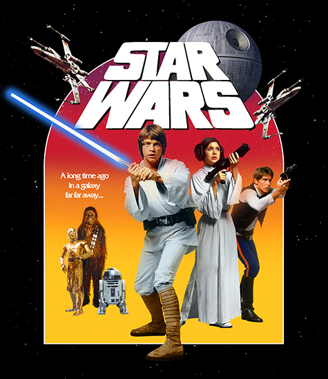 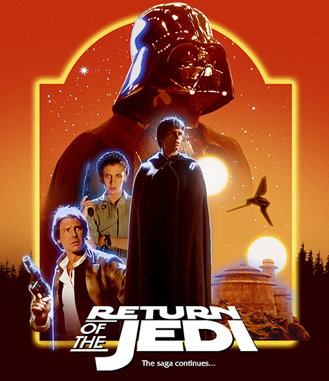
My gallery: HERE
|
|
|
|
The Following 6 Users Say Thank You To Paris For This Post: ctaulbee, joelazza, M0vieM0nster, Matush, Speedz0r, VincentLupo | |
|
Feb 26 2018, 08:14 PM
Post
#40
|
|
|
Group: Members Posts: 3,265 Coverart: 91 Thanks: 1039 Joined: September 19 2009 My Favorite Custom Cover: Friday the 13th by Samppa My Favorite Cover Designer: Euroboy, Samppa, Bunny Dojo |
Inspiration and some of the resources
My gallery: HERE
|
|
|
|
|
Feb 26 2018, 08:39 PM
Post
#41
|
|
|
Group: Moderator Posts: 5,702 Coverart: 240 Thanks: 22377 From: Norway Joined: June 24 2006 |
Great work so far! Love the blue glow on the characters on the right one
Please keep my covers on this site and this site only! |
|
|
|
The Following 4 Users Say Thank You To Speedz0r For This Post: Bazzah, ctaulbee, Matush, VincentLupo | |
|
Feb 26 2018, 08:54 PM
Post
#42
|
|
 Group: Master Designer Posts: 1,074 Coverart: 376 Thanks: 1853 From: Poland Joined: November 29 2008 My Favorite Custom Cover: many... |
Great work for me m8, I can not wait to finish. I have no suggestion at this moment sorry
QUOTE (venome @ Aug 21 2012, 12:20 AM) Mat this stunning work m8, wish it were mine :P |
|
|
|
|
Feb 26 2018, 08:57 PM
Post
#43
|
|
|
Group: Contributor Posts: 3,491 Coverart: 136 Thanks: 5254 From: United Kingdom Joined: May 22 2006 |
Where the blue light is coming from? Really impressive work so far
i see it's the way you've done it based on the inspiration but just my 2 cents. Will you add a star wars TT?This post has been edited by M0vieM0nster: Feb 26 2018, 09:04 PM |
|
|
|
The Following 4 Users Say Thank You To M0vieM0nster For This Post: Bazzah, ctaulbee, Matush, VincentLupo | |
|
Feb 26 2018, 09:26 PM
Post
#44
|
|
|
Group: Members Posts: 3,265 Coverart: 91 Thanks: 1039 Joined: September 19 2009 My Favorite Custom Cover: Friday the 13th by Samppa My Favorite Cover Designer: Euroboy, Samppa, Bunny Dojo |
Thanks, all!
The blue light is needed to add cool/warm contrast. Without it, the composition would be as appealing? And thanks, Movie! I'll def add the Star Wars title about the current TT to match the retail My gallery: HERE
|
|
|
|
|
Feb 26 2018, 10:21 PM
Post
#45
|
|
|
Group: Contributor Posts: 3,491 Coverart: 136 Thanks: 5254 From: United Kingdom Joined: May 22 2006 |
Some subtle stars outside the frame?
|
|
|
|
The Following 4 Users Say Thank You To M0vieM0nster For This Post: Bazzah, ctaulbee, Matush, VincentLupo | |
|
Feb 26 2018, 11:15 PM
Post
#46
|
||
|
Group: Master Designer Posts: 2,666 Coverart: 546 Thanks: 7137 Joined: July 22 2008 |
QUOTE (Paris @ Feb 26 2018, 04:13 PM) It's still feeling a little "photoshoppy" so I was wondering if anyone could help me point out why Exciting work, Paris! Nothing jumps out as needing to be changed, but here are a bunch of small "maybes" for potential adjustments to see if they help: Could it be a matter of the lighting? Mark Hamill and Darth Vader look very close to the desired effect, but Carrie Fisher is a bit flatly lit (like a regular photo, rather than an "epic" portrait). On the right, too, the buildings are a bit flat (otherwise, the right side of the cover is darn-outstanding). Likewise, maybe tighten up the color palette even a tiny bit further, to get the green out of Carrie Fisher's top? Along with the overall outline glow, it seems like Sturzan enjoys adding little bursts of light; maybe some additional small pings would further enhance your effect? For the background treeline, perhaps add a very slight gradient lightning the bottom? It might be worth playing with the black hues under Selective Color to give the darkness a slight blue-purple tint? Also, the title treatment is almost definitely contributing to the "photoshoppy" feeling you mentioned. I think you need to work your magic there -- either in losing the perspective, changing from plain white text, or adding some sort of interaction with the composition. I hope something in there is helpful and look forward to seeing where you head with this one and the series as a whole 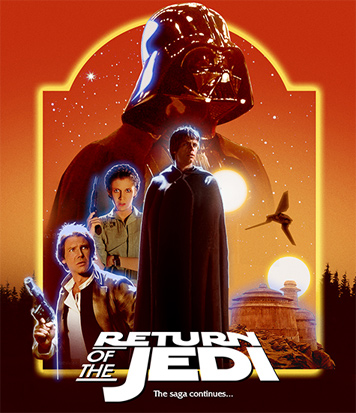 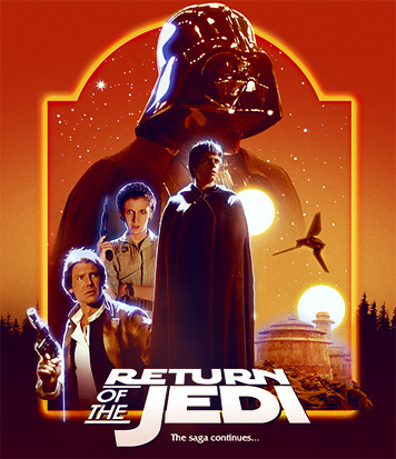
|
|
|
|
|
|
The Following 9 Users Say Thank You To Bunny Dojo For This Post: Bazzah, Bozzy, ctaulbee, M0vieM0nster, Matush, Paris, sauron, Speedz0r, VincentLupo | ||
|
Feb 27 2018, 10:21 AM
Post
#47
|
|
|
Group: Root Admin Posts: 22,893 Coverart: 1,634 Thanks: 52577 From: Home Joined: May 3 2006 My Favorite Cover Designer: All HiRes designers |
Beautiful work, but... I too find the blue glow a little unnatural. Also, it feels a little off-balance with so many characters on the left side?
|
|
|
|
|
Feb 27 2018, 09:22 PM
Post
#48
|
|
|
Group: Members Posts: 3,265 Coverart: 91 Thanks: 1039 Joined: September 19 2009 My Favorite Custom Cover: Friday the 13th by Samppa My Favorite Cover Designer: Euroboy, Samppa, Bunny Dojo |
Thanks again, Bunny! I played with your suggestions and they really helped!. And I tried better integrating the TT by adding color unity to the composition and having it better echo the composition structure.
Thanks for the feedback, Bazz! I think I'm going to stick with the blue because of the color contrast. And I went back and forth on the layout weight because I was also unsure about it. But I then added the dark shuttle against the bright sky and thought it provided the needed balance? (IV included for continuity ref. I'll add white rim lights soon as well as other additions)  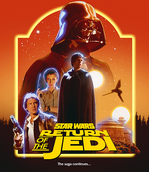
My gallery: HERE
|
|
|
|
The Following 5 Users Say Thank You To Paris For This Post: Bazzah, ctaulbee, M0vieM0nster, Matush, VincentLupo | |
|
Feb 28 2018, 12:06 PM
Post
#49
|
||||
|
Group: Master Designer Posts: 3,060 Coverart: 404 Thanks: 8527 From: Germany Joined: June 13 2013 My Favorite Custom Cover: van Helsing by Bunny Dojo |
I like what you've done, grat layout and choice of images. I don't think it's off-balance as well with the buildings and the shuttle.
But I agree abut the blue glow. In my opinion it's not fitting the warm colors and most important the blue glow around characters in Star Wars stands for the force ghosts. Of course not the same color but very similar. And neither of them is a force ghost in Episode VI. ^^ Han's hand holding the gun isn't working for me as well. Somehow it's obvious looking fake. It's too big I think and should be placed higher. |
|||
|
|
|
|||
|
Feb 28 2018, 12:34 PM
Post
#50
|
|
|
Group: Members Posts: 3,265 Coverart: 91 Thanks: 1039 Joined: September 19 2009 My Favorite Custom Cover: Friday the 13th by Samppa My Favorite Cover Designer: Euroboy, Samppa, Bunny Dojo |
Thanks for the note on Han's hand placement. The image isn't cut out and no color matching has been done on his arm.
I started on Empire and I have a better idea on where I want the series to go. And VI is staring to look like an a little too complex... I'll walk IV closer is Struzan style and that should hopefully make these feel closer. And I'll add more elements to the bottom of Empire to make it a more pleasing composition. (Sorry guy, I think that one might have blue outlines too  ) ) 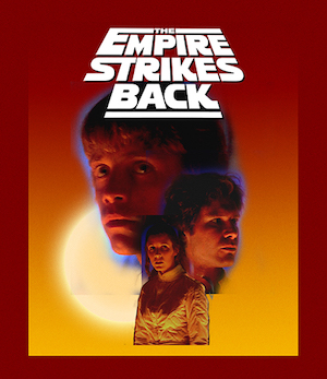 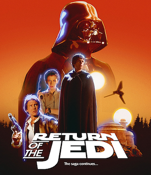 This post has been edited by Paris: Feb 28 2018, 08:16 PM My gallery: HERE
|
|
|
|
The Following 5 Users Say Thank You To Paris For This Post: Bazzah, ctaulbee, M0vieM0nster, Matush, VincentLupo | |
|
Feb 28 2018, 01:00 PM
Post
#51
|
|
|
Group: Root Admin Posts: 22,893 Coverart: 1,634 Thanks: 52577 From: Home Joined: May 3 2006 My Favorite Cover Designer: All HiRes designers |
These are looking like they are going to be an excellent set
|
|
|
|
|
Feb 28 2018, 07:33 PM
Post
#52
|
|
|
Group: Members Posts: 3,265 Coverart: 91 Thanks: 1039 Joined: September 19 2009 My Favorite Custom Cover: Friday the 13th by Samppa My Favorite Cover Designer: Euroboy, Samppa, Bunny Dojo |
Thanks, Bazz!
I'm going to tweak Jedi to make it more like a montage with a better hierarchy. The good thing about this cover set is that I'm learning more about montage as I go along, but that's also the bad part haha. My gallery: HERE
|
|
|
|
The Following 6 Users Say Thank You To Paris For This Post: Bazzah, ctaulbee, M0vieM0nster, Matush, sauron, VincentLupo | |
|
Feb 28 2018, 09:35 PM
Post
#53
|
|
|
Group: Members Posts: 3,265 Coverart: 91 Thanks: 1039 Joined: September 19 2009 My Favorite Custom Cover: Friday the 13th by Samppa My Favorite Cover Designer: Euroboy, Samppa, Bunny Dojo |
I need a greater contrast in character sizes for Jedi
My gallery: HERE
|
|
|
|
|
May 6 2018, 07:10 PM
Post
#54
|
|
|
Group: Members Posts: 3,265 Coverart: 91 Thanks: 1039 Joined: September 19 2009 My Favorite Custom Cover: Friday the 13th by Samppa My Favorite Cover Designer: Euroboy, Samppa, Bunny Dojo |
A rough new direction. I haven't focused on hair, color or edges until I have a final direction, but this is close.
I'm trying to get these two covers to live in the same world and feel like a set. Princess Leia isn't integrated with color or lighting so she feels a little "photoshopy". Adding light wrap or rim light to her head will help her sit in a little better. It's a very fine line between plausible Star Wars retail montage and fan art , so this one has been tough to get right. Luke and Yoda are in the direction I want to go: • basic, dramatic lighting with no lighting effects • lifted black levels • detail in dark areas • hires, sharpened images to give the feeling of it being painted 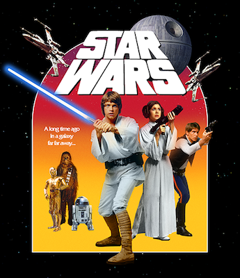 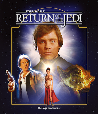
My gallery: HERE
|
|
|
|
|
May 6 2018, 07:19 PM
Post
#55
|
|||
|
Group: Members Posts: 3,265 Coverart: 91 Thanks: 1039 Joined: September 19 2009 My Favorite Custom Cover: Friday the 13th by Samppa My Favorite Cover Designer: Euroboy, Samppa, Bunny Dojo |
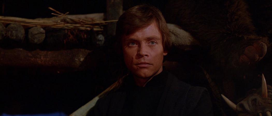
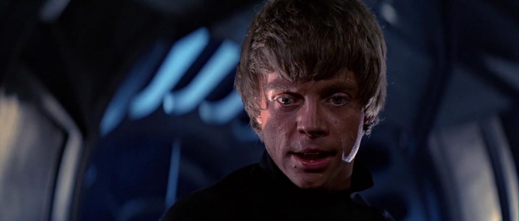
I also tried a technique I think will be my new "go-to" for improving lighting. Adding lighting is not difficult, except hair. Light interacts differently with hair making it hard to paint light on someone's hair convincingly. So I pasted Luke's rim lighting from image 1 to image 2 for the cover
This post has been edited by Paris: May 6 2018, 07:20 PM My gallery: HERE
|
||
|
|
|
||
|
May 6 2018, 07:25 PM
Post
#56
|
|
|
Group: Root Admin Posts: 22,893 Coverart: 1,634 Thanks: 52577 From: Home Joined: May 3 2006 My Favorite Cover Designer: All HiRes designers |
I like where this is going. How about having both of the frames the same?
|
|
|
|
|
May 6 2018, 09:14 PM
Post
#57
|
|
|
Group: Members Posts: 3,265 Coverart: 91 Thanks: 1039 Joined: September 19 2009 My Favorite Custom Cover: Friday the 13th by Samppa My Favorite Cover Designer: Euroboy, Samppa, Bunny Dojo |
Thanks, I'll look into that!
Update with better integration. Yoda is not fitting in at the moment   This post has been edited by Paris: May 6 2018, 09:25 PM My gallery: HERE
|
|
|
|
|
May 6 2018, 10:25 PM
Post
#58
|
|
|
Group: Members Posts: 3,265 Coverart: 91 Thanks: 1039 Joined: September 19 2009 My Favorite Custom Cover: Friday the 13th by Samppa My Favorite Cover Designer: Euroboy, Samppa, Bunny Dojo |
more character blocking. For the top half, I'll add some ships or Struzan shooting stars
  This post has been edited by Paris: May 6 2018, 10:30 PM My gallery: HERE
|
|
|
|
The Following 5 Users Say Thank You To Paris For This Post: Bazzah, ctaulbee, Matush, Speedz0r, VincentLupo | |
|
May 7 2018, 10:13 AM
Post
#59
|
|
|
Group: Members Posts: 479 Coverart: 43 Thanks: 1143 From: Switzerland Joined: August 12 2009 |
Neat idea for the hair! As you said, hair lighting is very difficult because technically you would have to break it down to lighting single hairs.
This post has been edited by weyn: May 7 2018, 10:25 AM |
|
|
|
|
Oct 4 2018, 09:45 AM
Post
#60
|
|
|
Group: Members Posts: 3,265 Coverart: 91 Thanks: 1039 Joined: September 19 2009 My Favorite Custom Cover: Friday the 13th by Samppa My Favorite Cover Designer: Euroboy, Samppa, Bunny Dojo |
After Spy, I went back to studying Struzan to get a better sense of what makes a good montage and what makes his work unique.
http://www.drewstruzan.com/illustrated/portfolio/?type=mp I came away with some new insights: - keep dark values light - keep light values dark - lean towards desaturated not vibrant - use "light wrap" from the background color if brighter than character - mix positive space with negative space Still rough. There's a lot of in progress assets. I have to make parts of the image more painterly and Luke's body (a painting from a trading card) more realistic. New version: 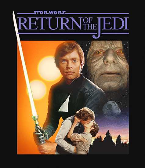 edit: deleted older image because it was confused as the new version. This post has been edited by Paris: Oct 4 2018, 02:54 PM My gallery: HERE
|
|
|
|
The Following 8 Users Say Thank You To Paris For This Post: Bazzah, ctaulbee, JollyRoger, M0vieM0nster, M0vieM0nster, Matush, sauron, VincentLupo | |
|
Oct 4 2018, 02:13 PM
Post
#61
|
|
|
Group: Cover Designer Posts: 13,830 Coverart: 564 Thanks: 12363 From: Denmark Joined: August 16 2007 My Favorite Custom Cover: To have and have not My Favorite Cover Designer: Tim Gengler |
Excellent layout!!
A little too much blue lighting IMO tho, I'd turn it down a tad. Han's hand holding the gun looks a little too big, and maybe placed a little low? A designer knows he has achieved perfection - not when there's nothing left to add - but when there's nothing left to take away - Antoine de Saint Exupéry |
|
|
|
The Following 4 Users Say Thank You To JollyRoger For This Post: Bazzah, ctaulbee, Matush, VincentLupo | |
|
Oct 4 2018, 02:36 PM
Post
#62
|
|
|
Group: Members Posts: 3,265 Coverart: 91 Thanks: 1039 Joined: September 19 2009 My Favorite Custom Cover: Friday the 13th by Samppa My Favorite Cover Designer: Euroboy, Samppa, Bunny Dojo |
I updated my post, JR
My gallery: HERE
|
|
|
|
|
Oct 4 2018, 02:57 PM
Post
#63
|
|
|
Group: Cover Designer Posts: 13,830 Coverart: 564 Thanks: 12363 From: Denmark Joined: August 16 2007 My Favorite Custom Cover: To have and have not My Favorite Cover Designer: Tim Gengler |
lol, see that now
Liking it; maybe work some more on the emperor? His skin looks a little like plastic. The layout itself is great! This post has been edited by JollyRoger: Oct 4 2018, 02:57 PM A designer knows he has achieved perfection - not when there's nothing left to add - but when there's nothing left to take away - Antoine de Saint Exupéry |
|
|
|
The Following 4 Users Say Thank You To JollyRoger For This Post: Bazzah, ctaulbee, Matush, VincentLupo | |
|
|
1 User(s) are reading this topic (1 Guests and 0 Anonymous Users)
| 0 Members: | ||||
|
||||
|
|
| The Artwork hosted on this site is for personal use only. We do not condone piracy and we do not supply images for use in any illegal activities, including DVD or Blu-ray piracy. | ||||
| Time is now: 13th October 2025 - 06:17 PM | Gallery Index | Privacy policy | Lo-Fi Version | 
|
Copyright © 2006 - 2025 by HiResCovers.net