


Welcome to HiResCovers.NET
|
| |||||||||||||
|
||||||||||||||
|
|
| |||
|
||||
|
| |||||||||||||||||
|
||||||||||||||||||
|
| |||||||||||||||||||||||||
|
||||||||||||||||||||||||||
|
|
| |||
|
||||
 Loading tabs, please wait...
abcdefghijklmnopqrstuvwxyzABCDEFGHIJKLMNOPQRSTUVWXYZ
|
|

Welcome Guest, Register to Remove this Message!
|
Welcome to the highest quality Custom DVD, Blu-ray and Ultra-HD 4k cover art, available anywhere in the world. Please register, or log in, to browse our site. • Almost 200,000 300 dpi high quality images • Moderated uploads, to ensure the highest quality possible. • A forum for artwork requests, help designing cover art and much more • If you cannot find the movie you need, simply create a request for it to be created and uploaded to the gallery. • A section of Design Assets, including templates, logos and fonts. |
Guest Message © 2025 Dev Fuse

|
|
 
|
 Aug 29 2020, 01:45 AM Aug 29 2020, 01:45 AM
Post
#1
|
|
  Group: Members Posts: 479 Coverart: 43 Thanks: 1143 From: Switzerland Joined: August 12 2009 |
After my Rear Window cover I rewatched some old Hitchcock flicks and wanted to keep the creative flow going
 I'm kicking off this thread with North by Northwest. The next one will probably be Psycho just to be in time for the 60th Anniversary Edition release next month, eventually followed by The Man Who Knew Too Much. 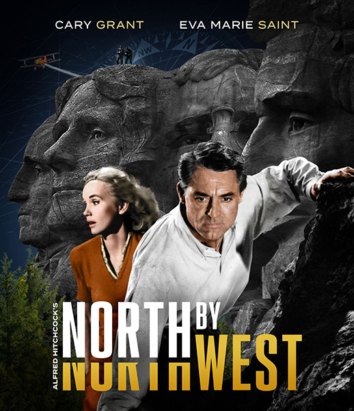 Note that the current state of the front key art is intermediate at best but you get a general idea of the layout. In particular I'm wondering if the TT works like that. This post has been edited by weyn: Aug 29 2020, 01:46 AM |
   |
 
|


|
Aug 29 2020, 06:48 AM
Post
#2
|
|
  Group: Moderator Posts: 5,702 Coverart: 240 Thanks: 22382 From: Norway Joined: June 24 2006 |
Fantastic work so far, I have nothing to add. Awesome work on the TT imo, very creative

  Please keep my covers on this site and this site only! |
|
|
|
The Following 4 Users Say Thank You To Speedz0r For This Post: Bazzah, ctaulbee, sauron, VincentLupo | |


|
Aug 29 2020, 08:49 AM
Post
#3
|
|
 Group: Members Posts: 3,265 Coverart: 91 Thanks: 1039 Joined: September 19 2009 My Favorite Custom Cover: Friday the 13th by Samppa My Favorite Cover Designer: Euroboy, Samppa, Bunny Dojo |
nice start!
- there's no character my eye really settles on- too many different eye lines from actors and monuments. Change Cary Grant's eyes to be looking at the camera to give the viewer some stability in what could be a busy image - There's way too much going on in the composition - a lot of good pieces, but too much together. Simplify with depth of field - blur out the background, and maybe find a different image of the monuments for a clearer, wider image - feels like clip art with the sharp details? Blur with depth of field should help. Remove the guys on the top of Jefferson, and maybe find a different way to put in the plane? it's not flowing with the composition atm - Also I think what could help unify the cover is lighting? The light on the fg and bg are both very neutral, and it's not reading as "night" to me, seems uncanny. There's an amazing Casablanca cover in the HRC that has great use of colored rim light. I think blue rim light and warm key lights would be the way to go to sell night and bring these images together? My gallery: HERE
|
|
|
|
The Following 5 Users Say Thank You To Paris For This Post: Bazzah, ctaulbee, sauron, Speedz0r, VincentLupo | |
|
Aug 29 2020, 09:32 AM
Post
#4
|
|
  Group: Root Admin Posts: 22,894 Coverart: 1,634 Thanks: 52597 From: Home Joined: May 3 2006 My Favorite Cover Designer: All HiRes designers |
Excellent layout and I really like the title too. I am sure when you have finished with the imagery, it will look as good as they always do
    |
|
|
|
The Following 4 Users Say Thank You To Bazzah For This Post: ctaulbee, sauron, Speedz0r, VincentLupo | |
|
Aug 31 2020, 03:57 PM
Post
#5
|
|
|
Group: Members Posts: 48 Thanks: 99 Joined: October 27 2012 |
love this so far!
|
|
|
|
The Following 5 Users Say Thank You To yodamjh For This Post: Bazzah, ctaulbee, sauron, Speedz0r, VincentLupo | |
|
Sep 3 2020, 01:25 AM
Post
#6
|
|
|
Group: Members Posts: 479 Coverart: 43 Thanks: 1143 From: Switzerland Joined: August 12 2009 |
Thanks for all the inputs, especially Paris.
Ditched the airplane (will save it for the back), rearranged almost every single element on the front, enhanced the Mount Rushmore images thanks to AI, added a full moon and started with rim lights and color grading. For now I set everything in a blue hue. I'm thinking about a 2nd color, probably a complementary to the blue. I'll also try to change his eyes as suggested so that Grant is looking directly into the camera. 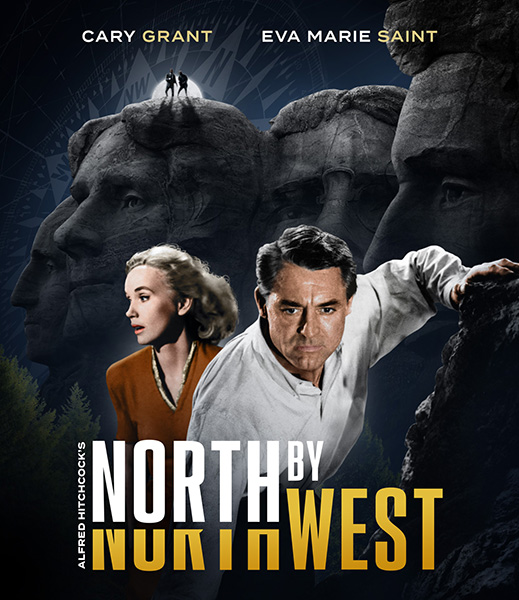
|
|
|
|
The Following 6 Users Say Thank You To weyn For This Post: Bazzah, ctaulbee, M0vieM0nster, sauron, Speedz0r, VincentLupo | |
|
Sep 3 2020, 01:27 AM
Post
#7
|
|
  Group: Contributor Posts: 3,491 Coverart: 136 Thanks: 5254 From: United Kingdom Joined: May 22 2006 |
Looking a lot better now and well i think we're all pretty sure the final cover will be awesome
 This post has been edited by M0vieM0nster: Sep 3 2020, 01:28 AM |
|
|
|
The Following 5 Users Say Thank You To M0vieM0nster For This Post: Bazzah, ctaulbee, sauron, Speedz0r, VincentLupo | |
|
Sep 3 2020, 10:41 AM
Post
#8
|
|
|
Group: Root Admin Posts: 22,894 Coverart: 1,634 Thanks: 52597 From: Home Joined: May 3 2006 My Favorite Cover Designer: All HiRes designers |
Awesome update buddy. And that moon is a really nice addition. I also like the new compass. I love the way you have reduced the background details to enhance the main characters as the focal point, but do you think it would work if you brought some of the details back in a little bit? For example, the trees and Mount Rushmore look like they have lost too much detail to me. Or would that ruin the focal point you have created?
|
|
|
|
The Following 4 Users Say Thank You To Bazzah For This Post: ctaulbee, sauron, Speedz0r, VincentLupo | |
|
Sep 4 2020, 09:03 PM
Post
#9
|
|
|
Group: Members Posts: 3,265 Coverart: 91 Thanks: 1039 Joined: September 19 2009 My Favorite Custom Cover: Friday the 13th by Samppa My Favorite Cover Designer: Euroboy, Samppa, Bunny Dojo |
Good update! Maybe push the night look a little more? And make Cary a little more front and center - Eve may need an image of her also looking at camera? There are already two giant heads looking to the left, and it feels odd to also have her look left.
My gallery: HERE
|
|
|
|
The Following 7 Users Say Thank You To Paris For This Post: Bazzah, ctaulbee, JustG1701, M0vieM0nster, sauron, Speedz0r, VincentLupo | |
|
Sep 21 2020, 11:30 PM
Post
#10
|
|
|
Group: Members Posts: 479 Coverart: 43 Thanks: 1143 From: Switzerland Joined: August 12 2009 |
Will post an update soon. I like the idea with the boosted tones, especially blue. I'll also try to find a shot of Marie Saint where she faces in another direction, possibly towards the camera. Not so sure about the enlarged Cary Grant. Don't wanna cover the Rushmore heads too much. It was already a pain in the a$$ to arrange them properly beforehand.
|
|
|
|
The Following 5 Users Say Thank You To weyn For This Post: Bazzah, ctaulbee, sauron, Speedz0r, VincentLupo | |
|
Nov 5 2020, 09:55 PM
Post
#11
|
|
 Group: Members Posts: 1,339 Coverart: 38 Thanks: 935 From: Backyard Joined: July 30 2008 |
I know nothing about the process, but it looks in a good direction. |
|
|
|
The Following 5 Users Say Thank You To Sxxo For This Post: Bazzah, ctaulbee, sauron, Speedz0r, VincentLupo | |
|
Nov 20 2020, 08:03 PM
Post
#12
|
|
  Group: Moderator Posts: 3,067 Coverart: 678 Thanks: 14732 From: belgium Joined: July 15 2020 My Favorite Custom Cover: Avengers Endgame by Kernie My Favorite Cover Designer: Now, It Is Hard To Choose |
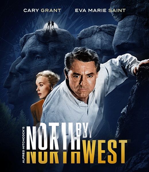
i really do like the first picture.
More than the last one, but for sure, yes, it will be a great one. Any update?  |
|
|
|
The Following 5 Users Say Thank You To ripley For This Post: Bazzah, ctaulbee, sauron, Speedz0r, VincentLupo | |
|
Nov 24 2020, 05:54 PM
Post
#13
|
||||
  Group: Master Designer Posts: 3,060 Coverart: 404 Thanks: 8528 From: Germany Joined: June 13 2013 My Favorite Custom Cover: van Helsing by Bunny Dojo |
Very exciting start, your title for this one is amazing!
Great touch on the moon and the compass as well. I also thing the update is a huge step forward and I like what Paris has suggested with the night look but I'd maybe keep the blueish more discreet. |
|||
|
|
|
|||

|
|
2 User(s) are reading this topic (2 Guests and 0 Anonymous Users)
| 0 Members: | ||||
|
||||
|
|
| The Artwork hosted on this site is for personal use only. We do not condone piracy and we do not supply images for use in any illegal activities, including DVD or Blu-ray piracy. | ||||
| Time is now: 14th October 2025 - 11:48 AM | Gallery Index | Privacy policy | Lo-Fi Version | 
|
Copyright © 2006 - 2025 by HiResCovers.net