


Welcome to HiResCovers.NET
|
| |||||||||||||
|
||||||||||||||
|
|
| |||
|
||||
|
| |||||||||||||||||
|
||||||||||||||||||
|
| |||||||||||||||||||||||||
|
||||||||||||||||||||||||||
|
|
| |||
|
||||
 Loading tabs, please wait...
abcdefghijklmnopqrstuvwxyzABCDEFGHIJKLMNOPQRSTUVWXYZ
|
|

Welcome Guest, Register to Remove this Message!
|
Welcome to the highest quality Custom DVD, Blu-ray and Ultra-HD 4k cover art, available anywhere in the world. Please register, or log in, to browse our site. • Almost 200,000 300 dpi high quality images • Moderated uploads, to ensure the highest quality possible. • A forum for artwork requests, help designing cover art and much more • If you cannot find the movie you need, simply create a request for it to be created and uploaded to the gallery. • A section of Design Assets, including templates, logos and fonts. |
Guest Message © 2025 Dev Fuse

 
|

 May 25 2020, 10:04 PM May 25 2020, 10:04 PM
Post
#1
|
|
  Group: Members Posts: 1,339 Coverart: 38 Thanks: 935 From: Backyard Joined: July 30 2008 |
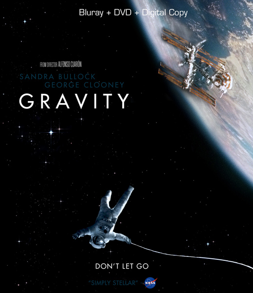
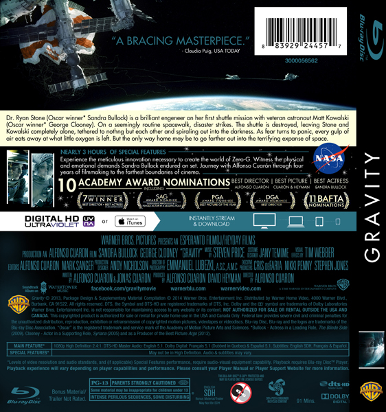
I remember that in those days almost everybody done something for this one. So, why not try... Want to try if this perspective feels right. Isn't finish cas the images still need some treatment. Thanks in advance.
Attached image(s)
 |
   |
 
|


|
May 26 2020, 01:27 AM
Post
#2
|
||
  Group: Master Designer Posts: 1,636 Coverart: 219 Thanks: 7688 From: Switzerland Joined: March 15 2017
|
Good start

|
|
|
|
|
|
The Following 4 Users Say Thank You To stampe For This Post: Bazzah, ctaulbee, Speedz0r, VincentLupo | ||

|
May 26 2020, 02:48 AM
Post
#3
|
|
 Group: Members Posts: 479 Coverart: 43 Thanks: 1143 From: Switzerland Joined: August 12 2009 |
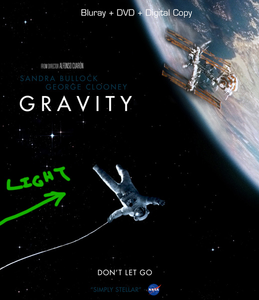
Promising layout. The only concern I have so far is that the lighting doesn't make sense. As for the astronaut, the light source clearly comes from the right side (assuming it's sun light). However this would mean that the part of earth you're showing should be covered in dark since it's facing away from the sun.
|
|
|
|
The Following 5 Users Say Thank You To weyn For This Post: Bazzah, ctaulbee, M0vieM0nster, Speedz0r, VincentLupo | |
|
May 26 2020, 08:58 AM
Post
#4
|
|
  Group: Root Admin Posts: 22,893 Coverart: 1,634 Thanks: 52596 From: Home Joined: May 3 2006 My Favorite Cover Designer: All HiRes designers |
Nice layout
I agree with weyn about the lighting though.
     |
|
|
|

|
May 26 2020, 06:50 PM
Post
#5
|
|
  Group: Moderator Posts: 12,532 Coverart: 67 Thanks: 20282 From: United Kingdom Joined: May 14 2006 |
Looking good so far, apart from what weyn has suggested, I think the names and “simply stellar” is too dark and hard to read.
|
|
|
|
The Following 4 Users Say Thank You To sauron For This Post: Bazzah, ctaulbee, Speedz0r, VincentLupo | |
|
Jun 7 2020, 05:35 PM
Post
#6
|
|
|
Group: Members Posts: 1,339 Coverart: 38 Thanks: 935 From: Backyard Joined: July 30 2008 |
Just got back from a couple of days away to work.
Wyen you are right about the light, but i don't know if i fully understand the part that the planet sould be dark. I'll do an update soon and then lets see how it goes. Thanks all the replies. This post has been edited by Sxxo: Jun 7 2020, 05:36 PM |
|
|
|
The Following 5 Users Say Thank You To Sxxo For This Post: Bazzah, ctaulbee, M0vieM0nster, Speedz0r, VincentLupo | |
|
Jun 7 2020, 06:46 PM
Post
#7
|
|||
  Group: Root Admin Posts: 8,142 Coverart: 2,919 Thanks: 17826 From: The Realm of Nightmares Joined: May 3 2006 |
Need to flip your guy around so his highlights are facing the light like the planet.
          My Gallery • Please leave a like and short comment if you download my work, thanks. • My Criterion Collection |
||
|
|
|
||
The Following 5 Users Say Thank You To ctaulbee For This Post: Bazzah, M0vieM0nster, pytlaczek, Speedz0r, VincentLupo | |||

|
Oct 21 2020, 06:48 PM
Post
#8
|
|
|
Group: Members Posts: 1,339 Coverart: 38 Thanks: 935 From: Backyard Joined: July 30 2008 |
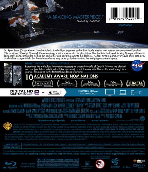
It´s been a while now... Started the back and it's not finished. Just want to try to balance it with the front and then fix the light issue. Thanks to all in advance.
Attached image(s)
 |
|
|
|
The Following 6 Users Say Thank You To Sxxo For This Post: Bazzah, ctaulbee, M0vieM0nster, sauron, Speedz0r, VincentLupo | |
|
Oct 21 2020, 06:49 PM
Post
#9
|
|
|
Group: Root Admin Posts: 22,893 Coverart: 1,634 Thanks: 52596 From: Home Joined: May 3 2006 My Favorite Cover Designer: All HiRes designers |
Nice layout buddy. It goes well with the front
|
|
|
|
The Following 4 Users Say Thank You To Bazzah For This Post: ctaulbee, sauron, Speedz0r, VincentLupo | |
|
Oct 21 2020, 07:38 PM
Post
#10
|
|
|
Group: Moderator Posts: 12,532 Coverart: 67 Thanks: 20282 From: United Kingdom Joined: May 14 2006 |
Looks good but I feel the synopsis needs more space above and below as it feels too cramped at the moment.
|
|
|
|
The Following 4 Users Say Thank You To sauron For This Post: Bazzah, ctaulbee, Speedz0r, VincentLupo | |
|
Oct 21 2020, 07:41 PM
Post
#11
|
|
  Group: Contributor Posts: 3,491 Coverart: 136 Thanks: 5254 From: United Kingdom Joined: May 22 2006 |
Looking good to me
|
|
|
|
The Following 5 Users Say Thank You To M0vieM0nster For This Post: Bazzah, ctaulbee, sauron, Speedz0r, VincentLupo | |
|
Oct 25 2020, 09:06 PM
Post
#12
|
|
|
Group: Members Posts: 1,339 Coverart: 38 Thanks: 935 From: Backyard Joined: July 30 2008 |
Update with some details:
Finished the wards, added a star texture, missing logos, some colour and adjustments on pics. More space for the sypnosis like Sauron suggested. Will move to the front and match the colour pallete. Thanks for the replies. This post has been edited by Sxxo: Oct 25 2020, 09:10 PM
Attached image(s)
 |
|
|
|
The Following 6 Users Say Thank You To Sxxo For This Post: Bazzah, ctaulbee, M0vieM0nster, sauron, Speedz0r, VincentLupo | |
|
Oct 26 2020, 09:58 AM
Post
#13
|
|
|
Group: Root Admin Posts: 22,893 Coverart: 1,634 Thanks: 52596 From: Home Joined: May 3 2006 My Favorite Cover Designer: All HiRes designers |
Nice work buddy
|
|
|
|
The Following 4 Users Say Thank You To Bazzah For This Post: ctaulbee, sauron, Speedz0r, VincentLupo | |
|
Oct 26 2020, 12:06 PM
Post
#14
|
|
  Group: Cover Designer Posts: 13,830 Coverart: 564 Thanks: 12364 From: Denmark Joined: August 16 2007 My Favorite Custom Cover: To have and have not My Favorite Cover Designer: Tim Gengler |
The synopsis looks very small, perhaps a slightly larger box, and then bigger fontsize could help?
A designer knows he has achieved perfection - not when there's nothing left to add - but when there's nothing left to take away - Antoine de Saint Exupéry |
|
|
|
The Following 5 Users Say Thank You To JollyRoger For This Post: Bazzah, ctaulbee, sauron, Speedz0r, VincentLupo | |

|
Oct 26 2020, 08:08 PM
Post
#15
|
|
|
Group: Moderator Posts: 12,532 Coverart: 67 Thanks: 20282 From: United Kingdom Joined: May 14 2006 |
I still feel like you need more space and maybe add more spacing between each line of text.
|
|
|
|
The Following 4 Users Say Thank You To sauron For This Post: Bazzah, ctaulbee, Speedz0r, VincentLupo | |
|
Oct 26 2020, 08:40 PM
Post
#16
|
|
|
Group: Members Posts: 1,339 Coverart: 38 Thanks: 935 From: Backyard Joined: July 30 2008 |
QUOTE (JollyRoger @ Oct 26 2020, 12:06 PM)  The synopsis looks very small, perhaps a slightly larger box, and then bigger fontsize could help? QUOTE (sauron @ Oct 26 2020, 08:08 PM) I still feel like you need more space and maybe add more spacing between each line of text. Will fix that by trying a lagger box and space between lines. Thanks for the tips. |
|
|
|
The Following 5 Users Say Thank You To Sxxo For This Post: Bazzah, ctaulbee, sauron, Speedz0r, VincentLupo | |
|
Oct 27 2020, 08:36 PM
Post
#17
|
|
|
Group: Members Posts: 1,339 Coverart: 38 Thanks: 935 From: Backyard Joined: July 30 2008 |
Made a colour palette change for the blue. And more space to the synopsis. Spine done.
Attached image(s)
 |
|
|
|
The Following 6 Users Say Thank You To Sxxo For This Post: Bazzah, ctaulbee, M0vieM0nster, sauron, Speedz0r, VincentLupo | |
|
Oct 28 2020, 07:58 PM
Post
#18
|
|
|
Group: Moderator Posts: 12,532 Coverart: 67 Thanks: 20282 From: United Kingdom Joined: May 14 2006 |
Looks better now
The spine TT is the wrong way round though. |
|
|
|
The Following 4 Users Say Thank You To sauron For This Post: Bazzah, ctaulbee, Speedz0r, VincentLupo | |
|
Nov 2 2020, 11:02 PM
Post
#19
|
||
|
Group: Members Posts: 1,339 Coverart: 38 Thanks: 935 From: Backyard Joined: July 30 2008 |
Minor changes on front.
And the light issue is fixed. Maybe its finished. This post has been edited by Sxxo: Nov 2 2020, 11:04 PM
Attached thumbnail(s)
|
|
|
|
|
|
The Following 5 Users Say Thank You To Sxxo For This Post: Bazzah, ctaulbee, sauron, Speedz0r, VincentLupo | ||
|
Nov 3 2020, 12:16 AM
Post
#20
|
|||
|
Group: Root Admin Posts: 8,142 Coverart: 2,919 Thanks: 17826 From: The Realm of Nightmares Joined: May 3 2006 |
Looks good to me, like the less yellow look much better

My Gallery • Please leave a like and short comment if you download my work, thanks. • My Criterion Collection |
||
|
|
|
||
|
|
2 User(s) are reading this topic (2 Guests and 0 Anonymous Users)
| 0 Members: | ||||
|
||||
|
|
| The Artwork hosted on this site is for personal use only. We do not condone piracy and we do not supply images for use in any illegal activities, including DVD or Blu-ray piracy. | ||||
| Time is now: 14th October 2025 - 02:52 AM | Gallery Index | Privacy policy | Lo-Fi Version | 
|
Copyright © 2006 - 2025 by HiResCovers.net