


Welcome to HiResCovers.NET
|
| |||||||||||||
|
||||||||||||||
|
|
| |||
|
||||
|
| |||||||||||||||||
|
||||||||||||||||||
|
| |||||||||||||||||||||||||
|
||||||||||||||||||||||||||
|
|
| |||
|
||||
 Loading tabs, please wait...
abcdefghijklmnopqrstuvwxyzABCDEFGHIJKLMNOPQRSTUVWXYZ
|
|

Welcome Guest, Register to Remove this Message!
|
Welcome to the highest quality Custom DVD, Blu-ray and Ultra-HD 4k cover art, available anywhere in the world. Please register, or log in, to browse our site. • Almost 200,000 300 dpi high quality images • Moderated uploads, to ensure the highest quality possible. • A forum for artwork requests, help designing cover art and much more • If you cannot find the movie you need, simply create a request for it to be created and uploaded to the gallery. • A section of Design Assets, including templates, logos and fonts. |
Guest Message © 2025 Dev Fuse

 
|

 May 8 2020, 11:31 AM May 8 2020, 11:31 AM
Post
#1
|
||||||
  Group: Master Designer Posts: 3,060 Coverart: 404 Thanks: 8528 From: Germany Joined: June 13 2013 My Favorite Custom Cover: van Helsing by Bunny Dojo |
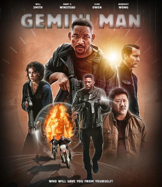
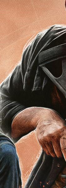
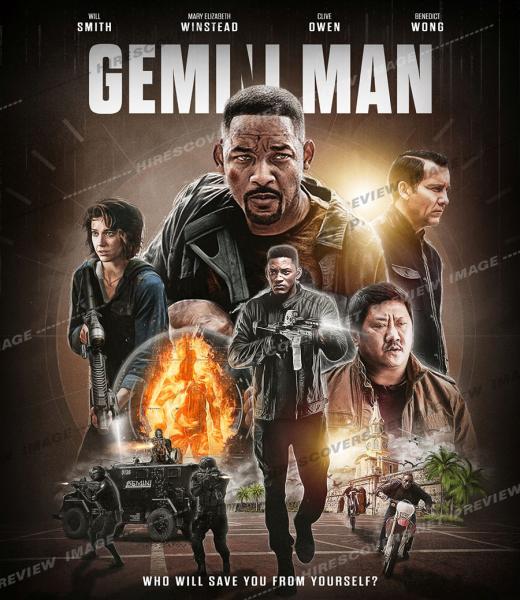
At the moment I have a weakness for these illastration looks so after Midway I've tried this with another cover.
I didn't expect that before but there's not really much to work with for Gemini Man and at the moment I don't know what to use for the back.  Here is what I have so far and as always your suggestions are welcome! 
This is what I did with the characters (I know it's a bit hard to see...):
Front artwork: 
 |
|||||
   |
 
|
|||||


|
May 8 2020, 02:23 PM
Post
#2
|
|
  Group: Contributor Posts: 3,197 Coverart: 477 Thanks: 1504 From: Quebec Joined: May 9 2012 |
I think you have a good idea here but you need to perfection it ! The color and TT suggest its a action comedy movie but its far away of this. Also be careful with the glow light on wong its to much at the moment !
|
|
|
|

|
May 8 2020, 04:11 PM
Post
#3
|
||||
|
Group: Master Designer Posts: 3,060 Coverart: 404 Thanks: 8528 From: Germany Joined: June 13 2013 My Favorite Custom Cover: van Helsing by Bunny Dojo |
I personally don't see any problems with the colors but what you had in mind? . Or did you mean the title's color? I know the title isn't perfectly working for that type of movie, it was just a try. But I'm open for any suggestions what to do instead.
 This post has been edited by Fidi: May 8 2020, 04:23 PM |
|||
|
|
|
|||
|
May 8 2020, 06:21 PM
Post
#4
|
|
  Group: Root Admin Posts: 22,895 Coverart: 1,634 Thanks: 52597 From: Home Joined: May 3 2006 My Favorite Cover Designer: All HiRes designers |
Awesome work so far bud! Now that shoty has mentioned it though, the Title does make it look like a comedy..... it needs to be more action style. Maybe it is the arch of the title that doesn't help??
    |
|
|
|
|
May 8 2020, 07:11 PM
Post
#5
|
|
  Group: Moderator Posts: 12,533 Coverart: 67 Thanks: 20286 From: United Kingdom Joined: May 14 2006 |
I’m not overly keen on the TT and the fading on the lower part of the characters, how about having them sit inside the circle?
I’ve not seen the film so not sure if what you have done on the front ties in with the film. |
|
|
|
|
May 12 2020, 10:57 AM
Post
#6
|
||||||
|
Group: Master Designer Posts: 3,060 Coverart: 404 Thanks: 8528 From: Germany Joined: June 13 2013 My Favorite Custom Cover: van Helsing by Bunny Dojo |
Thanks for your both comments as well.
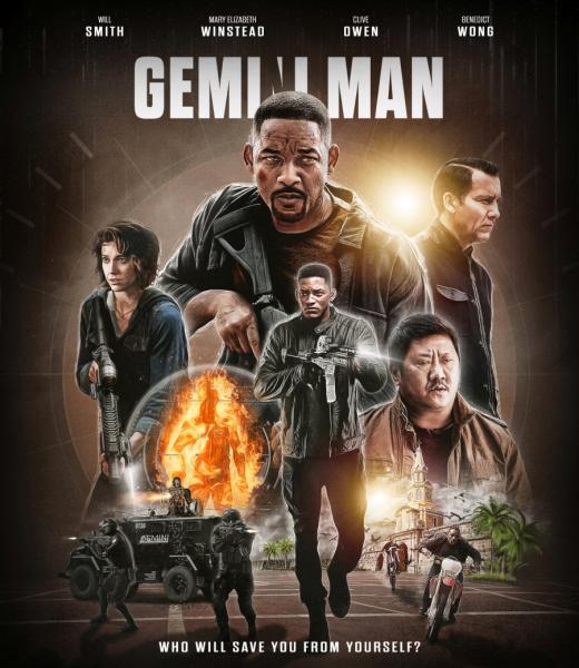
I'm not sure what to do with this cover. I thought it was a good idea to go this way with nearly no resources available. But at the moment I'm not sure if I even should continue this. I've changed a few things, title was moved up and it's no comedy-effect anymore (allthough I think the ne one doesn't work 100% as well), changed the colors to something less popping, added Will's clone (with the only available image of him) and spend more work on painting the effects of the characters. Still need to do something in front of Wong.
|
|||||
|
|
|
|||||
|
May 12 2020, 12:16 PM
Post
#7
|
|
|
Group: Root Admin Posts: 22,895 Coverart: 1,634 Thanks: 52597 From: Home Joined: May 3 2006 My Favorite Cover Designer: All HiRes designers |
Really nice work again
I would love to know if I am alone on these points though, but here goes. I am not a fan of the font used for the title. I think that is where the 'comedy' look may be coming from. It needs a more sci-fi/futuristic style font. I don't like the way wong fades into the floor, but you have said you are addressing that Will's clone looks really odd. I know it is from the poster, but he looks really awkward to me? I liked the eyes in the previous version. |
|
|
|
|
May 12 2020, 12:25 PM
Post
#8
|
||
  Group: Members Posts: 120 Coverart: 28 Thanks: 530 Joined: January 3 2020 |
Agree with everyone about the font, something nearer the original poster font might suit better.
I'd try making the front more two-tone as there's a bit too much orange/ brown. Also maybe you could swap the position of Wong with the burning man and bikes to potentially cover up that weird wrist angle? Mockup without the swap:
|
|
|
|
|
|

|
May 12 2020, 01:18 PM
Post
#9
|
|
|
Group: Contributor Posts: 3,197 Coverart: 477 Thanks: 1504 From: Quebec Joined: May 9 2012 |
Look a lot better like this man !
|
|
|
|
|
May 12 2020, 04:26 PM
Post
#10
|
||
  Group: Master Designer Posts: 2,666 Coverart: 546 Thanks: 7138 Joined: July 22 2008 |
You have a lot of great pieces here, and I'm excited to see the effects you're exploring.
If you could bring the top Will Smith down and left a bit, that might help tighten the composition and give you more options for your title treatment. (That creates a blank space next to his shoulder, but maybe there's a good piece of scenery or special effects for up there.) Otherwise, I pretty much agree with the guys here that the two things holding this cover back from greatness are the font and color. The font is a little too fat and bouncy, and the shading effect highlights that further, making it look friendly. Something sharper -- either sharp edges or a sharp metal texture or just a sharp flat color -- could help. For the coloring, I think your 13 Hours, Matrix, and Sully covers are all perfect examples of great dark color palettes. The colors on this one might work with a lighter background, instead of the reddish brown. Or, you could simplify the color palette even further (not necessarily gold, but this is just an example): 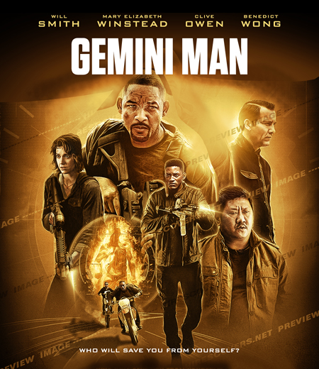
|
|
|
|
|
|
|
May 12 2020, 04:32 PM
Post
#11
|
|||
  Group: Root Admin Posts: 8,142 Coverart: 2,919 Thanks: 17826 From: The Realm of Nightmares Joined: May 3 2006 |
I tend to agree with Baz, I like the new changes though.
The title is the big one for me not fond of the Font or the effect, it still looks to rounded, maybe flatter style with harder edges, could 3D it maybe if you wanted. Edit: I see me and the Bunny are on the same sort of track lol.           My Gallery • Please leave a like and short comment if you download my work, thanks. • My Criterion Collection |
||
|
|
|
||
The Following 5 Users Say Thank You To ctaulbee For This Post: Bazzah, Fidi, sauron, Speedz0r, VincentLupo | |||
|
May 12 2020, 07:38 PM
Post
#12
|
|
|
Group: Moderator Posts: 12,533 Coverart: 67 Thanks: 20286 From: United Kingdom Joined: May 14 2006 |
Before I saw Tim’s recommendation regarding the title, I was going to suggest having a flat white title instead of something with loads of effects, the main focal point is the images so a simple title could work best.
|
|
|
|
The Following 5 Users Say Thank You To sauron For This Post: Bazzah, ctaulbee, Fidi, Speedz0r, VincentLupo | |
|
May 19 2020, 12:24 PM
Post
#13
|
|||||
|
Group: Master Designer Posts: 3,060 Coverart: 404 Thanks: 8528 From: Germany Joined: June 13 2013 My Favorite Custom Cover: van Helsing by Bunny Dojo |
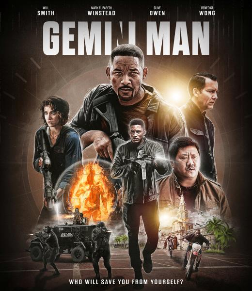
Thank you for your suggestions, they were very helpfull!
I've changed the title font like Tim has suggested, added the effect on the I N I as it's in the trailer. Also I've changed the colors again some more, tryed to rebuild the Plaza de La Aduana in Cartagena (this is where they have the hunt on the bikes in the movie) and made some screenshots to add the S.W.A.T. guys to the front. Still some stuff to do but this is where I am now:
|
||||
|
|
|
||||
The Following 7 Users Say Thank You To Fidi For This Post: Bazzah, ctaulbee, M0vieM0nster, merdec, sauron, Speedz0r, VincentLupo | |||||
|
May 19 2020, 12:28 PM
Post
#14
|
|
|
Group: Moderator Posts: 12,533 Coverart: 67 Thanks: 20286 From: United Kingdom Joined: May 14 2006 |
Looking really good, I think the TT could be a bit bigger?
Other than that no other suggestions
|
|
|
|
The Following 5 Users Say Thank You To sauron For This Post: Bazzah, ctaulbee, Fidi, Speedz0r, VincentLupo | |
|
May 19 2020, 12:30 PM
Post
#15
|
||||
|
Group: Master Designer Posts: 3,060 Coverart: 404 Thanks: 8528 From: Germany Joined: June 13 2013 My Favorite Custom Cover: van Helsing by Bunny Dojo |
Thanks bud.
You're not wrong about the title but if I enlarge it the I-N-I won't really be visible anymore and I'm not sure if I should move down Will Smith anymore? |
|||
|
|
|
|||
The Following 5 Users Say Thank You To Fidi For This Post: Bazzah, ctaulbee, sauron, Speedz0r, VincentLupo | ||||
|
May 19 2020, 12:38 PM
Post
#16
|
|
|
Group: Root Admin Posts: 22,895 Coverart: 1,634 Thanks: 52597 From: Home Joined: May 3 2006 My Favorite Cover Designer: All HiRes designers |
What a great update! The added scenery and swat team have really made the cover pop!
For the title you could try swapping the names and tag around, and then you have a little room to increase the title and bump it up a little? |
|
|
|
The Following 5 Users Say Thank You To Bazzah For This Post: ctaulbee, Fidi, sauron, Speedz0r, VincentLupo | |
|
May 19 2020, 02:43 PM
Post
#17
|
|
|
Group: Contributor Posts: 3,197 Coverart: 477 Thanks: 1504 From: Quebec Joined: May 9 2012 |
God damn such an improvement on this one i like the color suggestion by bunny dojo ! Also the title treatment rock now !!!
|
|
|
|
|
May 19 2020, 03:59 PM
Post
#18
|
|
  Group: Cover Designer Posts: 13,830 Coverart: 564 Thanks: 12364 From: Denmark Joined: August 16 2007 My Favorite Custom Cover: To have and have not My Favorite Cover Designer: Tim Gengler |
Awesome update!
A designer knows he has achieved perfection - not when there's nothing left to add - but when there's nothing left to take away - Antoine de Saint Exupéry |
|
|
|

|
May 19 2020, 04:24 PM
Post
#19
|
|
 Group: Members Posts: 421 Coverart: 84 Thanks: 1775 From: Eastern US Joined: January 3 2019 |
The update is looking great buddy! Especially like the bottom scene
This post has been edited by redt8tr: May 19 2020, 04:48 PM  |
|
|
|
|
May 19 2020, 05:44 PM
Post
#20
|
|||
|
Group: Root Admin Posts: 8,142 Coverart: 2,919 Thanks: 17826 From: The Realm of Nightmares Joined: May 3 2006 |
Looking good buddy, great update

My Gallery • Please leave a like and short comment if you download my work, thanks. • My Criterion Collection |
||
|
|
|
||
|
May 19 2020, 07:02 PM
Post
#21
|
||
|
Group: Moderator Posts: 12,533 Coverart: 67 Thanks: 20286 From: United Kingdom Joined: May 14 2006 |
QUOTE (Fidi @ May 19 2020, 01:30 PM)  Thanks bud. You're not wrong about the title but if I enlarge it the I-N-I won't really be visible anymore and I'm not sure if I should move down Will Smith anymore? I did think that might be the case, Baz’s suggestion could work or enlarge it a little to close the gap between the names and the title?
|
|
|
|
|
|
|
May 20 2020, 07:34 AM
Post
#22
|
|||||
|
Group: Master Designer Posts: 3,060 Coverart: 404 Thanks: 8528 From: Germany Joined: June 13 2013 My Favorite Custom Cover: van Helsing by Bunny Dojo |
Better like this?
|
||||
|
|
|
||||
|
May 20 2020, 07:51 AM
Post
#23
|
|
|
Group: Moderator Posts: 12,533 Coverart: 67 Thanks: 20286 From: United Kingdom Joined: May 14 2006 |
I think that looks much better now

|
|
|
|
|
May 20 2020, 08:08 AM
Post
#24
|
|||
|
Group: Root Admin Posts: 8,142 Coverart: 2,919 Thanks: 17826 From: The Realm of Nightmares Joined: May 3 2006 |
This is really coming together now my friend, well done on all the changes
My Gallery • Please leave a like and short comment if you download my work, thanks. • My Criterion Collection |
||
|
|
|
||
|
May 20 2020, 09:30 AM
Post
#25
|
|
|
Group: Root Admin Posts: 22,895 Coverart: 1,634 Thanks: 52597 From: Home Joined: May 3 2006 My Favorite Cover Designer: All HiRes designers |
Works for me
|
|
|
|
The Following 5 Users Say Thank You To Bazzah For This Post: ctaulbee, Fidi, sauron, Speedz0r, VincentLupo | |
|
May 21 2020, 07:37 PM
Post
#26
|
|
 Group: Members Posts: 479 Coverart: 43 Thanks: 1143 From: Switzerland Joined: August 12 2009 |
Not sold on the narrow N, should be the same width as the normal N at the very end of the TT.
|
|
|
|
|
May 22 2020, 09:09 AM
Post
#27
|
|
|
Group: Root Admin Posts: 22,895 Coverart: 1,634 Thanks: 52597 From: Home Joined: May 3 2006 My Favorite Cover Designer: All HiRes designers |
I hadn't noticed the 'n' in the update. I have to agree with weyn
|
|
|
|
The Following 5 Users Say Thank You To Bazzah For This Post: ctaulbee, Fidi, sauron, Speedz0r, VincentLupo | |
|
May 22 2020, 03:53 PM
Post
#28
|
||
|
Group: Master Designer Posts: 2,666 Coverart: 546 Thanks: 7138 Joined: July 22 2008 |
This is looking better and better!
What if you were to move the two Will Smiths and Clive Owen down a bit? That might give you some nice extra room up top. 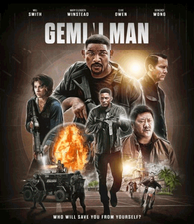 Alternatively, you could remove the other names up top and just have "WILL SMITH" on one line, which would give you a tiny bit of extra space. |
|
|
|
|
|
The Following 8 Users Say Thank You To Bunny Dojo For This Post: Bazzah, ctaulbee, Fidi, M0vieM0nster, RRJR84, sauron, Speedz0r, VincentLupo | ||
|
May 26 2020, 07:07 AM
Post
#29
|
|||||
|
Group: Master Designer Posts: 3,060 Coverart: 404 Thanks: 8528 From: Germany Joined: June 13 2013 My Favorite Custom Cover: van Helsing by Bunny Dojo |
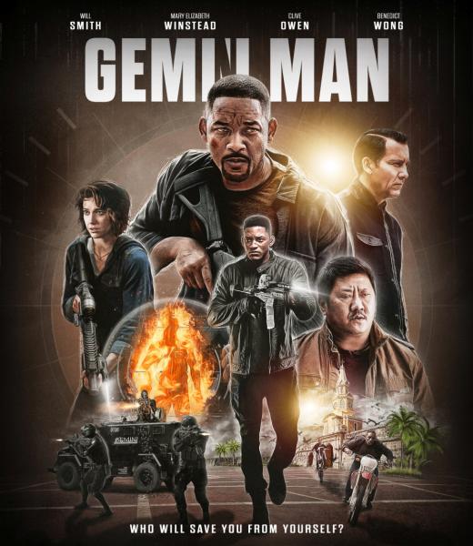
Thanks guys.
Small update with the right title and I've also moved down the three characters as Tim has suggested:
|
||||
|
|
|
||||
|
May 26 2020, 08:55 AM
Post
#30
|
|
|
Group: Root Admin Posts: 22,895 Coverart: 1,634 Thanks: 52597 From: Home Joined: May 3 2006 My Favorite Cover Designer: All HiRes designers |
I would say this is done now? It looks awesome buddy
|
|
|
|
The Following 5 Users Say Thank You To Bazzah For This Post: ctaulbee, Fidi, sauron, Speedz0r, VincentLupo | |
|
May 26 2020, 11:54 AM
Post
#31
|
||
 Group: Master Designer Posts: 1,636 Coverart: 219 Thanks: 7688 From: Switzerland Joined: March 15 2017
|
Awesome work buddy
|
|
|
|
|
|

|
May 26 2020, 02:35 PM
Post
#32
|
|||
|
Group: Root Admin Posts: 8,142 Coverart: 2,919 Thanks: 17826 From: The Realm of Nightmares Joined: May 3 2006 |
Well done my friend the title looks great now
My Gallery • Please leave a like and short comment if you download my work, thanks. • My Criterion Collection |
||
|
|
|
||
|
May 26 2020, 04:30 PM
Post
#33
|
|
|
Group: Cover Designer Posts: 13,830 Coverart: 564 Thanks: 12364 From: Denmark Joined: August 16 2007 My Favorite Custom Cover: To have and have not My Favorite Cover Designer: Tim Gengler |
Still a weird angle of the wrist? Maybe add something there? Another character to the right of Winstead to obcure the wrist??
A designer knows he has achieved perfection - not when there's nothing left to add - but when there's nothing left to take away - Antoine de Saint Exupéry |
|
|
|
|
May 26 2020, 05:20 PM
Post
#34
|
||||
|
Group: Master Designer Posts: 3,060 Coverart: 404 Thanks: 8528 From: Germany Joined: June 13 2013 My Favorite Custom Cover: van Helsing by Bunny Dojo |
Thanks.
QUOTE (JollyRoger @ May 26 2020, 06:30 PM) Still a weird angle of the wrist? Maybe add something there? Another character to the right of Winstead to obcure the wrist?? Unfortunately there's no other character I could add, these are all which are in the movie. |
|||
|
|
|
|||
The Following 5 Users Say Thank You To Fidi For This Post: Bazzah, ctaulbee, sauron, Speedz0r, VincentLupo | ||||
|
May 26 2020, 06:47 PM
Post
#35
|
||
|
Group: Moderator Posts: 12,533 Coverart: 67 Thanks: 20286 From: United Kingdom Joined: May 14 2006 |
You could try making Will Smith bigger to cover the gap and hide more of the weird hand angle? In my example I also rotated him a little so his eyes were more level, kind of like when you straighten a photo with the horizon line if that makes sense, sorry I’m never good at explaining myself properly lol.
|
|
|
|
|
|
The Following 6 Users Say Thank You To sauron For This Post: Bazzah, ctaulbee, Fidi, M0vieM0nster, Speedz0r, VincentLupo | ||
|
May 27 2020, 04:52 PM
Post
#36
|
|
|
Group: Members Posts: 479 Coverart: 43 Thanks: 1143 From: Switzerland Joined: August 12 2009 |
Legit point about that gap. And good solution from sauron. Making old Will in the BG bigger not only solves this issue but also adds to the dynamic of the cover in terms of character size relations. And you can still see the gunstock, thus revealing he's armed and it's an action flick - YAY! ^^
Have you tried wrapping the actors' names on just one line? |
|
|
|
|
Jun 1 2020, 10:11 AM
Post
#37
|
|||||
|
Group: Master Designer Posts: 3,060 Coverart: 404 Thanks: 8528 From: Germany Joined: June 13 2013 My Favorite Custom Cover: van Helsing by Bunny Dojo |
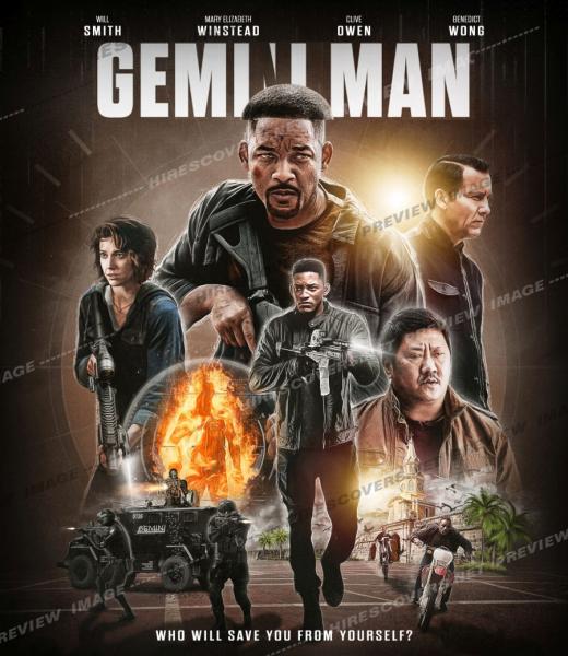
I've increased Will's size for about 15%. So that should do it now?
|
||||
|
|
|
||||
The Following 7 Users Say Thank You To Fidi For This Post: Bazzah, ctaulbee, M0vieM0nster, pytlaczek, sauron, Speedz0r, VincentLupo | |||||

|
Jun 1 2020, 10:27 AM
Post
#38
|
|
|
Group: Root Admin Posts: 22,895 Coverart: 1,634 Thanks: 52597 From: Home Joined: May 3 2006 My Favorite Cover Designer: All HiRes designers |
It looks perfect to me
Very nice work buddy
|
|
|
|
The Following 5 Users Say Thank You To Bazzah For This Post: ctaulbee, Fidi, M0vieM0nster, Speedz0r, VincentLupo | |
|
Jun 1 2020, 02:50 PM
Post
#39
|
|||
|
Group: Root Admin Posts: 8,142 Coverart: 2,919 Thanks: 17826 From: The Realm of Nightmares Joined: May 3 2006 |
Looks good to me bud, if you wanted to obscure the hand/wrist more you could increase the size your circular insert image some.
My Gallery • Please leave a like and short comment if you download my work, thanks. • My Criterion Collection |
||
|
|
|
||
|
Jun 1 2020, 04:55 PM
Post
#40
|
|
|
Group: Moderator Posts: 12,533 Coverart: 67 Thanks: 20286 From: United Kingdom Joined: May 14 2006 |
Looks good to me
|
|
|
|
The Following 5 Users Say Thank You To sauron For This Post: Bazzah, ctaulbee, Fidi, Speedz0r, VincentLupo | |
|
Jun 1 2020, 08:58 PM
Post
#41
|
|
|
Group: Members Posts: 479 Coverart: 43 Thanks: 1143 From: Switzerland Joined: August 12 2009 |
A huge improvement over your initial design
What if you add some haze/dust around the characters? This would give some depth to the cover, add to the seamless look and mask possible image flaws (like the missing bottom part of Benedict Wong). Regarding the Wong picture, you could try to extend his body silhouette with this picture here and then just fade it: LINK Example from "The Rise of Skywalker":  This post has been edited by weyn: Jun 1 2020, 09:02 PM |
|
|
|
The Following 6 Users Say Thank You To weyn For This Post: Bazzah, ctaulbee, M0vieM0nster, sauron, Speedz0r, VincentLupo | |
|
Jun 4 2020, 12:01 PM
Post
#42
|
|
|
Group: Cover Designer Posts: 13,830 Coverart: 564 Thanks: 12364 From: Denmark Joined: August 16 2007 My Favorite Custom Cover: To have and have not My Favorite Cover Designer: Tim Gengler |
Looking better now! I like this idea

A designer knows he has achieved perfection - not when there's nothing left to add - but when there's nothing left to take away - Antoine de Saint Exupéry |
|
|
|
The Following 5 Users Say Thank You To JollyRoger For This Post: Bazzah, ctaulbee, Fidi, Speedz0r, VincentLupo | |
|
Dec 3 2020, 09:37 AM
Post
#43
|
|||||
|
Group: Master Designer Posts: 3,060 Coverart: 404 Thanks: 8528 From: Germany Joined: June 13 2013 My Favorite Custom Cover: van Helsing by Bunny Dojo |
Hey guys,
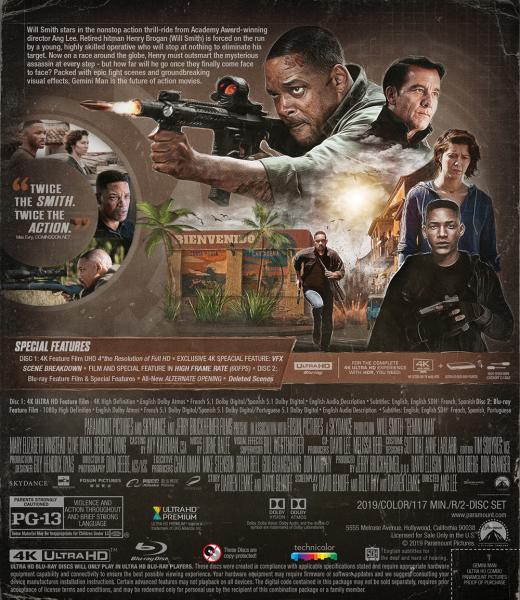
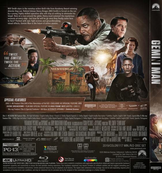
after only six months I found some time again to open Photoshop. I moved on to the back but as always I'm not sure about a few things. Do the stills work like that beside the main image or should I go a more "classic" way? I've added some grunge elements across the cover on the borders. Do they work or should I remove them? This is where I am at the moment:
 Thanks for your suggestions.
|
||||
|
|
|
||||
|
Dec 3 2020, 10:12 AM
Post
#44
|
|
|
Group: Root Admin Posts: 22,895 Coverart: 1,634 Thanks: 52597 From: Home Joined: May 3 2006 My Favorite Cover Designer: All HiRes designers |
I love the collage, and stills layout. But the more I look at it, the more I think the stills should have the same exposure as the collage? And I like the grunge
|
|
|
|
The Following 5 Users Say Thank You To Bazzah For This Post: ctaulbee, Fidi, sauron, Speedz0r, VincentLupo | |
|
Dec 3 2020, 12:18 PM
Post
#45
|
|||
|
Group: Root Admin Posts: 8,142 Coverart: 2,919 Thanks: 17826 From: The Realm of Nightmares Joined: May 3 2006 |
My Gallery • Please leave a like and short comment if you download my work, thanks. • My Criterion Collection |
||
|
|
|
||
The Following 5 Users Say Thank You To ctaulbee For This Post: Bazzah, Fidi, sauron, Speedz0r, VincentLupo | |||
|
Dec 3 2020, 06:35 PM
Post
#46
|
||
|
Group: Master Designer Posts: 2,666 Coverart: 546 Thanks: 7138 Joined: July 22 2008 |
QUOTE (Bazzah @ Dec 3 2020, 06:12 AM) I love the collage, and stills layout. But the more I look at it, the more I think the stills should have the same exposure as the collage? Yeah, that left circle of imagery seems like it would look great at regular brightness and balance everything out nicely. Very stylish design, Fidi! It's exciting to see you back in action!
|
|
|
|
|
|
|
Dec 3 2020, 07:17 PM
Post
#47
|
|||||
|
Group: Master Designer Posts: 3,060 Coverart: 404 Thanks: 8528 From: Germany Joined: June 13 2013 My Favorite Custom Cover: van Helsing by Bunny Dojo |
Thank you three for leaving a comment.
Better like this then?
And just for comparison, with our without grunge?  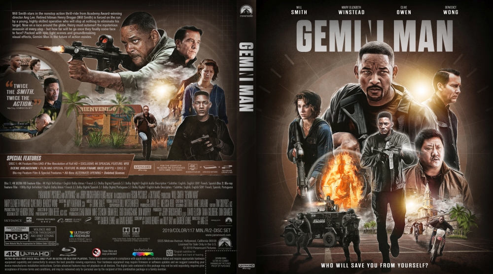
|
||||
|
|
|
||||
|
Dec 3 2020, 07:28 PM
Post
#48
|
|
|
Group: Root Admin Posts: 22,895 Coverart: 1,634 Thanks: 52597 From: Home Joined: May 3 2006 My Favorite Cover Designer: All HiRes designers |
Yeah, the stills look much better now. And looking at them side by side, I prefer the clean version
|
|
|
|
The Following 5 Users Say Thank You To Bazzah For This Post: ctaulbee, Fidi, sauron, Speedz0r, VincentLupo | |
|
Dec 3 2020, 07:28 PM
Post
#49
|
|||
|
Group: Root Admin Posts: 8,142 Coverart: 2,919 Thanks: 17826 From: The Realm of Nightmares Joined: May 3 2006 |
That's the ticket there, well done I like the with grunge version best
My Gallery • Please leave a like and short comment if you download my work, thanks. • My Criterion Collection |
||
|
|
|
||
The Following 5 Users Say Thank You To ctaulbee For This Post: Bazzah, Fidi, sauron, Speedz0r, VincentLupo | |||
|
Dec 3 2020, 07:41 PM
Post
#50
|
||
|
Group: Master Designer Posts: 2,666 Coverart: 546 Thanks: 7138 Joined: July 22 2008 |
Excellent! With or without grunge looks great (having it clean makes sense for the movie, but the grunge looks cool in your design).
|
|
|
|
|
|
|
Dec 3 2020, 09:20 PM
Post
#51
|
|
|
Group: Moderator Posts: 12,533 Coverart: 67 Thanks: 20286 From: United Kingdom Joined: May 14 2006 |
Looking good, I think with the grunge as I feel it suits the movie with all the fighting scenes.
|
|
|
|
The Following 5 Users Say Thank You To sauron For This Post: Bazzah, ctaulbee, Fidi, Speedz0r, VincentLupo | |
|
Dec 4 2020, 10:31 AM
Post
#52
|
|||||
|
Group: Master Designer Posts: 3,060 Coverart: 404 Thanks: 8528 From: Germany Joined: June 13 2013 My Favorite Custom Cover: van Helsing by Bunny Dojo |
Thanks again.
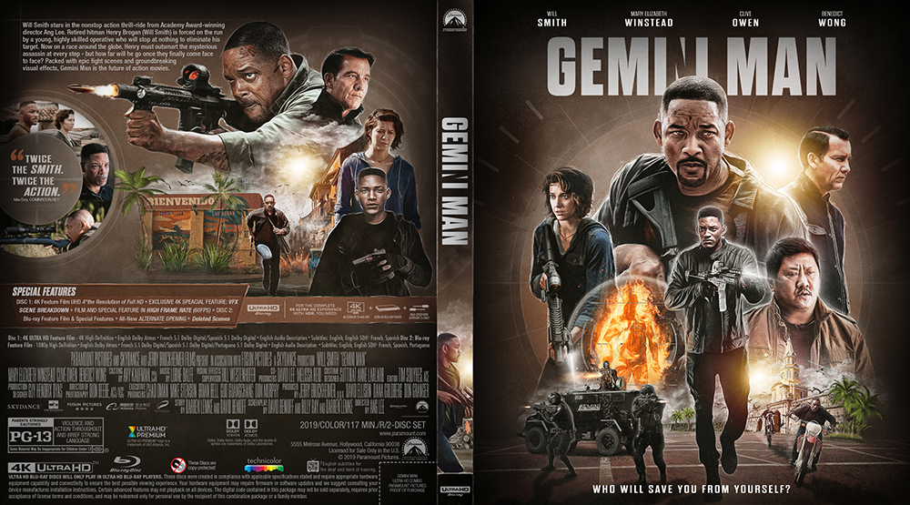
I've decided to go without the grunge because I think Tim is right - it fits the movies look (HFR) better than with it. I only kept the two lines beside the spine and I've also added a image on the spine. And I've tried to make it more clear and visible that the circle with the stills and the quote is another crosshair. 
|
||||
|
|
|
||||
|
Dec 4 2020, 11:44 AM
Post
#53
|
|
 Group: Contributor Posts: 3,491 Coverart: 136 Thanks: 5254 From: United Kingdom Joined: May 22 2006 |
Looks fantastic bud, great to see you back
|
|
|
|
|
Dec 4 2020, 11:52 AM
Post
#54
|
|
|
Group: Root Admin Posts: 22,895 Coverart: 1,634 Thanks: 52597 From: Home Joined: May 3 2006 My Favorite Cover Designer: All HiRes designers |
It looks perfect to me
Another Fidi classic!
|
|
|
|
|
Dec 4 2020, 04:11 PM
Post
#55
|
||
|
Group: Master Designer Posts: 2,666 Coverart: 546 Thanks: 7138 Joined: July 22 2008 |
A fantastic victory! It was worth the wait!
Only one tiny possible suggestion -- I can't 100% tell from the preview, but are the actors' names and tagline on the front the only white text on the cover? If so, maybe either they could be in your very very light grey-tan, or a couple of pieces on the back could be white to match? (The Special Features heading and Twice the Smith. Twice the Action. text?) |
|
|
|
|
|
|
Dec 4 2020, 04:53 PM
Post
#56
|
||||
|
Group: Master Designer Posts: 3,060 Coverart: 404 Thanks: 8528 From: Germany Joined: June 13 2013 My Favorite Custom Cover: van Helsing by Bunny Dojo |
Of course you were right and I've fixed that color on the front. Thanks
|
|||
|
|
|
|||
|
Dec 4 2020, 07:35 PM
Post
#57
|
|
|
Group: Moderator Posts: 12,533 Coverart: 67 Thanks: 20286 From: United Kingdom Joined: May 14 2006 |
Looks great Fidi!
|
|
|
|
|
Dec 5 2020, 09:18 AM
Post
#58
|
|
 Group: Moderator Posts: 5,702 Coverart: 240 Thanks: 22382 From: Norway Joined: June 24 2006 |
Nothing to add, it just looks really cool. Fantastic stuff buddy!
 Please keep my covers on this site and this site only! |
|
|
|
|
|
3 User(s) are reading this topic (3 Guests and 0 Anonymous Users)
| 0 Members: | ||||
|
||||
|
|
| The Artwork hosted on this site is for personal use only. We do not condone piracy and we do not supply images for use in any illegal activities, including DVD or Blu-ray piracy. | ||||
| Time is now: 14th October 2025 - 12:40 PM | Gallery Index | Privacy policy | Lo-Fi Version | 
|
Copyright © 2006 - 2025 by HiResCovers.net