


Welcome to HiResCovers.NET
|
| |||||||||||||
|
||||||||||||||
|
|
| |||
|
||||
|
| |||||||||||||||||
|
||||||||||||||||||
|
| |||||||||||||||||||||||||
|
||||||||||||||||||||||||||
|
|
| |||
|
||||
 Loading tabs, please wait...
abcdefghijklmnopqrstuvwxyzABCDEFGHIJKLMNOPQRSTUVWXYZ
|
|

Welcome Guest, Register to Remove this Message!
|
Welcome to the highest quality Custom DVD, Blu-ray and Ultra-HD 4k cover art, available anywhere in the world. Please register, or log in, to browse our site. • Almost 200,000 300 dpi high quality images • Moderated uploads, to ensure the highest quality possible. • A forum for artwork requests, help designing cover art and much more • If you cannot find the movie you need, simply create a request for it to be created and uploaded to the gallery. • A section of Design Assets, including templates, logos and fonts. |
Guest Message © 2025 Dev Fuse

 
|

 Sep 6 2018, 07:03 PM Sep 6 2018, 07:03 PM
Post
#1
|
|
  Group: Root Admin Posts: 22,895 Coverart: 1,634 Thanks: 52601 From: Home Joined: May 3 2006 My Favorite Cover Designer: All HiRes designers |
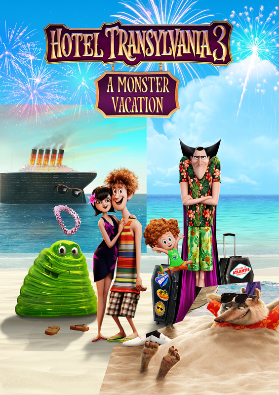
I know it's a bit early
 But I think I have almost finished the front. Any suggestions? But I think I have almost finished the front. Any suggestions? 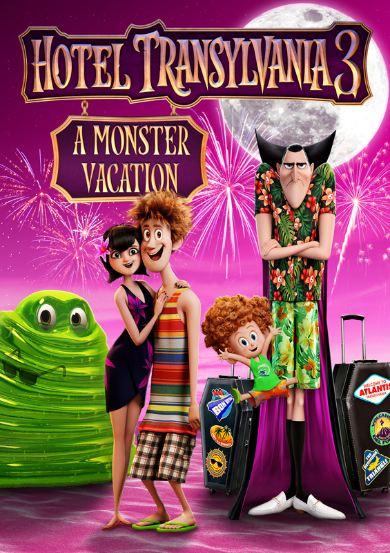
     |
   |
 
|


|
Sep 6 2018, 10:57 PM
Post
#2
|
|
|
Group: Root Admin Posts: 22,895 Coverart: 1,634 Thanks: 52601 From: Home Joined: May 3 2006 My Favorite Cover Designer: All HiRes designers |
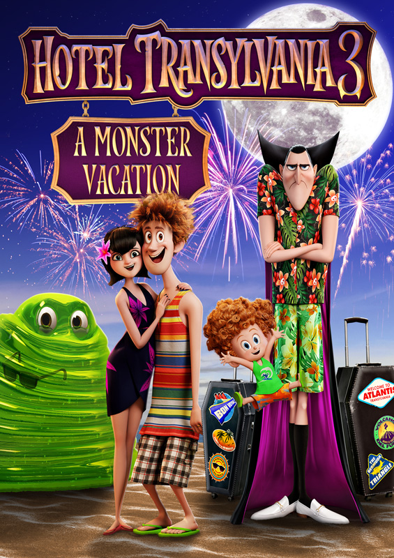
Or does it look better in blue?
|
|
|
|
|
Sep 6 2018, 11:48 PM
Post
#3
|
|
  Group: Contributor Posts: 3,491 Coverart: 136 Thanks: 5254 From: United Kingdom Joined: May 22 2006 |
I think i prefer the pink although the fireworks for example do stand out more against the blue and my only other thought at this point might be to add some slight tint to the moon? Yellow and depending on which background you go for? Great start though! Or thinking about it it merge the blue and pink to meet half way?
|
|
|
|

|
Sep 7 2018, 06:42 AM
Post
#4
|
|
  Group: Moderator Posts: 5,702 Coverart: 240 Thanks: 22382 From: Norway Joined: June 24 2006 |
I like the colored version better as I feel the characters fit more in with the rest of the scene. I also think that everything is a bit too big atm, so I would scale it down a little so it doesn't look so "crowded"?. I think seeing more of the background would help the cover and maybe see if you can add the boat in as well? I haven't seen the movie but I'm guessing the boat is the "hotel" in this one?
edit: I wouldn't mind a brighter background and sand either, like in the posters for the movie 
 Please keep my covers on this site and this site only! |
|
|
|
|
Sep 7 2018, 08:38 AM
Post
#5
|
|
|
Group: Root Admin Posts: 22,895 Coverart: 1,634 Thanks: 52601 From: Home Joined: May 3 2006 My Favorite Cover Designer: All HiRes designers |
Thanks guys. I think I am swaying towards the colour version too. I am not sure about the ship on the front, as I have used it on the back. But it may work in the background. And you are right, the characters are far too big

|
|
|
|
|
Sep 7 2018, 08:38 AM
Post
#6
|
|
  Group: Members Posts: 4,140 Coverart: 54 Thanks: 1364 From: Portugal Joined: October 18 2006 My Favorite Cover Designer: ShokXoneStudios; BunnyDojo |
#2 version for me. Great start Darren, the only thing I think you could fix is Blobby's size, he looks a bit bigger when compared with the others and he's also behind them, so he should be smaller.
Practice custom Blu-Ray covers, DVD covers and other stuff designs are displayed solely for the purpose of demonstrating design skills and are no way intended to infringe upon the copyrights of the owners of the respective images with which they were designed. Thank you for reading. |
|
|
|
|
Sep 7 2018, 12:04 PM
Post
#7
|
|
|
Group: Root Admin Posts: 22,895 Coverart: 1,634 Thanks: 52601 From: Home Joined: May 3 2006 My Favorite Cover Designer: All HiRes designers |
Thanks Arky... how's this? I wanted to add Frankenstein, but I can't find a decent image of him. And in case you couldn't see the invisible guy before, I have added some clothing to make him more obvious
 Also I have reduced the size of the characters, adjusted lighting/shadows, added ship Also I have reduced the size of the characters, adjusted lighting/shadows, added ship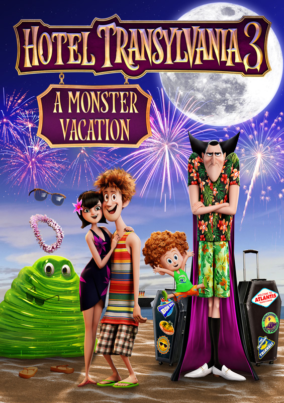
|
|
|
|
The Following 4 Users Say Thank You To Bazzah For This Post: ctaulbee, M0vieM0nster, Speedz0r, VincentLupo | |
|
Sep 7 2018, 12:10 PM
Post
#8
|
|
|
Group: Moderator Posts: 5,702 Coverart: 240 Thanks: 22382 From: Norway Joined: June 24 2006 |
Look a lot better now, I would also reduce the size of the TT tho.
Please keep my covers on this site and this site only! |
|
|
|
|
Sep 7 2018, 12:35 PM
Post
#9
|
|
|
Group: Contributor Posts: 3,491 Coverart: 136 Thanks: 5254 From: United Kingdom Joined: May 22 2006 |

|
|
|
|
|
Sep 7 2018, 12:48 PM
Post
#10
|
|
|
Group: Root Admin Posts: 22,895 Coverart: 1,634 Thanks: 52601 From: Home Joined: May 3 2006 My Favorite Cover Designer: All HiRes designers |
Good call speed. Thanks
|
|
|
|
|
Sep 7 2018, 03:14 PM
Post
#11
|
|
|
Group: Members Posts: 4,140 Coverart: 54 Thanks: 1364 From: Portugal Joined: October 18 2006 My Favorite Cover Designer: ShokXoneStudios; BunnyDojo |
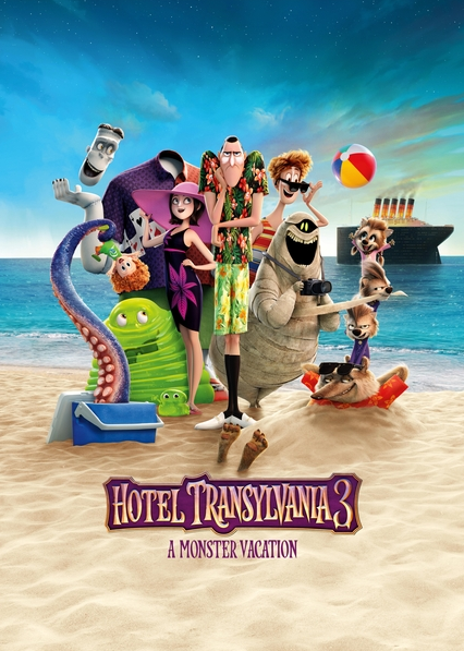
You can use this image as a reference for the characters's size. And maybe you can try to add the title like the one on the image, to free some space to add more characters?
Practice custom Blu-Ray covers, DVD covers and other stuff designs are displayed solely for the purpose of demonstrating design skills and are no way intended to infringe upon the copyrights of the owners of the respective images with which they were designed. Thank you for reading. |
|
|
|
|
Sep 7 2018, 04:05 PM
Post
#12
|
|
|
Group: Root Admin Posts: 22,895 Coverart: 1,634 Thanks: 52601 From: Home Joined: May 3 2006 My Favorite Cover Designer: All HiRes designers |
Something like this?
 The reason I had it so dark, was because the back was looking like this... 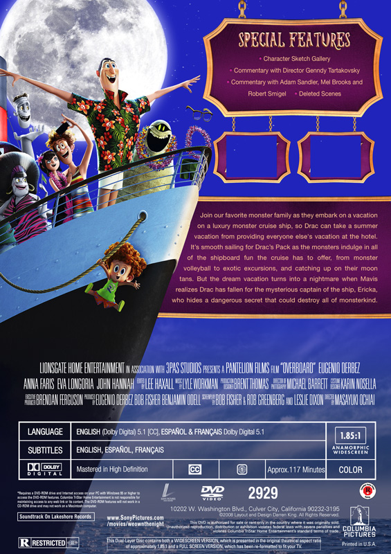
|
|
|
|
The Following 4 Users Say Thank You To Bazzah For This Post: ctaulbee, sauron, Speedz0r, VincentLupo | |
|
Sep 7 2018, 06:33 PM
Post
#13
|
|
|
Group: Moderator Posts: 5,702 Coverart: 240 Thanks: 22382 From: Norway Joined: June 24 2006 |
Starting to look like a another great cover from you Baz. I know you still have a lot of work to do with the wolf, but from the looks of your preview he's too big compared to the rest of them, even if he is closer. You should do as Ark said and use the picture above as reference to how big each character should be
Please keep my covers on this site and this site only! |
|
|
|
|
Sep 8 2018, 03:27 PM
Post
#14
|
|
  Group: Cover Designer Posts: 13,830 Coverart: 564 Thanks: 12364 From: Denmark Joined: August 16 2007 My Favorite Custom Cover: To have and have not My Favorite Cover Designer: Tim Gengler |
Looks great, liking the back layout, although it looks to me that you need something (an image or an additional Special Features box or something) in the free space between the credits and the synopsis box.
On the front, if you could add some slight shadow below the hair of the boy, same as you have on the skinny guy in the striped shirt. Take a closer look and you notice that his forehead rests almost totally in shadow from his hair. The smaller boy's hair would cast a similar shadow on the forehead, if you understand what I'm getting at.. This post has been edited by JollyRoger: Sep 8 2018, 03:30 PM A designer knows he has achieved perfection - not when there's nothing left to add - but when there's nothing left to take away - Antoine de Saint Exupéry |
|
|
|

|
Sep 8 2018, 04:15 PM
Post
#15
|
|
|
Group: Root Admin Posts: 22,895 Coverart: 1,634 Thanks: 52601 From: Home Joined: May 3 2006 My Favorite Cover Designer: All HiRes designers |
Thanks guys. The back is nowhere near done Jrr. I was just showing where I was going with it
OK, so after A LOT of cloning and masking.... How is the front looking? 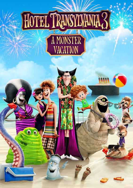
|
|
|
|
|
Sep 8 2018, 04:19 PM
Post
#16
|
|
|
Group: Cover Designer Posts: 13,830 Coverart: 564 Thanks: 12364 From: Denmark Joined: August 16 2007 My Favorite Custom Cover: To have and have not My Favorite Cover Designer: Tim Gengler |
Looks great, although I'm still missing the slight shadow on the kid's forehead.
Would the triple kids work better in between the mummy and the vampire? (you would need to move the kid with curly hair, missing the shadow on his forehead)  This post has been edited by JollyRoger: Sep 8 2018, 04:22 PM A designer knows he has achieved perfection - not when there's nothing left to add - but when there's nothing left to take away - Antoine de Saint Exupéry |
|
|
|
|
Sep 8 2018, 04:56 PM
Post
#17
|
|
|
Group: Root Admin Posts: 22,895 Coverart: 1,634 Thanks: 52601 From: Home Joined: May 3 2006 My Favorite Cover Designer: All HiRes designers |
Thanks Jrr. I can't move those kids, without moving the Mummy. I have added the shadow, just for you
Also, moved the fireworks and background |
|
|
|
|
Sep 8 2018, 06:00 PM
Post
#18
|
|
 Group: Moderator Posts: 12,533 Coverart: 67 Thanks: 20286 From: United Kingdom Joined: May 14 2006 |
Wow this is looking great but I did prefer the darker background especially if you have fireworks on it - during the day they won't be as obvious.
|
|
|
|
|
Sep 8 2018, 06:17 PM
Post
#19
|
|
|
Group: Cover Designer Posts: 13,830 Coverart: 564 Thanks: 12364 From: Denmark Joined: August 16 2007 My Favorite Custom Cover: To have and have not My Favorite Cover Designer: Tim Gengler |
If the trio is linked with the mummy, I'd suggest you move the lot of them a bit left. The free space behind (to the left of) the mummy brings an unbalance to the layout imo.
A designer knows he has achieved perfection - not when there's nothing left to add - but when there's nothing left to take away - Antoine de Saint Exupéry |
|
|
|
|
Sep 8 2018, 06:49 PM
Post
#20
|
|
|
Group: Root Admin Posts: 22,895 Coverart: 1,634 Thanks: 52601 From: Home Joined: May 3 2006 My Favorite Cover Designer: All HiRes designers |
Thank you
Better? I have darkened the sky a little, and shifted the kids and mummy over a bit.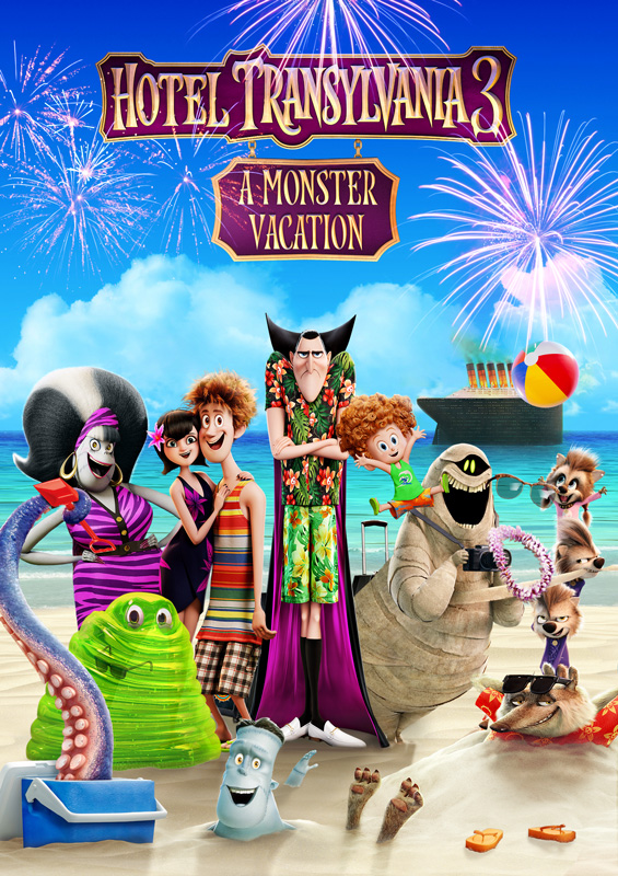
|
|
|
|
|
|
1 User(s) are reading this topic (1 Guests and 0 Anonymous Users)
| 0 Members: | ||||
|
||||
|
|
| The Artwork hosted on this site is for personal use only. We do not condone piracy and we do not supply images for use in any illegal activities, including DVD or Blu-ray piracy. | ||||
| Time is now: 14th October 2025 - 01:46 PM | Gallery Index | Privacy policy | Lo-Fi Version | 
|
Copyright © 2006 - 2025 by HiResCovers.net