


Welcome to HiResCovers.NET
|
| |||||||||||||
|
||||||||||||||
|
|
| |||
|
||||
|
| |||||||||||||||||
|
||||||||||||||||||
|
| |||||||||||||||||||||||||
|
||||||||||||||||||||||||||
|
|
| |||
|
||||
 Loading tabs, please wait...
abcdefghijklmnopqrstuvwxyzABCDEFGHIJKLMNOPQRSTUVWXYZ
|
|

Welcome Guest, Register to Remove this Message!
|
Welcome to the highest quality Custom DVD, Blu-ray and Ultra-HD 4k cover art, available anywhere in the world. Please register, or log in, to browse our site. • Almost 200,000 300 dpi high quality images • Moderated uploads, to ensure the highest quality possible. • A forum for artwork requests, help designing cover art and much more • If you cannot find the movie you need, simply create a request for it to be created and uploaded to the gallery. • A section of Design Assets, including templates, logos and fonts. |
Guest Message © 2025 Dev Fuse

 Sep 29 2018, 07:04 PM Sep 29 2018, 07:04 PM
Post
#1
|
|
  Group: Cover Designer Posts: 13,830 Coverart: 564 Thanks: 12364 From: Denmark Joined: August 16 2007 My Favorite Custom Cover: To have and have not My Favorite Cover Designer: Tim Gengler |
Never did convert my DVD cover for this title to BD format; not am I gonna.
Instead, I'm trying something new 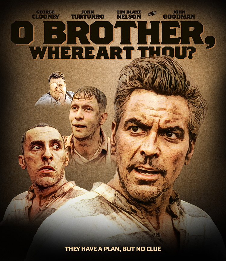
 A designer knows he has achieved perfection - not when there's nothing left to add - but when there's nothing left to take away - Antoine de Saint Exupéry |
   |
 
|


|
|
Replies
|
|
Sep 30 2018, 06:23 PM
Post
#2
|
|
  Group: Members Posts: 3,265 Coverart: 91 Thanks: 1039 Joined: September 19 2009 My Favorite Custom Cover: Friday the 13th by Samppa My Favorite Cover Designer: Euroboy, Samppa, Bunny Dojo |
Good start!
 I think you should pull back a little before going to the back. I would remove all effects (effects this heavy on an entire cover can make it look less retail? It feels a little photoshop-happy. I would slowly start adding effects back in until it feels like too much. I think you should pull back a little before going to the back. I would remove all effects (effects this heavy on an entire cover can make it look less retail? It feels a little photoshop-happy. I would slowly start adding effects back in until it feels like too much. I also think that the BG in your second post had good contrast levels (minus the black vignette and heavy texture) . It would be nice to have the heads a little smaller and in the sky (lower the horizon closer to the bottom and maybe have a full-body image of the 3 leads? Your head layout is very interesting and like a classic poster but it has some edge tension with John Turturro on the left Keep it up! My gallery: HERE
|
|
|
|
The Following 4 Users Say Thank You To Paris For This Post: Bazzah, ctaulbee, JollyRoger, VincentLupo | |


|
|
2 User(s) are reading this topic (2 Guests and 0 Anonymous Users)
| 0 Members: | ||||
|
||||
|
|
| The Artwork hosted on this site is for personal use only. We do not condone piracy and we do not supply images for use in any illegal activities, including DVD or Blu-ray piracy. | ||||
| Time is now: 13th October 2025 - 11:35 PM | Gallery Index | Privacy policy | Lo-Fi Version | 
|
Copyright © 2006 - 2025 by HiResCovers.net