Page 1 of 6
Posted: Sat Jul 25, 2009 10:10 pm
by Kernie
Hey everyone,
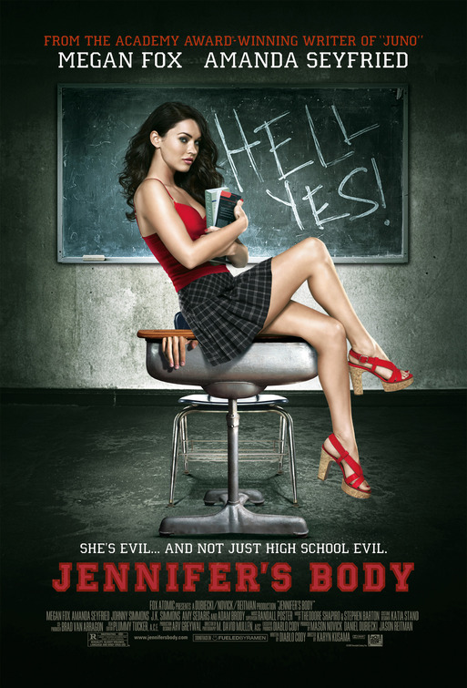
I've started a cover for
Jennifer's Body, the new Megan Fox film coming out in the Fall. I, for one, will see it because Megan is a brilliant thespian and I appreciate the subtle range of emotions that she can portray, it will be interesting to see a realistic examination of a teenage girl's psyche after she has been possessed by a demon and how she will overcome such hardships.
Nah, I'm totally seeing it because she's hot...

So, here it is, it's still kind of early. Not sure what to put in that "dead space" on the chalkboard to the right of Megan or if I'm going to span the chalkboard to the back cover or cut it off after the spine. Still working, but would like to get some feedback! Thanks!

[attachment=9026:jennifer...view_001.jpg]
Posted: Sat Jul 25, 2009 11:06 pm
by chefjoe
Looks sharp m8, I too have been thinking on this one, different approach though. :thumbsup:
Posted: Sun Jul 26, 2009 12:28 am
by ~booche~
Damn sod the cover just span her lol
Nice start m8, wonder if some like maths etc on the chalk board would fill it ? (not seen or heard about this film)
Hope to see more lol
Posted: Sun Jul 26, 2009 1:45 am
by felipe-11
Well, the cover's looking good (how can't it, Megan Fox is on it), for the space on the right I'd leave the tagline thats on the poster "hell yes" (I'll leave you the image in case your artwork didn't have it).
PS: That TT looks amazing, did you make it yourself? If you did, which program are you using?
Posted: Sun Jul 26, 2009 3:11 am
by donger
I love the line in the trailer where she says "I go both ways". Put that on the chalk board.
Posted: Sun Jul 26, 2009 3:48 am
by Kernie
Thanks for the input!
I did make the TT myself (I usually always recreate my TT's in some way). I used the 3D Invigorator program in Adobe AfterEffects and exported a PNG with transparency for Photoshop (I added the textures in PS though).
As for the chalkboard, I cloned out the "Hell Yes" that was originally on the artwork because it ended up getting cropped off the edge and didn't read so well. Maybe I'll add a tagline in that space, although my personal preference is to keep taglines in the upper or lower quarter of the cover (not sure why, just a personal preference). Besides some sort of text, I'm really not sure what to put in that "dead space," but I think I'll play around and see what works...
Thanks again for the comments!! Keep them coming!!
Posted: Sun Jul 26, 2009 6:26 am
by felipe-11
Thanks kernie, you got me looking up some 3D-effects plugins, theyre really cool, might have to revisit some old cover now

Posted: Sun Jul 26, 2009 2:46 pm
by sauron
Very good cover mate! Just fill the cover with megan then it will get all our approvals lol
Posted: Sun Jul 26, 2009 9:44 pm
by D4nY
hi! what font use for title and what font use for starring name?
thanks
Posted: Sun Jul 26, 2009 10:08 pm
by Kernie
It's called "College" and it's available for free download here:
http://www.dafont.com/college.fontThe only difference is the TT has a red border around it (and of course, I made it all 3D), but at the center it's still College.
Now, back to the cover... anybody have any further suggestions? I'm kind of stalled at the moment...