So far..
Originally the background was colored and the pic was B/W, but I switched it and like it better.
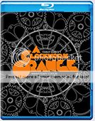
[attachment=19100:PB.jpg]
..
Pitch Black
-
invisigoth

- HiRes Addict
- Posts: 998
- Joined: Sun May 14, 2006 4:20 am
- Location: N.Y.
- Contact:
-
JollyRoger

- HiRes Uber Member
- Posts: 13911
- Joined: Thu Aug 16, 2007 11:43 pm
- Location: Denmark
- Contact:
looks done to me! 
I really like the front!
I'd try to make tagline and Director's Cut text smaller, but more spaced out horisontally.
I really like the front!
I'd try to make tagline and Director's Cut text smaller, but more spaced out horisontally.
A designer knows he has achieved perfection - not when there's nothing left to add - but when there's nothing left to take away
- Antoine de Saint Exupéry

SITE RULES
- Antoine de Saint Exupéry
SITE RULES


I really like the design so far :yikes: But if it's possible, make a version too without "the chronicles of Riddick" line. I hate the second movie, and I considere Pitch Black as a stand-alone movie. I like simple covers. And I would be happy if you wouldn add a bar code on the back. I don't like them neither, I think they ruin the design of most of the covers.
Wheew, I think that's all.
Wheew, I think that's all.
Last edited by edulopez on Sun Jan 29, 2012 12:13 pm, edited 1 time in total.
-
invisigoth
- HiRes Addict
- Posts: 998
- Joined: Sun May 14, 2006 4:20 am
- Location: N.Y.
- Contact:
edulopez wrote:QUOTE (edulopez @ Jan 29 2012, 07:08 AM) <{POST_SNAPBACK}>I really like the design so far :yikes: But if it's possible, make a version too without "the chronicles of Riddick" line. I hate the second movie, and I considere Pitch Black as a stand-alone movie. I like simple covers. And I would be happy if you wouldn add a bar code on the back. I don't like them neither, I think they ruin the design of most of the covers.
Wheew, I think that's all.
OKedulopez wrote:QUOTE (edulopez @ Jan 29 2012, 07:20 AM) <{POST_SNAPBACK}>Also, if possible, remove the "unrated director's cut" cause I am going to use it on my UK disc, which has only the theatrical cut.
OK, although I wasn't planning on upping 2 versions, maybe i can have you DL the UK version and after you have it replace it with a US. Starting the back today.JollyRoger wrote:QUOTE (JollyRoger @ Jan 29 2012, 02:48 AM) <{POST_SNAPBACK}>\
I'd try to make tagline and Director's Cut text smaller, but more spaced out horisontally.
Sounds good JR.
**

-
invisigoth
- HiRes Addict
- Posts: 998
- Joined: Sun May 14, 2006 4:20 am
- Location: N.Y.
- Contact:
nikerun147 wrote:QUOTE (nikerun147 @ Jan 29 2012, 02:18 PM) <{POST_SNAPBACK}>On the front, what abou switching the stars background and the black background behind riddick?
Is this what you're saying Paris? ..I did this quick, if it's right I'd probably leave it to edulopez.
[attachment=19115:pbchunk.jpg]You do not have the required permissions to view the files attached to this post.

Who is online
Users browsing this forum: No registered users and 1 guest
- Menu
- Search the site
- Latest gallery additions
- Statistics
- Totals
Total posts 207052
Total topics 58499
Total Announcements: 0
Total Stickies: 80
Total Attachments: 26728
Topics per day: 8
Posts per day: 28
Users per day: 13
Topics per user: 1
Posts per user: 2
Posts per topic: 4
Total members 92764
Our newest member montanelas
- The team
- Administrators
Ace
bazzah
ctaulbee
iHTTP-Steven
Moderators
BajeeZa
Jazzy
ripley
sauron
Speedz0r
VincentLupo