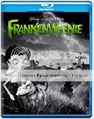
Maybe it's just the light colour of his top? That could be what's making him stand out on the front? :S This is really shaping up though This is most probably just me and the minority but with all the space you have up top on the back you could quite easily fit a... dare i say it :P BARCODE in lol but that's upto you I don't think the synopsis nor quote needs to stretch pretty much the whole width of the back.
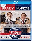
Not so keen on the two color quote at the back top. Looks weird having a word with first letter blue the rest grey...
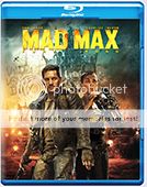
Also - IMHO if you are gonna sport a bar code on the cover, make it proper instead. It's just my personal opinion, but customizing it make me notice it even more than a regular one. Seeing you're not a big fan of them initially, I think you should lose it
A designer knows he has achieved perfection - not when there's nothing left to add - but when there's nothing left to take away
I like the added bar code, but it is a bit faded ATM and looks a little off. You could also have it continue behind the robot's head and just make it an outline one instead of an imprinted steel one.
Either way, with or without it, your cover looks great!
Few things: • the quote on the back is a dark grey on a black background, why not try a white? • Also the Stills bar could be a little well-formated. Why not have Hugh in the center, the other characters to the side of him
Totals
Total posts 207052
Total topics 58499
Total Announcements: 0
Total Stickies: 80
Total Attachments: 26728
Topics per day: 8
Posts per day: 28
Users per day: 13
Topics per user: 1
Posts per user: 2
Posts per topic: 4
Total members 92764
Our newest member montanelas

 This is most probably just me and the minority but with all the space you have up top on the back you could quite easily fit a... dare i say it :P BARCODE in lol but that's upto you
  I don't think the synopsis nor quote needs to stretch pretty much the whole width of the back.