Mission Impossible Series

Finished WIP's or WIP with no updates posted by the author for more than 60 days will be closed and placed here.

If you wish to continue an unfinished WIP that has been closed -- PM a Mod and they will re-open it for you.
edskizzorhands
Valued Member
Posts: 109
Joined: Fri May 20, 2011 1:05 pm
Contact:

Post by edskizzorhands »

So I decided to make matching covers for all the films, using a similar layout to my Days of thunder (and upcoming Top Gun, Minority Report, War of The Worlds and Collateral covers).

The main posters for first 3 films have the side profile shot of Cruise, so I tried to line them up and close of possible to create a uniform look.
The problem I faced with the original film is lack of quality pics and the original poster design is a tighter shot of cruises head. I used several stock pics for the pose and placed the poster head on. Not perfect but I think it works. Would have been nice to find a version without the map on cruises face but oh well! Maintains the design of the original while adding a bit more action to flow with 2 and 3. I also recreated the logo from the title sequence of the first film, I changed the color scheme for 2 and 3 but kept the same design.


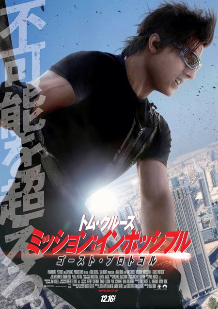
I am planning a Ghost Protocal cover as soon as I can find a hi rez version of the Japanese poster that features the side profile design.
Unfortunately the rest of the world isn't following the previous films in the promo design.

If anyone can help me find a hi rez version of this pic I'd be grateful!
Last edited by edskizzorhands on Wed Dec 14, 2011 3:04 am, edited 1 time in total.
User avatar
bpmford
HiRes Uber Member
Posts: 2317
Joined: Fri May 08, 2009 4:28 pm
Location: Calgary, Canada
Contact:

Post by bpmford »

Hey, really cool start on this set skizz!

If I had one reco to start, I'd say (if it's possible) to brighten up and bring back more detail into cruise's face on MI1.
User avatar
Bunny Dojo
HiRes Uber Member
Posts: 2725
Joined: Tue Jul 22, 2008 4:44 am
Contact:

Post by Bunny Dojo »

I like it! Nice work extending that first poster, the designs definitely lend themselves well to a cohesive set with that in place.

One thing I'd love to see is a background element added to the black space around the designs. Perhaps a map of the main setting or even some generic code or a few stills would work nicely, the way the James Bond Ultimate Editions (example) were done? The simplicity is fantastic, but a faded little touch of something could really help further solidify the idea of the set (and also add another cool element to look at and enjoy, of course). :)

Keep up the great work. If you can't find a large version of the Japanese poster, the Cruise character poster isn't that far off from the style as a backup, and quite a few of the stills from the film feature his ever-popular side view. :)
User avatar
M0vieM0nster
HiRes Uber Member
Posts: 3539
Joined: Mon May 22, 2006 11:21 pm
Location: United Kingdom
Contact:

Post by M0vieM0nster »

Nice start
User avatar
chefjoe
HiRes Uber Member
Posts: 5688
Joined: Sun May 14, 2006 3:18 pm
Location: Georgia, USA
Contact:

Post by chefjoe »

i agree with all said above! And I can't stand his movies, haha
crazy-horse
Valued Member
Posts: 225
Joined: Tue May 16, 2006 9:39 am
Location: London UK
Contact:

Post by crazy-horse »

Really handsome looking set. Great work.
User avatar
felipe-11
HiRes Uber Member
Posts: 1622
Joined: Sat Dec 15, 2007 1:49 am
Location: Washington DC
Contact:

Post by felipe-11 »

Nice start man, I like what you've done with the first poster adding the hands, great idea! I think Bunny has a good point too.

I too was a little disappointed that they didn't use the profile shot on the 4th one for the american posters, the first 3 had a nice continuity that way. Hope you find the japanese one.
edskizzorhands
Valued Member
Posts: 109
Joined: Fri May 20, 2011 1:05 pm
Contact:

Post by edskizzorhands »

I went through tons of GP pics yesterday and could only find one that worked. It's alittle grainy but I think it will work until I find a higher rez version.
I'm still hoping to find a better version of the Japanese poster, because I wanted the title to be red, but with this cover I came up with the red clashes with the brown/gold tone of the art.

User avatar
bpmford
HiRes Uber Member
Posts: 2317
Joined: Fri May 08, 2009 4:28 pm
Location: Calgary, Canada
Contact:

Post by bpmford »

Looks great skizz! Really fits with the rest!

Maybe add the IV to that one as well to fit with the Roman numerals.
Last edited by bpmford on Wed Dec 14, 2011 10:20 pm, edited 1 time in total.
crazy-horse
Valued Member
Posts: 225
Joined: Tue May 16, 2006 9:39 am
Location: London UK
Contact:

Post by crazy-horse »

Just a quick question skizz, I was going to request a Mission Impossible Collection cover for all 4 movies for a Bluray 25mm spine space saver Amaray case.

Any plans before I do ;)
Post Reply

Return to “Closed WIP's”

Who is online

Users browsing this forum: No registered users and 1 guest