Welcome to HiResCovers.NET
|
| |||||||||||||
|
||||||||||||||
|
|
| |||
|
||||
|
| |||||||||||||||||
|
||||||||||||||||||
|
| |||||||||||||||||||||||||
|
||||||||||||||||||||||||||
|
|
| |||
|
||||
 Loading tabs, please wait...
abcdefghijklmnopqrstuvwxyzABCDEFGHIJKLMNOPQRSTUVWXYZ
Welcome Guest, Register to Remove this Message!
|
Welcome to the highest quality Custom DVD, Blu-ray and Ultra-HD 4k cover art, available anywhere in the world. Please register, or log in, to browse our site. • Almost 200,000 300 dpi high quality images • Moderated uploads, to ensure the highest quality possible. • A forum for artwork requests, help designing cover art and much more • If you cannot find the movie you need, simply create a request for it to be created and uploaded to the gallery. • A section of Design Assets, including templates, logos and fonts. |
Guest Message © 2025 Dev Fuse
|
|
 
|
 Feb 8 2008, 03:51 PM Feb 8 2008, 03:51 PM
Post
#1
|
|
|
Here are some of my scanned covers, proving i can contribute to this site and hope to get access. The cover Breakfast Club had some sort of smudge when i bought it so i coudnt fix that part is in top in the back cover in the hand of the second guy, i deleted the cover Just Friends and added a new cover hoping to replace jsut friends and i fixed all the covers so i replaced them and i think they will be acceptable now...
http://www.hirescovers.net/gallery/display....php?pos=-41760 http://www.hirescovers.net/gallery/display....php?pos=-41764 http://www.hirescovers.net/gallery/display....php?pos=-41763 http://www.hirescovers.net/gallery/display....php?pos=-41762 http://www.hirescovers.net/gallery/display....php?pos=-41761 http://www.hirescovers.net/gallery/display....php?pos=-41759 http://www.hirescovers.net/gallery/display....php?pos=-41758 http://www.hirescovers.net/gallery/display....php?pos=-41832 This post has been edited by mr_cyclone: Feb 11 2008, 07:34 PM |
|
|
|
|
 Feb 10 2008, 08:48 PM Feb 10 2008, 08:48 PM
Post
#2
|
|
|
what i will say your covers need work. theres a lot of moire evident.
try reading the tutorial i uploaded which gives a basic start to making a good scan - theres obviously a lot more to it. i would also try using some of the filters that you have in your add like smartblur/ median filter / despeckle ect.. all scans are trial and error, the idea is to remove the moire, but leave enough detail and leaving the writing clear and legible. just to give you an idea here is the last scan i uploaded. http://www.hirescovers.net/gallery/display....php?pos=-41418 its a challenge to keep trying toi improve, and i consider this to be one of my best scans: http://www.hirescovers.net/gallery/display....php?pos=-37126  Sorry for my English, i'm from Leicester innit?
|
|
|
|
|
 Feb 10 2008, 09:18 PM Feb 10 2008, 09:18 PM
Post
#3
|
|
 Group: Members Posts: 9 Coverart: 14 Thanks: 0 Joined: November 20 2007 |
if they are as bad as you say they are how come the have been approved onto the site ?
|
|
|
|
 Feb 10 2008, 09:38 PM Feb 10 2008, 09:38 PM
Post
#4
|
|
|
I'm pretty sure the cover for Boys And Girls is a semi rebuild.. Judging by the difference in quality looking on the pictures and the text on the back. Same goes for "The Breakfast Club"
Anyway, if I where you - I'd try and work with MHD's tutorial and see where it gets you. Corbyt, I'm sorry but I don't see how you are connected to this chap? And as far as I can see, MHD's advice is spot on. The quality on the covers are OK. But could be better. |
|
|
|
|
 Feb 10 2008, 10:04 PM Feb 10 2008, 10:04 PM
Post
#5
|
|
 Group: Members Posts: 9 Coverart: 14 Thanks: 0 Joined: November 20 2007 |
Wasnt saying anything else no offence intended was only pointing out a valid point
Sry if i ofended anyone in doing so |
|
|
|
 Feb 10 2008, 10:22 PM Feb 10 2008, 10:22 PM
Post
#6
|
|
|
when you say semi rebuild do you mean i added the text to both covers because the covers came like that i didnt rebuild or anything to it?
I'm pretty sure the cover for Boys And Girls is a semi rebuild.. Judging by the difference in quality looking on the pictures and the text on the back. Same goes for "The Breakfast Club" Anyway, if I where you - I'd try and work with MHD's tutorial and see where it gets you. Corbyt, I'm sorry but I don't see how you are connected to this chap? And as far as I can see, MHD's advice is spot on. The quality on the covers are OK. But could be better. |
|
|
|
|
 Feb 10 2008, 10:37 PM Feb 10 2008, 10:37 PM
Post
#7
|
||
|
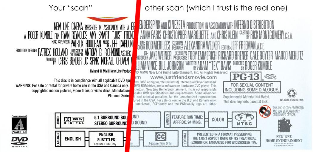
when you say semi rebuild do you mean i added the text to both covers because the covers came like that i didnt rebuild or anything to it? I'm no master-scanner myself, but I don't understand how the plot can come out crystal clear when the spine-logo's are plagued with scan-dots. Let me just demonstrate an example, comparing your "scan" of Just Friends.. and another one I found. Which by the way, has the "normal" scan-artifact.
I really don't mean to come off as a "narc" or anything.. It's just that the covers you've uploaded, show signifigant signs of halfassed rebuilds. And add to this, I'm pretty sure you havn't scanned the covers yourself... |
||
|
|
||
 Feb 10 2008, 11:18 PM Feb 10 2008, 11:18 PM
Post
#8
|
|
|
oh on just friends i had to redo the whole bottom part because when i scanned it the text came out really choppy that if u printed it out you wouldnt of been able to read it so i tryed my best to do it like the original but i can easly post another cover and remove this one till i can do it better and well my scans i do them at 600dpi to try and fix as much as possible then make them the right size and make them look good but i guess thats my mistake since i do my covers at 600 but like ive said im still new at this so it will take a while to learn more and i dont mean to be rude but i dont download covers and rebuild them as my own like you mentioned at the bottom i scan my own covers and fix them if u want a pictures of proofs i be happy to show you.
I'm no master-scanner myself, but I don't understand how the plot can come out crystal clear when the spine-logo's are plagued with scan-dots. Let me just demonstrate an example, comparing your "scan" of Just Friends.. and another one I found. Which by the way, has the "normal" scan-artifact. I really don't mean to come off as a "narc" or anything.. It's just that the covers you've uploaded, show signifigant signs of halfassed rebuilds. And add to this, I'm pretty sure you havn't scanned the covers yourself... This post has been edited by mr_cyclone: Feb 11 2008, 12:14 AM |
|
|
|
|
 Feb 10 2008, 11:20 PM Feb 10 2008, 11:20 PM
Post
#9
|
|
|
what im talking about is improving the overall look. I have taken an image from undefeated just to show you. obviously the results with any scan depend on a number of things, but try to get it as good as you can
you may be creating problems for yourself by scanning at 600 dpi, try reducing the scan to 300 before you do anything
Attached image(s)
   Sorry for my English, i'm from Leicester innit?
|
|
|
|
|
 Feb 10 2008, 11:32 PM Feb 10 2008, 11:32 PM
Post
#10
|
|
|
yeah im a try and fix my covers like u showed me on the image of undefeated, ill try to do a cover a little later and ill see the difference between 300 and 600 and see which one is better because i thought 600 was the way to do it but diffrent sites and people have diffrent rules and tips i suppose. here i just did a little test a fast one between 600 and 300
what im talking about is improving the overall look. I have taken an image from undefeated just to show you. obviously the results with any scan depend on a number of things, but try to get it as good as you can you may be creating problems for yourself by scanning at 600 dpi, try reducing the scan to 300 before you do anything This post has been edited by mr_cyclone: Feb 11 2008, 01:20 AM
Attached image(s)
 |
|
|
|
|
 Feb 11 2008, 06:05 PM Feb 11 2008, 06:05 PM
Post
#11
|
|
|
would this cover be more acceptable or will it be the same like the other ones i posted, i did it last night
http://www.hirescovers.net/gallery/display....php?pos=-41832 |
|
|
|
|
 Feb 11 2008, 06:25 PM Feb 11 2008, 06:25 PM
Post
#12
|
|
|
thats a lot better.
scannign at 600 increases detail but also increases moire.(the patteren effect) most people who scn at 600 reduce the image to 300 before filtering it. personally i scan at 300 to begin..personal choice.  Sorry for my English, i'm from Leicester innit?
|
|
|
|
|
 Feb 11 2008, 06:31 PM Feb 11 2008, 06:31 PM
Post
#13
|
|
|
i finished doing some work on all the covers exept Pulse because i didnt really see nothing wrong with that one so i replaced most of the covers just right now, Just Friends i deleted that one and i would like to replace it with the new cover i posted yesterday The Assasination Of Jesse James if thats ok with everyone...
thats a lot better. scannign at 600 increases detail but also increases moire.(the patteren effect) most people who scn at 600 reduce the image to 300 before filtering it. personally i scan at 300 to begin..personal choice. This post has been edited by mr_cyclone: Feb 11 2008, 06:46 PM |
|
|
|
|
 Feb 14 2008, 06:04 PM Feb 14 2008, 06:04 PM
Post
#14
|
|
|
added a new dvd cover here is the link to it
http://www.hirescovers.net/gallery/display....php?pos=-41959 so this are the scanned covers i've posted so far This post has been edited by mr_cyclone: Feb 15 2008, 02:43 AM
Attached image(s)
 |
|
|
|
|
 Feb 15 2008, 08:26 PM Feb 15 2008, 08:26 PM
Post
#15
|
|
|
Congratulations, and welcome to the contributor group. I have to tell you, at first the guys were voting against you being a contributor. But due to the improvement, and willingness to improve you have shown, they have changed their minds! Keep up the great work!
 |
|
|
|
|
 Feb 15 2008, 09:17 PM Feb 15 2008, 09:17 PM
Post
#16
|
|
|
thanks everyone so much i really appreciate it alot.
|
|
|
|
|
 
|
1 User(s) are reading this topic (1 Guests and 0 Anonymous Users)
| 0 Members: | ||||
|
||||
|
|
| The Artwork hosted on this site is for personal use only. We do not condone piracy and we do not supply images for use in any illegal activities, including DVD or Blu-ray piracy. | ||||
| Time is now: 10th October 2025 - 09:06 AM | Gallery Index | Privacy policy | Lo-Fi Version | 
|
Copyright © 2006 - 2025 by HiResCovers.net


